vBulletin 4 [Deleted]

About four or so post ago click on the pic I attached with the post were the avatar goes the hole thing is too wide its the ONLY theme that does this???
 
About four or so post ago click on the pic I attached with the post were the avatar goes the hole thing is too wide its the ONLY theme that does this???

Something you have is causing this. It's not like this on KH-Flare.
 
About four or so post ago click on the pic I attached with the post were the avatar goes the hole thing is too wide its the ONLY theme that does this???
Yes this is an issue with this style. You can change this in your properties quite easily. You'll have to change left message content margin afterwards. :)

Also there are some button issues that need to be adjusted. :)
 
Last edited:
You have the info container over 220px.. Easily fixed and changed to 124px. Also needed to adjust content margin obviously.:)
 
You have the info container over 220px.. Easily fixed and changed to 124px. Also needed to adjust content margin obviously.:)

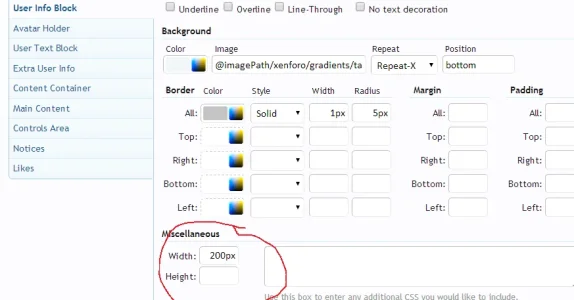
The User Info Container style property is already at the default 124px for width.

I added 200px width to the User Info Block style property and increased the left margin of the Content Container style property from the default 140px to 225px when making the style. I don't know why you guys are having issues with it, as it's fine on KH-Flare:

Thread.webp
 
Here are the two problems that need to be changed by the user. Page width has nothing to do with fixing this problem. :D

.sp1.webp
 

Attachments

  • sp2.webp
    sp2.webp
    34.6 KB · Views: 26
@VinnySx, @Gabby

I took a different approach to having a big user info block, which was applied in this latest update. Let me know if those issues are resolved.
 
Amaury updated vBulletin 4 with a new update entry:

Messages and Navigation

  • Re-arranged sub-navigation bar in order of relevance: New Posts, Search Forums, Watched Threads, Watched Forums, Mark Forums Read
  • Removed border radius on buttons
  • Moved Log Out link under Your Account
  • Added border-left to navigation sidebar
  • Moved username and user title above the avatar in the user info block
  • Changed avatar size from medium to large in the user info block
  • Adjusted quick reply to keep the avatar small due to the change above
  • Styled all prefixes...

Read the rest of this update entry...
 
Thanks for your update :)

How can I change this problem? vBulletin is a child of the default style.

out.webp
 
I'm with Vinny on this, I was hoping that was fixed here. If it was, this would be a good one. Right now the avatars in the posts are too wide.

Thanks!
 
Top Bottom