Implemented Updated Look

digitalpoint

Well-known member
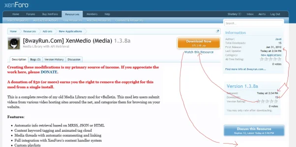
Generally I think the new version is laid out better, but one thing I don't like is the visitor's avatar/post count/likes on the resource detail page. It's not consistent... why is it on the detail page, but not the main page? But more importantly I just think it should go away. It's visitor stats that really have nothing to do with resources at all.
 
Upvote 3
This suggestion has been implemented. Votes are no longer accepted.
I think the way it is now is much better. The tab system in each resource page was a really smart move.

Looks very nice. And I agree about the removing of the visitor's panel.

1.webp
 
I too think it's a big improvement and agree with DP request.

Related suggestion: if this is considered maybe place the version block (which currently resides in the resource message area and move that out and place it under the information block.

edit: screenshot applied since the version data resides in the information block possibly move the ratings stars under the download now and do away with the version block altogether, and switch the watch button down to the discuss this resource button.

newlayout.webp
 
Absolutely agree that Version is out of place sitting in the text content area. I kept puzzling around trying to make sense of it and it just didn't make a pattern.
Also agree it would be a smart move to cut the visitor block - this is one of the few places it DOESN'T belong. This page is about someone else and THEIR WORK, not me as user.
That would then, as suggested make room for Version to move into the sidebar where it fits in with Information.

Would like Watch this Resource to be a big button same as Download and Discuss. These are the three key responses to the page so they should be presented the same way.
 
- If the "orange Download Now" button would be put into the sidebar (positioned at the very top / above "Information"), there would be more space for the "Title" (and also for a "Prefix") of the Add-on.
- why is there a "Prefix" showing for the "Discussion", but not showing for the Add-on itself (like e.g. "Graphic") ?
 
Why is "blogs" plural? Should it be just "blog"? It makes it seem like there are many (separate) blogs about the resource, when they are really just many blog posts from a single author.
 
Ah Mike that's a LOT better! Really good to take on the feedback. Thank you.

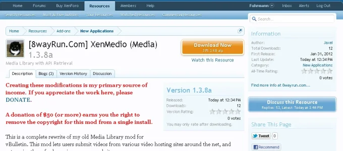
VERSION now in the side column and Blogs renamed as Updates Much much clearer.

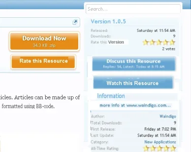
Any chance of a couple more buttons for the user actions?
Rate this Resource is very important to developers. This was the main criticism I've heard so far on this nice new design.
For the user I champion making Watch this Resource a button too.

RM2.webp


Rate this Resource --> rate this Version
Developer website right under the Information title.
 
What will happen to all the references to Download/Resource/Version/etc if we are not going to use it for download software purposes?

Say if we use it to rank a website/car, do we have options to select which actions we can have for each category? Sort of mix and match options to best fit the products.
 
Two things I was thinking: 1) the user avatar could be replaced by a custom icon made for the add-on (since it's next to the add-on title that makes more sense), if the author doesn't have one, show some default add-on icon instead. 2) it may be cleaner to have all buttons in the sidebar.
 
Giving this a shot now.

Mike, I am quite amused at all this re-arrangement stuff. I like it in a different manner, but I won't bother you with that. I would like to know a few things if you could respond...

1. Are the variables which hold the version and Information block data available in the center Description tab template or not?
2. What template hooks have you given in the Description Tab?
3. Are the version and Information blocks and Discussions button (and the reply stats) on the sidebar in resource_view?

Thanks...

And if I may, any chance of giving us a ballpark estimate of when we can buy this? Maybe mention the month? March? or April?
 
Mike, I am quite amused at all this re-arrangement stuff. I like it in a different manner, but I won't bother you with that.

Sadik from the rest of your post it is clear your interest is mainly about buying and using the RM on your site. Of course over there you can rearrange it as you like.

There is a very different user interest about how the RM appears here - for the specific function of coordinating XF Resources.
If the RM does not arrange its components to be user-friendly and clear to the nth degree, then the precious relationship between developers and admins in the community will be damaged. It's that important.
It's deeply to the credit of the KAM team that they are so thoroughly consulting on the issues in detail.

I'd be hard put to assess just which is more important: the efficient, user-friendly core XF or the burstingly vibrant add-on array.
I guess the core XF wins just because it is the foundation without which the addons would have no meaning!
But there's not much in it because XF absolutely HAS to focus on getting the core right. That is a wise priority. But the very fact that the RM has been created shows how the team recognise how vital the addons are to extend XF functional reach.
 
Of course Shan... the developers here deserve all the praise they get. And respectfully, it matters little whether the resource information block is inside the description or on sidebar even here, because they have achieved the core objective, which is getting the functionality right. BUT, it does look good now how it is. :) lol

I am mostly interested in which templates sees what data and what template hooks there are in the RM, because I want to customize it... :)
 
respectfully, it matters little whether the resource information block is inside the description or on sidebar even here, because they have achieved the core objective, which is getting the functionality right. BUT, it does look good now how it is. :) lol
I am mostly interested in which templates sees what data and what template hooks there are in the RM, because I want to customize it... :)

I guess I look at at as a businesswoman. It offers resources to clients. Do that in a way that is unclear and even a bit muddled and you put clients off. In business that's a sin.
I'm so glad the team are businesslike in the best possible interpretation of that. Look after your clients and they'll look after you.

I think for the templates you'll have to wait. It's still very much a work in progress.
 
Top Bottom