XF 1.4 Undo css change for mobile

ibaker

Well-known member
I am using responsive design and for larger screens I have set the position of the #AccountMenu drop down menu to a specific position with:
Code:
{left: 72px !important; top: 75px !important;}

But I also want to revert that code back to the XF default for the #AccountMenu on mobile. So I need to know what code I need to use in my @Media block to undo it.

Any advice
 
Thanks Brogan but as I said in my post I am already using that. Let me explain it in more detail.

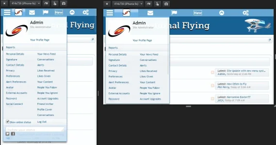
I have a side column menu that the user can choose to have through their preferences, the column on the left side or right of their screen. The drop down menus for Account, Conversations and Alerts pop downs are changed from their default XF position to the left or right of the trigger to accommodate the column width.
1.webp

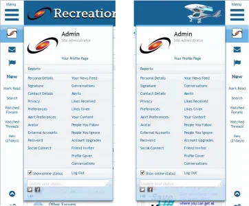
BUT on a mobile device you can have either a portrait view or landscape view. What I have is the menu bar is then changed from a column to a sticky row across the top. So I have to override the changes that I made in the positioning of the drop downs used for the column menu back to the default XF positioning so they drop down beneath their respective triggers instead of being in a fixed position. This is important as the mobile menu stretches across the top of the mobile device depending on whether it is in Portrait or Landscape view.
2.webp

For example my code is:

Code from the navigation_visitor_tab template...NOTE the $visitor.customFields.menu}', 'ac_right', 'ac_left' addition to the div class. Adjusting the #AccountMenu class to the variable determined by the user selecting an option in their preferences would not work so I had to add a class to make the placement of the AccountMenu drop down display based on the user choice
Code:
        <!-- account -->
        <li class="navTab account Popup PopupControl PopupClosed {xen:if $tabs.account.selected, 'selected'}">

            <xen:set var="$visitorHiddenUnread" value="{xen:calc '{$visitor.alerts_unread} + {$visitor.conversations_unread}'}" />
            <a href="{xen:link account}" class="navLink accountPopup NoPopupGadget" rel="Menu"><span><img src="{xen:helper avatar, $visitor, s}" alt="" /></span></a>

            <div class="Menu JsOnly {xen:if '{$visitor.customFields.menu}', 'ac_right', 'ac_left'}" id="AccountMenu">

Code:
<!-- Lots of general css code for large screen display is above this -->

<!-- set the placement of the drop down box for Account on non mobile column view screens -->
.ac_left {left: 72px !important; top: 75px !important;}
.ac_right {right: 72px !important; top: 75px !important; left:auto !important;}

<!-- run different css if using mobile -->
<xen:if is="@enableResponsive">
    @media (max-height:580px), (max-width:580px){

<!-- need to replace this code with code that will revert the above large screen column display
    of the account drop down box back to its XF default placement -->
        .ac_left, .ac_right {left: 10px !important; top: 32px !important;}
    }

    @media (min-height:740px), (min-width:740px){
        .mobile_sub_menu{display:none;}}
</xen:if>
 
Last edited:
Top Bottom