The WebMonsters' Network...

Mr. Goodie2Shoes

Well-known member
Its still under background development, BUT! nothing to worry about :D

The WebMonsters' Network
http://www.thewebmonsters.net
Because we are more than just Web Masters... :D

Its an all-new Web Masters' Network where people will talk about how to improve the Internet!

so... what do ya think? Any suggestion?
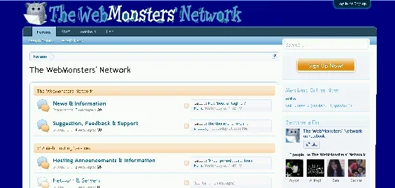
 
I think your topics are fine. But apart from the header logo (which is cool) the board in general looks too much like standard XF. Which looks good but doersn't look like YOU.
There have also been comments about visiting an XF generic board for admins or coders, from here, and getting confused because the boards look so similar.
You could change this quite simply by making the background much darker.

webmonsters.webp

Appearances/ Styles/ Style Property groups/

General/
Background (main content area, edges on each side)
. Click the colour to change it.
DO NOT OVERLOOK! Click "Update Style Properties" button at the bottom.
Refresh your forum page see if you like it.

Header and Navigation/ Header /
Background.. Click the colour to change it.
DO NOT OVERLOOK! Click "Update Style Properties" button at the bottom.
Refresh your forum page see if you like it.
 
You'll also need to colour in the O and the N in "Monsters" in your title.

Look on my mockup and you'll see that changing the background colour as I did, leaves the two letters in your logo with the old background colour.
Maybe that is because I was doing a mockup in Paint so it won't happen for you. Worth checking though.
If it does happen you'll need to colour in those areas inside the letters in an art editor.
You can match the colour by dipping (in Paint or Irfanview)
or in Style Properties click the background colour to open its control popup
the code for the colour is in a little box just under the big square that displays the colour.
 
okay... finally added an awesome theme:
ChirstmasSpecial.png


:D what do ya think?!? :D
 
Oh yes this is COOL.
Love the beautiful blue background and the bright red bits.

Couple of boring practical points - the border areas down the sides are very wide - hopefully this adjusts for smaller screens bso the actual forum content is not squashed in the middle.

The very pale pale grey background of the content area and the cat bars is silky elegant.
But not much contrast. Many users have poor setup on their screens so colours are not accurate. Also low contrast risks it not being obvious where the separations are. I'd consider just a tiny tiny bit more difference in there.

I like the way you use white silhouette in the lower part. Will look forward to your next seasonal.
 
Top Bottom