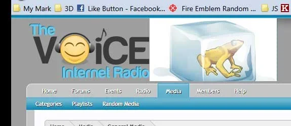
Since I've done some restructuring and have grown a bit since asking for help with my logo/skin before, I figure I'll start a general feedback thread here. And everyone else is doing it, sooo... 
The Voice Internet Radio is a forum for music news and discussion. First, there's an internet radio station that plays a mixture of genres (majority is pop/rock) and gives listeners several options to impact what we play, through requests on the forum and through Twitter, discussion of songs we play on the forum, and the ability to suggest new music to be added to the playlist. Details on what's playing and how to listen are fixed at the bottom of the forum (which I think will encourage forum browsers to tune in to the station as well--that's a new change from having it in the header). On the forum, there are several forums for music discussion, currently segmented by genre (I've thought about switching that up, so feedback is welcome there), a forum for posting personal charts of your favorite music, other music discussion (i.e. where to get free, legal music or our Face-Off section, used for Fan Favorite polls and other debates/opinions), and an off-topic forum, of course. In addition, I've made a few pages, such as our Monthly Picks playlist, that add more content to the site.
The site currently uses several add-ons, including XenMoods, XenMedio, XenAtendo, and TaigaChat. We're planning on another custom modification soon that will allow listeners to rate songs that are played on the station on popularity and freshness.
Also, if you have any questions, let me know--I'm working on a FAQ, but it hasn't been publicly posted yet, so if there's anything you'd like to know that I haven't already included, I can add that to the FAQ before I post it up.
Thanks for reading this overly-long post and for checking out the site! Feedback is obviously welcome and will be considered.
The Voice Internet Radio is a forum for music news and discussion. First, there's an internet radio station that plays a mixture of genres (majority is pop/rock) and gives listeners several options to impact what we play, through requests on the forum and through Twitter, discussion of songs we play on the forum, and the ability to suggest new music to be added to the playlist. Details on what's playing and how to listen are fixed at the bottom of the forum (which I think will encourage forum browsers to tune in to the station as well--that's a new change from having it in the header). On the forum, there are several forums for music discussion, currently segmented by genre (I've thought about switching that up, so feedback is welcome there), a forum for posting personal charts of your favorite music, other music discussion (i.e. where to get free, legal music or our Face-Off section, used for Fan Favorite polls and other debates/opinions), and an off-topic forum, of course. In addition, I've made a few pages, such as our Monthly Picks playlist, that add more content to the site.
The site currently uses several add-ons, including XenMoods, XenMedio, XenAtendo, and TaigaChat. We're planning on another custom modification soon that will allow listeners to rate songs that are played on the station on popularity and freshness.
Also, if you have any questions, let me know--I'm working on a FAQ, but it hasn't been publicly posted yet, so if there's anything you'd like to know that I haven't already included, I can add that to the FAQ before I post it up.
Thanks for reading this overly-long post and for checking out the site!
