XF 2.2 Text editor and attachment manager improvements

1596357822277.webp
Central to the experience of interacting with forum software is the interface through which visitors will create their content. This is usually done through the text editor and attachment manager, so keeping these systems fresh and inspiring is very important to us.

From the outset, XenForo has employed a rich text editor (RTE) to allow visitors to compose their messages in a what-you-see-is-what-you-get (WYSIWYG) interface, so that bold text is shown emboldened, large text is appropriately large etc., rather than working directly with the underlying BB code in order to take the guesswork out of message editing. We've always built a custom implementation on top of what we consider to be the best-in-class tools, and through the life of the XenForo we have already made major switches to completely new libraries twice, moving from TinyMCE to Redactor and then to Froala.

With XenForo 2.2, we have made another major change to our implementation. We continue to build upon Froala, but we have improved every aspect of our system.

We'd love you to read what we've put down here, but if you're pushed for time...

tl;dr

To view this content we will need your consent to set third party cookies.
For more detailed information, see our cookies page.
 
Not sure it needs the text at all. I mean, once you know where the button is it's not that hard to find again. Looks a bit odd as the only button the the toolbar with text and it's even got it's own tab to help it stand out.
 
The preview functionality doesn't seem that intuitive to me -- especially when unlabeled. It’s completely unlabeled on mobile. if I see and tap on the unlabeled button while typing -- it doesn't actually seem to do anything. It just changes the format a little with no obvious purpose.


It’s competent unlabeled on mobile.

Does it need to be? Chances are you're only going to be using it on mobile if you've used it before on desktop and know what it does. None of the other icons are labelled either.

I suppose you could have a little toast in mobile that pops in and fades out when you tap it letting you know that you're toggling between Preview mode on or off.
I mean, there are people who visit the site entirely on mobile.
 
True, but they also have to figure out what all the other non labelled icons do somehow.

Seems odd to make the preview button the only one in the toolbar the deserves a permanent label. Might be worth figuring out a way for mobile users to more easily understand what all the icons do.
 
but the other icons are wordprocessor recognizable and actually do something (generally) when u tap on them. Preview doesn't quite make sense without context.
 
Eh, I wouldn't say they're all recognizable. Especially if you're talking about a user that only uses mobile phones and doesn't do much if any desktop word processing.

Remove formatting probably doesn't mean much to someone with basic word internet skills that doesn't format text often, just types the text to interact.

Inline code and inline spoiler are not normal buttons or familiar icons to most people, and to figure out what they do on mobile it inserts extra bb code into your message without any explanation. At least with preview you can toggle it.

The same issue with the preview toggling applies to the bb code toggling, another button that probably does something that most users don't even know exists because they don't even know what bb code is. So if you're going to fix it for BB code toggling, a button without text, and try to make the editor more usable to mobile only users then perhaps that same fix will work for the preview icon without text.
 
Or just add a way to hide all the button for mobile users and shuffle the problem under the carpet. Boom, problem solved and you end up with a cleaaaaan editor :cool:
 
For mobiles I would hide all the icons under a folded toolbar above an editor with an "unfold" triangle; below - smilie & picture icons to the left and Post button to the right.
 
Just wanted to know if anyone can get this menu to appear in Android Chrome. For me it doesn't. Which means it is impossible to delete a table unless you go in the bbcode view and delete the code yourself. Thanks!
1594499083458.webp
 
Just wanted to know if anyone can get this menu to appear in Android Chrome. For me it doesn't. Which means it is impossible to delete a table unless you go in the bbcode view and delete the code yourself. Thanks!
nope. can't remove a table, can't remove quotation. when I hit that floating + icon it just disappearing.
Sony Xperia. Android5.1.1.
 
Just wanted to know if anyone can get this menu to appear in Android Chrome. For me it doesn't. Which means it is impossible to delete a table unless you go in the bbcode view and delete the code yourself. Thanks!
View attachment 230261

Same and I am using the Android build of MS Edge Chromium. However, I tried my own forum, which runs XF 2.1 and had the same result so I am not sure this is new to 2.2.
 
Just wanted to know if anyone can get this menu to appear in Android Chrome. For me it doesn't. Which means it is impossible to delete a table unless you go in the bbcode view and delete the code yourself. Thanks!
View attachment 230261
I had opened a bug report about it last year, there is no action taken to the bug report yet so there still might be chances of changing it. This behavior is since XF 2.1 table bb code addition. I guess it is Froala's behavior as it doesn't seem to work on their own demo editor setup as well.

Bug report link:
 
Last edited:
Editor updates are periodically implemented.

XF2.2 is feature locked at this time so any updates will likely be introduced in a later version, unless there is time in the alpha/beta process to make changes.
 
I must apologize to Chris for my previous comments towards the latest Text Editor, though its main design was done by Froala team.

It really doesn't look that terrible in my theme.
Maybe it is just my upset seeing its border radius (4px) is different than XenForo default block-container border radius (3px).
However, in my theme, block containers have no border radius. The editor itself needs a little bit border radius to reduce visual fatigue.

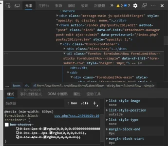
P.S.: A bug in my theme: looks like formSubmitRow gets redundant box-shadow applied. Will fix it in the future.

1596622368231.png
 

Attachments

  • 1596623000753.webp
    1596623000753.webp
    108.1 KB · Views: 37
I found that setting the border radius of the editor to 3px really improves the overall visual concord:
(2px is also acceptable.)

1596623301212.png
 
Last edited:

In conclusion

Implementing all these changes has been a fairly major undertaking, and those who watch the accompanying video with eagle eyes will no doubt spot a smattering of outstanding glitches, but we're pleased with how it's coming together and have confidence that any little gotchas will be squished by the public beta release.

We hope you like the changes and improvements we've made, which we believe will enormously improve everyone's enjoyment of authoring content for XenForo. Do let us know what you think 👇🏻
My group of misfits are of the “less is more” crowd. It more about turning off stuff we don’t use. The current Lightbox as example has that really hard to get rid of thumbnail selector then we have have the photo details jump up with every mouse or movement. Please let us turn that stuff off.
 
Top Bottom