Sved Co: A Minecraft Server

SvedCo

Member
Hi all.

I've recently transferred my website over completely from the brittle WordPress/phpBB setup I had going to XenForo. It seems to be a lot more interactive with our players now.

http://sved.co

What do you think? I'm not 100% finished with the style yet. We're looking for some new icons and a logo.

I also need to figure out how to place the image div on the left underneath the portal blocks (for small resolutions), or simply make it stay off the screen for smaller resolutions.
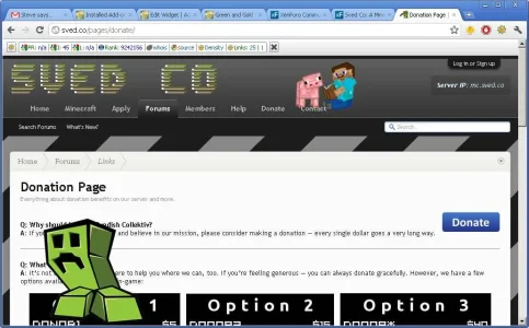
 
Looks really nice, I'd consider adding that green dude in the bottom left to your background image though - it looks kinda strange when scrolling through the forum list as it shows in the gaps between forums, and often covers up content on smaller screen sizes.
sved.webp

Also, the 'Apply' and 'Minecraft' links lead to an error page (as does the link in your above post).
 
Looks really nice, I'd consider adding that green dude in the bottom left to your background image though - it looks kinda strange when scrolling through the forum list as it shows in the gaps between forums, and often covers up content on smaller screen sizes.
View attachment 23000

Also, the 'Apply' and 'Minecraft' links lead to an error page (as does the link in your above post).
Oops, that was the image div I was talking about. I couldn't get it below the other content, even when toying with the z-index property of each div.

I didn't want to add it into the background image as the current one is just a small tile repeated - makes it take a short period to load a large bg image on my shared hosting (which has been terrible recently).

What was the error you got? "An unexpected database error has occurred."? I think that's a problem on my hosts end, but I haven't actually had much time to look into it yet. The pages have been working OK for me. Thanks for the reply. (y)
 
Those links all work from home, didn't at work today. I'll have another look tomorrow and see if I can work out why
 
Bacon? I think I just got trolled lol http://sved.co/bacon/

I like everything except the actual website background. too high contrast and the slanted black stripes takes my attention away from the content. Everything else is excellent! (y)
 
Looks great! How did you get your Minecraft Server stats into a Xenporta block?

Here's mine http://redstonerangers.com
The status block is mainly temporary, it's setup to grab the server info from the Minequery plugin and (using PHP) display it on a separate page. I've then simply used an iframe to implement that page inside the block.

I'm planning to develop the code into a proper XenForo block in the near future, and also making it customisable for other Minecraft server owners to input their IP/Port and display their own stats in an easy way. Stay tuned for that.

Bacon? I think I just got trolled lol http://sved.co/bacon/

I like everything except the actual website background. too high contrast and the slanted black stripes takes my attention away from the content. Everything else is excellent! (y)

That background X_X other than that looks good, well done.
Cheers for the suggestions regarding the background - I've changed it to something else now after getting a few suggestions about it and think it looks a lot better. What do you guys think of the current header colours? Be honest!

:)
 
Cheers for the suggestions regarding the background - I've changed it to something else now after getting a few suggestions about it and think it looks a lot better. What do you guys think of the current header colours? Be honest!

:)
Alot better (y)
 
Looks great.

Nitpicking .........
I thought the portal and the forum looked like different software packages and I think it was the inconsistent CSS. If you change the colour of the blue backgrounds of the titles to the grey you use in the portal ... I think it would be more consistent.

http://sved.co/pages/links/
-how about some icons to go with the text ?​

http://sved.co/pages/contact/
- sparse !​

http://sved.co/pages/donate/
- questions should be a larger font ? (easier to scan quickly?)
- either that or indent the entire A: Answer ?​

On any of your "Links" pages, forinstance - http://sved.co/pages/donate/
When I click on Links in the left sidebar ... I am directed to:​
I didn't like this ... to me it "breaks" using Pages as Tabs.​
Can this link - http://sved.co/forum/#links.19 be removed from the word Links ?​
 
Looks great.

Nitpicking .........
1. I thought the portal and the forum looked like different software packages and I think it was the inconsistent CSS. If you change the colour of the blue backgrounds of the titles to the grey you use in the portal ... I think it would be more consistent.

2. http://sved.co/pages/links/
-how about some icons to go with the text ?​

3. http://sved.co/pages/contact/
- sparse !​

4. http://sved.co/pages/donate/
- questions should be a larger font ? (easier to scan quickly?)​
- either that or indent the entire A: Answer ?​

5. On any of your "Links" pages, forinstance - http://sved.co/pages/donate/
When I click on Links in the left sidebar ... I am directed to:​
I didn't like this ... to me it "breaks" using Pages as Tabs.​
Can this link - http://sved.co/forum/#links.19 be removed from the word Links ?​
I numbered your suggestions for ease of follow up.

#1, 4, and 5 done - thanks for the nitpicking, I actually do appreciate that.
#2 will have to be done when I have access to my laptop and FTP (living on base at the moment, don't have a lot of my personal belongings)
#3 - I agree that it seems sparse. Any ideas what I could do there to make it have a better look and feel?

I suppose I could merge the 'Contact' and 'Links (external links)' pages and have two separate sections for contacting admins / supporting us on other websites. I've got a few more external links to add there as well when I find the time.
 
Top Bottom