Lack of interest [Suggestion] Better location for administrative tasks

This suggestion has been closed automatically because it did not receive enough votes over an extended period of time. If you wish to see this, please search for an open suggestion and, if you don't find any, post a new one.

Floren

Well-known member
Based on the Mike's post, I was wondering if is possible to have the admin/mod tools moved into existing toolbar. The main reason I want it relocated is because many users will customize the current Xen style. Since the toolbar contains intricate JS, less we play with it, the better it is. Plus, I think it will look sharper if we keep together all red alerts. First thing we all do when a page loads is to check the upper right area for any "redness". Then, why not keep it all together?

Regarding the additional space used, we can shorten easy the description of each event.
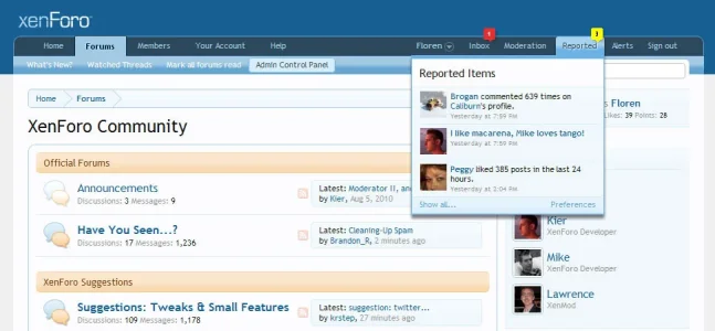
Current design:

report-moderator-bar-png.984


Improved design:

4905204252_16c6ea57a1_o.jpg


In case someone wonders how I managed to create the screenshot, I simply edited the HTML nodes, in Google Chrome.
 
Upvote 5
This suggestion has been closed. Votes are no longer accepted.
I was thinking that as well, because of how we're use to the alerts, putting everything around that area would be easier in my opinion.

Though maybe moderation and reported items could be contained in a single dropdown. 
 
The only issue I have with moving it below the navigation is that I already pay attention to alerts/inbox; seems logical that adding something that'll have similar functionality would go there.
 
I strongly disagree with moving them to the visitor area - when I load a page I see two areas of red, one is for me personally and can be disregarded, while the other is urgent and should not be ignored.

Putting them together destroys this principle of being aware of something without having to go looking for it.
 
I strongly disagree with moving them to the visitor area - when I load a page I see two areas of red, one is for me personally and can be disregarded, while the other is urgent and should not be ignored.

Putting them together destroys this principle of being aware of something without having to go looking for it..
That is an very good point your making there.
 
Putting them together destroys this principle of being aware of something without having to go looking for it.
Based onto web ergonomics experience I have, I believe the new design is user/mod/admin friendly.
There is no way in the world I would miss the little reg flags at the top. Not to mention that I can see right away the most urgent reported posts, into dropdown. Again, this is based on personal experience.
 
I strongly disagree with moving them to the visitor area - when I load a page I see two areas of red, one is for me personally and can be disregarded, while the other is urgent and should not be ignored.

Putting them together destroys this principle of being aware of something without having to go looking for it.
The alerts don't have to both be "red".
 
The alerts don't have to both be "red".
Red is most commonly used for alerts, and will draw your attention more then other colors.

I see what Kier is saying, but at least with myself, I check all of my alerts/inbox consistently. I also push for my moderators to be responsive to members if they're contacted privately, so we don't alienate our users.
 
It's precisely because of ergonomics and visual psychology that the indicators are placed where they are - reported posts and the moderation queue indicators serve a completely different purpose from the personal indicators in the navigation bar, in my opinion.

Of course, you're welcome to change the template yourself.
 
I see what Kier is saying, but at least with myself, I check all of my alerts/inbox consistently.
You may find that when you experience XenForo as board staff rather than a visitor, you will be constantly bombarded with inbox and alert notifications, and it's important to have a differentiation between them and indicators from the moderation bar.
 
I don't have a problem with the current location. I just don't buy the paradigm that alerts have to always be red.

4905204252_16c6ea57a1_o-jpg.1050


Tell me that when you focus on the middle of this image, you are not seeing red and yellow popping out at you in your peripheral vision.
 

Attachments

  • 4905204252_16c6ea57a1_o.webp
    4905204252_16c6ea57a1_o.webp
    46.3 KB · Views: 147
It's precisely because of ergonomics and visual psychology that the indicators are placed where they are - reported posts and the moderation queue indicators serve a completely different purpose from the personal indicators in the navigation bar, in my opinion.

Of course, you're welcome to change the template yourself.

Please keep it as it is.
It is just perfect !
 
you really want to debate about colors now ? Are you kidding ?
you can always adjust your own install to your likings.
I think you missed the point. It is not about what color the XenForo alert is but the idea that all alerts have to be red to be noticed.
 
Top Bottom