Fixed style issue

erich37

Well-known member
I have changed the body-background-color to "white" and the color of the inner content to pink.
Fixed-width-style.

I also checked this with the "XF default"-style and also here at Xenforo.com, I do see the same issue here.
So this issue seems to be a small XF-design-bug.


Code:
#content .pageContent {
    background-color: #FCD7E2;
    padding: 10px 20px;
}

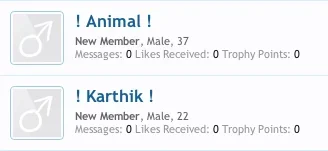
However, at "Registered Members"-page, this is showing fine.
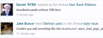
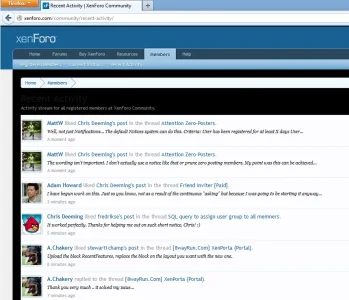
But at "Members / Recent Activities" it is showing strange. Seems like a padding or something is missing at the left-side.

I have check via FireBug, but can not figure it out.


Appreciate your help!
 
You have a link? My guess is that the right part there is transparent, and it is inheriting the color from one of the parents. You will have to check the parents one by one to figure out where it is coming from.,
 
this issue can also be seen here at Xenforo.com

just go to this page:
http://xenforo.com/community/recent-activity/


then change the background-color CSS (via Firebug) for example to black-color:

Code:
#content .pageContent {
    background-color: #000000;
    padding: 10px 20px;
}


You will see that there is a "padding" at the left-side of the Avatar or something else missing.

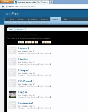
However, at "Registered Members", it is showing fine:
http://xenforo.com/community/members/


xfdefault-recent-activity.webp


xfdefault-registered-members.webp
 
#content .pageWidth is the one you are looking for.


not sure what to change in order to fix this?
As the CSS you have mentioned is the same for both "Recent Activity" and "Registered Members", however those 2 pages show differently....

Code:
#content .pageWidth {
    background-color: #FCFCFF;
}
.pageWidth {
    margin: 0 auto;
    width: 990px;
}
 
Well, they use different parents. The recent activity use newsFeed and members use primaryContent. I am not sure what you are after here, you just need to find what parent you need to change. primaryContent has a 10px padding all around, newsFeed does not.
 
oh, I just want to have the same padding for "Recent Activity" as there is for "Registered Members".

Do you know what is the CSS for the "newsFeed" or what kind of CSS I need to add to template "extra.css" in order to achieve this?


Many thanks!
 
oh, I just want to have the same padding for "Recent Activity" as there is for "Registered Members".

Do you know what is the CSS for the "newsFeed" or what kind of CSS I need to add to template "extra.css" in order to achieve this?


Many thanks!

Couldn't you add something like this in extra.css?

Code:
.news_feed_page_global .eventList .avatar .img {
margin-left: 10px;
}
.news_feed_page_global .event .content {
    margin-left: 75px;
}
 
Couldn't you add something like this in extra.css?

Code:
.news_feed_page_global .eventList .avatar .img {
margin-left: 10px;
}
.news_feed_page_global .event .content {
    margin-left: 75px;
}


you are genious :love: .... that did the trick (y)


what is the "margin-left: 75px;" actually doing ? Is this already included in the default style ?
I understand that the 10px is what has been missing, but I do not understand how you come up with the 75px stuff ?
 
you are genious :love: .... that did the trick (y)


what is the "margin-left: 75px;" actually doing ? Is this already included in the default style ?
I understand that the 10px is what has been missing, but I do not understand how you come up with the 75px stuff ?

You're welcome,

To compensate for the additional 10px margin to the left hand side of the avatar. It was originally 65px and had to be adjusted by 10px otherwise the text would sit flush on the right hand side of the avatar.
 
you are genious :love: .... that did the trick (y)


what is the "margin-left: 75px;" actually doing ? Is this already included in the default style ?
I understand that the 10px is what has been missing, but I do not understand how you come up with the 75px stuff ?

Actually, try removing the code i gave you and just insert the following in extra

Code:
.news_feed_page_global .eventList .avatar .img {
margin: 0 10px;
}
 
Actually, try removing the code i gave you and just insert the following in extra

Code:
.news_feed_page_global .eventList .avatar .img {
margin: 0 10px;
}

nope.
This is moving the "Date" at the "Recent Activity" strangely too much to the left, meaning in some cases the "Date" is totally attached to the Avatar-image. There is no space between "Date" and "Avatar-image", although the date is underneath the Avatar....

The code you provided initially (first) is working fine. :)
 
nope.
This is moving the "Date" at the "Recent Activity" strangely too much to the left, meaning in some cases the "Date" is totally attached to the Avatar-image. There is no space between "Date" and "Avatar-image", althogh the date is underneath the Avatar....

The code you provided initially (first) is working fine. :)

Ah okay. yeah I just tried the code and it does slightly shift to the left. :D
 
Hmm. This could be considered a consistency problem:

Recent Activity
Screen shot 2013-01-13 at 2.00.59 PM.webp

Members
Screen shot 2013-01-13 at 2.01.47 PM.webp

You can see one has 10px padding all around, whereas the other removes that padding from the left side.

It's apparently intentional:

events.css

Code:
.event,
.event.forceBorder:first-child
{
	overflow: hidden; zoom: 1;
	padding-left: 0;
	padding-right: 0;
}

The list items for recent activity explicitly remove the normal 10px primaryContent padding on the left and right.

I will mark this confirmed. The devs will decide.
 
The list items for recent activity explicitly remove the normal 10px primaryContent padding on the left and right.

I will mark this confirmed. The devs will decide.
I wouldn't call it a bug as long as it is intentionally overwritten that way. The easiest way to add the same look, is to just add a 10px padding to the ol tag:
Code:
.news_feed_page_global .eventList {
  padding: 0 10px;
}

That way you won't have to use !important to override the default padding.
 
Top Bottom