Lack of interest Status Message Box at top of Personal Details is confusing

This suggestion has been closed automatically because it did not receive enough votes over an extended period of time. If you wish to see this, please search for an open suggestion and, if you don't find any, post a new one.

erich37

Well-known member
usually the first thing a new user is doing is to fill in his data at the "Personal Account" page at
http://www.domain.com/account/

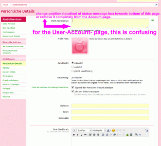
Unfortunately, the first thing the user is seeing at this page is the "Status Message"-box.
This gives the user the impression of the need of posting a "Status Message" and he totally forgets about the existance of the Forum-component.

I have seen this a lot with users who are not used to Forums, but merely used to FB only. They just write a status message and maybe also write something into the "About You"-box, but they do not write anything into the Forum itself.

Could you please position the "Status Message" box at the very bottom of the "Personal Account"-page and also position the "About You"-box at the very top of this page?


I strongly feel that this simple change would be more intuitive for the user.

Many thanks!
 
Upvote 1
This suggestion has been closed. Votes are no longer accepted.
The Status update area already has premium placement in the User's dropdown menu. I would think that 95%+ people will use the premium location to update their status.

Moving the About You to the top would likely just be a small style change ?
 
looking back to my initial message about a year ago, I have revisited this issue as it just came to my mind again when checking this at my own Forum:

I have submitted this as a Suggestion, but most probably this does not get considered by the devs, so maybe somebody knows of a template-edit or workaround in order for me to get rid of the "Status-Message-Box" at the "Account-page".
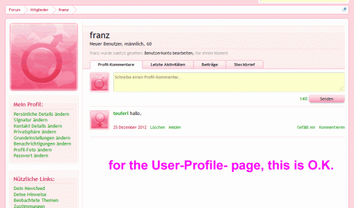
I do NOT want to remove the "Status-Message-Box" from the "User-Profile-page".


The very first page a totally new user who is registering at a XF-forum will view is the "Account-page" (if I am not mistaken).

So the user who is not familiar with Forum will think he needs to enter some text into the "Status-Message-Box", as this is the first thing he will recognize.
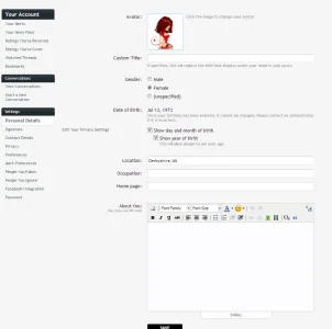
I would suggest to either re-locate the "Status-Message-Box" from top towards the very bottom at the "Account-page".
Or alternatively completely remove the "Status-Message-Box" from the "Account-page".

account-page.gif


The "Status-Message-Box" is anyway located at the "User-Profile-page", which is perfectly fine.

profile-page.gif
 
Open the account_personal_details template

Find:-

Code:
    <xen:hook name="account_personal_details_status">
    <xen:if is="{$canUpdateStatus}">
        <dl class="ctrlUnit">
            <dt><label for="ctrl_status">{xen:phrase status_message}:</label></dt>
            <dd>
                <textarea name="status" rows="2" cols="60" id="ctrl_status" autofocus="autofocus" class="textCtrl StatusEditor Elastic OptOut" data-statusEditorCounter="#statusEditorCounter"></textarea>
                <span id="statusEditorCounter" title="{xen:phrase characters_remaining}"></span>
                <div class="explain"><h3 class="statusHeader">{xen:phrase current_status}:</h3> <span class="CurrentStatus"><xen:if is="{$visitor.status}">{xen:string censor, $visitor.status}<xen:else />({xen:phrase none})</xen:if></span><!--TODO: clearing--></div>
            </dd>
        </dl>
    </xen:if>
    </xen:hook>

And remove it.

Leaving you with:-
statusremoved.webp
 
Top Bottom