nikkiradloff
Active member
Hi everyone! I've never formally posted here but very nice to meet you all 
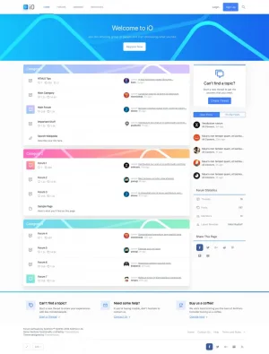
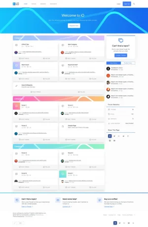
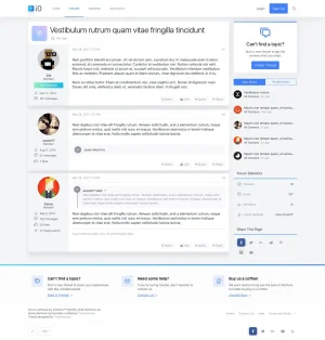
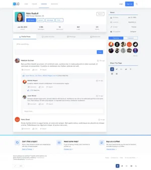
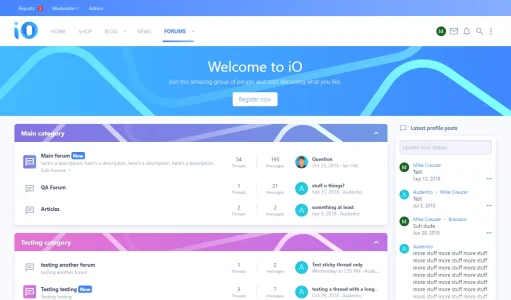
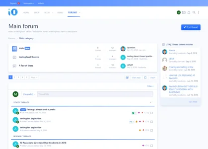
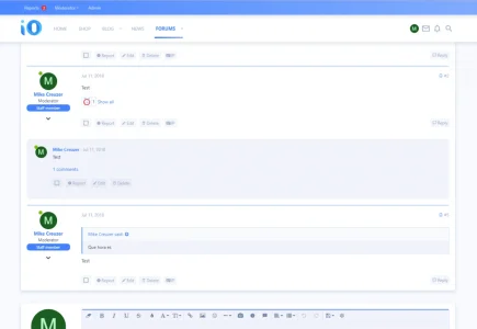
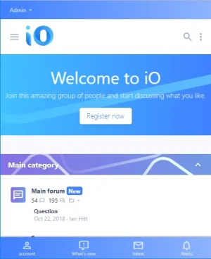
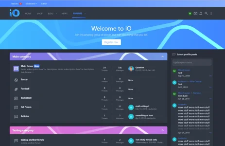
As our team continues to focus on XenForo 2 with UI.X 2, we're already looking to the future by building out our product line. Introducing iO, a modern theme that embraces white space, soft gradients and clean typography. Following the Interface Guidelines that Apple has set out, iO strives to be both sleek and playful.
With that aside, on to the exciting part!

