Sin Studios - A server development forum!

Status
Not open for further replies.

The Cyst

New member

Good morning, afternoon or evening - depending on where you are in the world!
My name is three (or The Cyst - long story lol) and I wanted to introduce Sin Studios. I have developed Sin Studios for my own personal gains. I want to develop my skills in server development, in every sense - I want to be a developer but also a system administrator. I am neither at this moment in time which is OK because I will learn. I am very proud of how far Sin Studios has come because I have done this by myself, with vary minimal help.

That's right! I am my own server administrator for the first time, how exciting! Who knew how much went on in the background? HAHA.

I just wanted to share my creation with everyone, the forums are hardly populated but they will be. I will be learning and then posting tutorials on what I have learnt to educate others in my shoes.

Eventually, I would love to be able to offer server plugins and hosting for games - that is a long time away but something I want to focus on in the future future. I have amazing plans for Sin Studios and wish people come along with me for the journey.

I have attempted to keep the forum bare in terms of categories and nodes, the main forum idea is around server development and that's the reason behind the forum being quite low on nodes.

If you have any suggestions, please let me know! I am very open to ideas and criticism.


Thank you.

three
 
Last edited:
I like it. Though I'd recommend taking out some sidebar widget so there isn't much of a space/gap at the bottom, below the node list. Perhaps, could put something there?
 
Looking good bro. Good luck in this adventure! It’s always a learning process. :)
Thank you my friend. It certainly is! I'm having a blast learning though, something I've always wanted to do.
I like it. Though I'd recommend taking out some sidebar widget so there isn't much of a space/gap at the bottom, below the node list. Perhaps, could put something there?
Big love, JoyFreak - big fan of your work!

That's some very good advice, I have taken that onboard and actioned it - I am happy with how it looks after removing some widgets. The empty space was definitely unnecessary so thank you.
 
Consider removing the Latest posts widget from the sidebar and adding it above the node list. That way you'll get rid of the empty space entirely.

Also, I would remove the Latest posts from the footer. It makes the footer very large with a lot of empty space again. Well, it depends on how you like it. I like it more compact.

One last thing, I would definitely make the navigation bar narrower. Or make it narrower at least on the thread view.

The colours are nice, interesting logo. I wish you all the best with your forum.
Hey BassMan, thanks for taking the time to check out the forum and also provided such a detailed reply.

Firstly, I removed the latest profile posts from the sidebar to eliminate the dead space that it was causing. Originally, the theme did contain the latest posts above the node but I removed it - this may be something I bring back depending on how things go.

I have taken your advice in regards to the footer and agree. For now, I have disabled the extra footer to allow for much more compactness as I do like things being compact too. Once I get the time to address the contents of the footer, I will bring it back with a much sleeker design.

You're completely right about the navigation bar! I couldn't agree more. I have made the relevant changes so it's a reasonable length throughout. Thank you.

Thanks for your feedback, I appreciate it! Let me know what you think of the changes and if there's anything else I can do :D
 
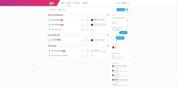
My only suggestion is to add a little colour to the site as it's got a lot of wide-open white space which can make the site look garish. This is what it looks like on a 27-inch 4K monitor: I would also agree with @BassMan to move the latest posts above the forum, this way they will be focussed on the visitor when they arrive at the site. Other than those few niggles it looks an interesting site - good luck!

1685452509975.webp
 
Navigation is better now. You could still leave the extra footer, just not with the Latest posts in it.

I still don't like that empty space below the forum list.
 

Thank you for your feedback, this has been disabled. :D


My only suggestion is to add a little colour to the site as it's got a lot of wide-open white space which can make the site look garish. This is what it looks like on a 27-inch 4K monitor: I would also agree with @BassMan to move the latest posts above the forum, this way they will be focussed on the visitor when they arrive at the site. Other than those few niggles it looks an interesting site - good luck!

View attachment 286598
Hi Davyc, thanks for your feedback! I completely understand where you're coming from and also, I didn't realise how it looked from a guest POV - thank you for providing the image. I have actioned this as per recommendations from yourself and Bassman. I have removed the latest posts from the sidebar and added them at the top of the nodes.

You are right, there is a lot of white space. I will visit the drawing board in relation to how I can improve this. Thank you. :D

Navigation is better now. You could still leave the extra footer, just not with the Latest posts in it.

I still don't like that empty space below the forum list.
You are right, I didn't realise how much space was there when you were unregistered. This has been changed now. Let me know your thoughts :D
 
Much better! Maybe rather use the Standard style for the Latest posts widget (edit the widget and you'll find the option there).
 
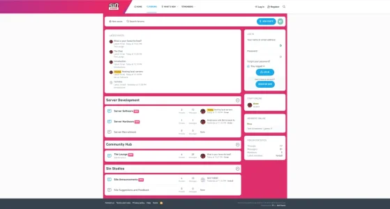
Here's a mock-up of what it could be like using your header color and few tweaks that could go into your extra.less file. It may give you a few ideas. PS this is a live shot after tweaking using the browser console :)
1685453373496.png
 
Much better! Maybe rather use the Standard style for the Latest posts widget (edit the widget and you'll find the option there).
That is some great advice, I have just changed it and agree - much better :D
Always check your forum as a guest. That way, users will see it for the first time.
Most definitely! It makes so much sense and is so important. My lesson has just be learnt :D
Here's a mock-up of what it could be like using your header color and few tweaks that could go into your extra.less file. It may give you a few ideas. PS this is a live shot after tweaking using the browser console :)
View attachment 286602
Thanks for the idea, Davy! I do like that. Could have a nice image in the background which covers the rest of the white space...
 
After some fantastic feedback, I have made some major changes to the design and layout of the theme!

Please let me know your thoughts of the new layout and how I can improve. Thank you.
 
Status
Not open for further replies.
Back
Top Bottom