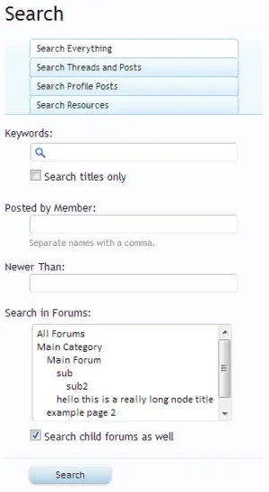
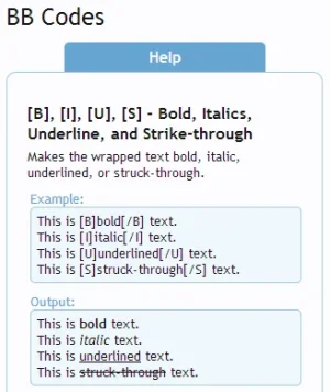
In order to better support smaller-screen devices such as mobile phones and tablets, XenForo 1.2 will be introducing a responsive version of the default design.
What is responsive design? At the simplest level, it allows you to specify CSS that applies only if the screen width is below a certain level. This allows the design to be significantly altered to fit smaller screens. For example, tabular or horizontally-focused designs don't work well when you only have a screen that's 320px wide (an iPhone).
So, what options will XenForo provide?

Here you can see that we provide 3 "inflection points". In general, they correspond to particular classes of devices.
For add-on developers, many of your pages will automatically support the responsive design well. It really depends how much "default" CSS you are using. If you are creating multi-column layouts (such as some resource manager pages), you will need to write custom responsive versions. However, if you're just using standard systems like tabs and forms, you will automatically inherit the responsive changes.
The extent of changes on a page will really vary based on the width of a device. For example, "wide devices" (601-800px by default) will see mostly similar pages, but things like sidebars will be moved if needed.
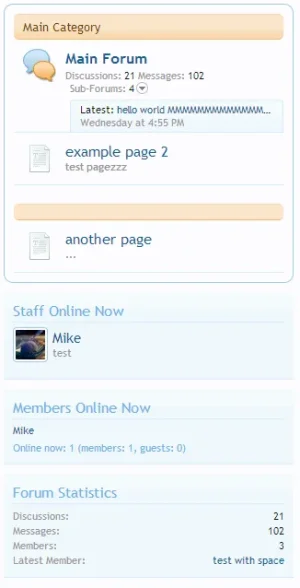
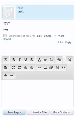
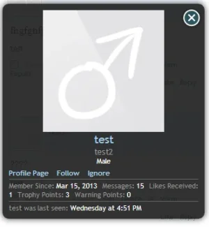
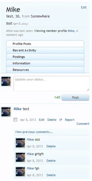
But this is really more about screenshots. For ease of my job, I'm taking these screenshots in Chrome on a desktop machine. As always, this is a work in progress and things are still subject to change.

This part does deserve special mention as it's very dynamic now. The short of it is that if there's not enough space to fit things (at any resolution), navigation/search options will be hidden as necessary and shown behind menus. User alerts/unread conversation counts will be folded into your user menu. If there is a selected navigation tab, it will always be shown as well.
These screens are all taken at the "narrow" level to show you the full extent of the possible changes.


What is responsive design? At the simplest level, it allows you to specify CSS that applies only if the screen width is below a certain level. This allows the design to be significantly altered to fit smaller screens. For example, tabular or horizontally-focused designs don't work well when you only have a screen that's 320px wide (an iPhone).
So, what options will XenForo provide?
Here you can see that we provide 3 "inflection points". In general, they correspond to particular classes of devices.
- Narrow (max width: 480px): phones vertical, some phones horizontal
- Medium (max width: 600px): some phones horizontal, 7" tablets vertical
- Wide (max width: 800px): 7" tablets horizontal, 10" tablets vertical
For add-on developers, many of your pages will automatically support the responsive design well. It really depends how much "default" CSS you are using. If you are creating multi-column layouts (such as some resource manager pages), you will need to write custom responsive versions. However, if you're just using standard systems like tabs and forms, you will automatically inherit the responsive changes.
The extent of changes on a page will really vary based on the width of a device. For example, "wide devices" (601-800px by default) will see mostly similar pages, but things like sidebars will be moved if needed.
But this is really more about screenshots. For ease of my job, I'm taking these screenshots in Chrome on a desktop machine.
This part does deserve special mention as it's very dynamic now. The short of it is that if there's not enough space to fit things (at any resolution), navigation/search options will be hidden as necessary and shown behind menus. User alerts/unread conversation counts will be folded into your user menu. If there is a selected navigation tab, it will always be shown as well.
These screens are all taken at the "narrow" level to show you the full extent of the possible changes.
