You are using an out of date browser. It may not display this or other websites correctly.
You should upgrade or use an alternative browser.
You should upgrade or use an alternative browser.
Responsive Design for XenForo 1.1 [Paid] [Deleted]
- Thread starter Arty
- Start date
One of my mods just brought it to my attention that they cannot login but only "register". It only ask for their "username". And when they press the 'Log In/Register' button after they enter their username it doesnt do anything but hide the 'Log In/Register' fields. So they press "Go" on the iphone keyboard to proceed to the next screen, which brings them to the Registration page.
Add this to responsive_extra.cssCode:#loginBar form { height: auto !important; }
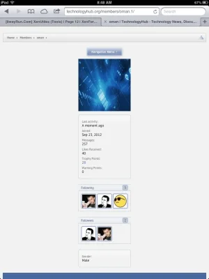
Thank you for fixing this for me. Works great now. But my breadcrumbs are still inactive. Can't even click it, seems like the Navigation Menu is causing the breadcrumbs to not work?
This is exactly how my responsive_extra.css look like:
PHP:
.xenOverlay.attachmentUploader { width: 290px !important; }
#Notices { display: block !important; }
#header_bar .itemLabel { padding-top: 5px; }
.breadBoxTop, .breadBoxBottom { margin-left: 0 !important; margin-right: 0 !important; padding-left: 0 !important; padding-right: 0 !important; }
.navTab.selected div.navLink a.navDivLink { color: #56575A !important; text-shadow: none; height: auto; background-image: none; }
#loginBar form { height: auto !important; }#logo { height: 30px; line-height: 30px; padding-top: 15px; }
OMG!!!!! Success!!! You are the man!!! Thank you so much for the support!! Everything works great now!
WYSIWYG editor is not shown on mobile devices, so its not a problem. You can only see it when faking small window in normal browser.
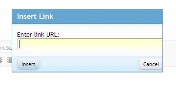
Was this in reply to my insert link popup problem? Because this is happening on desktop devices at full screen, even on your demo site.
Has anyone used this with Whisper 2 style?
http://xenforo.com/community/resources/whisper-2.53/
http://xenforo.com/community/resources/whisper-2.53/
Thanks for explaining, I misunderstood problem. Try adding this to editor_dialog.css:Was this in reply to my insert link popup problem? Because this is happening on desktop devices at full screen, even on your demo site.
Code:
html.editorPopup,
.editorPopup body
{
    min-width: 0 !important;
}Add-on doesn't change behavior of attachments. To convert to lower resolution click button to add images as thumbnails to post after uploading images.What do they have their maximum attachment file size set as? I have some iphone users that are trying to upload pics but its saying the file size is too large. Is it possible to convert these to a lower resolution upon upload?
Add-ons that don't change html and css should all work fine. This add-on has built in support for: xenPorta, xenAtendo, FooterPie, sfDirectory, User Albums.Also, is there a list of addons that are compatible? For example: XenPorta or Notifications Add-on?
Tested it, works fine.Has anyone used this with Whisper 2 style?
http://xenforo.com/community/resources/whisper-2.53/
Thanks for explaining, I misunderstood problem. Try adding this to editor_dialog.css:
Thanks, that did the trick!
Adam Howard
Well-known member
Thought it worth mentioning that this add-on does not have a conflict with "Better Blogs" ..... It works ! ! 
So I'm wondering what is the difference as to why "Responsive Design" (this add-on) works, but the style "Soft Responsive" doesn't. They basically do the same thing and although I'm new to both... I believe they do it the same way.
So what's changed......? !?
(Just thinking out loud. Maybe someone will catch what I missed)
Style works differently. Add-on messes with margin/padding for header block + absolute positioning of some elements in order to show menu, which is far from optimal. Style swaps header and content blocks, so content flow is natural and there is no need to use css tricks. Unfortunately same can't be done with add-on because header code is different for different styles, so it would cause a lot of conflicts with third party styles.Thought it worth mentioning that this add-on does not have a conflict with "Better Blogs" ..... It works ! !
So I'm wondering what is the difference as to why "Responsive Design" (this add-on) works, but the style "Soft Responsive" doesn't. They basically do the same thing and although I'm new to both... I believe they do it the same way.
So what's changed......? !?
(Just thinking out loud. Maybe someone will catch what I missed)
Similar threads
- Replies
- 5
- Views
- 557
- Replies
- 15
- Views
- 4K

