TheBigK
Well-known member
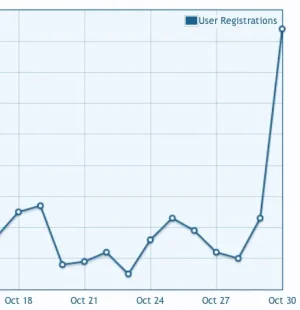
Last year, I did an experiment on our forum to see if there's any change in the registration rate on our site by displaying 'introduction' message at various places on our website. The results were surprising. Here's what I did -
1. I put a 'notice' that described what the site is about in just one or two lines. The noticed looked like a typical xenforo notice; but I used the ad_above_content template to display it.
2. I displayed a 300x250 rectangle with the same introduction message and below it, the 'Join Now & Facebook Connect buttons' in the ad_above_content. The header now displayed an ad on the left, and my welcome box on the right.
3. I removed the site welcome message altogether. Kept the default XF settings.
My Observations -
Let the default registration rate is X / day (average) (case #3 above).
The results for above three experiments were as follows -
1. Registration rate improved by about 1.3x.
2. Registration rate improved by about 4x.
The test was conducted for over a period of 15 days each.
Conclusion:
An upfront introduction message with quick action buttons (below the message) improved the registration rate by 4x! Note that we continuously monitored for the spam registration throughout the experiment.
I'm surprised how a simple change affects the registration rate so much. Since then, we switched to the 'sidebar' on all pages and now display the signup / fb connect buttons at the top of sidebar and the registration rate is the same with what we'd get with default XF layout (and no introduction message).
Things To Try :
I plan to try offering a pop-up (a-la Facebook) that asks users to join the site. I'm sure that's going to shoot our registration rate beyond 4x.
Side Note: The overall activity, posting rate and conversations were all time high when more users registered on the site.
Would love to hear your thoughts / experiments with user registrations.
