ReaderSociety

Lisa

Well-known member
Okay, we've finally gotten this site to the point where we're happy to share the link to it.

ReaderSociety is, obviously, a forum for book lovers. It came about when a group of people decided that the existing book forums around just weren't doing it for them - for whatever reason (trust me, there were many!) - and so we (@Dakis and I) decided to pick up the challenge and build the type of book forum we wanted.

We finally opened the doors on the 1st July and have to say that we're doing pretty well so far with, at the time of writing, almost 700 posts :)

There is still a bit of tweaking to do on the styles and we have a few addons in the works, but for now, if you're a reader or a writer, we'd like to invite you aboard :)

ReaderSociety
 
What differs you from the rest? What were the rest not doing that you guys thought you could bring to the table?
Attitude, mostly ;) As i said, we built the type of book forum we wanted - as in the group of people who were talking about not enjoying the existing forums. So what we bring to the table is what we wanted to bring to the table... a place that suits us :p
 
It's also the first project I start that is not 100% ready upon its launch, and it's an interesting experiment, getting initial feedback and opinions from the first members as to what they like and what they don't.

We surely have a long road ahead of us but we're up to a pretty good start, closing to 1000 posts after 1 week of existence :)
 
Two great admins coming together to craft a new community. Bound to be a success. Good luck guys.

EDIT: Not sure if deliberate, but Quotations page is not available for guests despite the nav tab showing.
 
Two great admins coming together to craft a new community. Bound to be a success. Good luck guys.

Aww thanks Chris, that means a lot :)

EDIT: Not sure if deliberate, but Quotations page is not available for guests despite the nav tab showing.
Kinda is and isn't all at the same time. Got quotes set to member only... didn't realise it still showed in the nav :D
 
My initial impression is that the site is too busy. I'm bombarded with a welcome announcement, a menu bar that slides from right to left when I scroll down, a welcome notice, a "sign up now" button, a "site uses cookies" notice, a "to finish or not to finish" announcement or thread preview, and then a lot of red icons, which evokes feelings of anxiety and dread. Overall, not a pleasant first experience. Makes me want to click away as quickly as possible.

That aside, there's almost nothing that I can think of that would be less conversation inducing than a site in which books are discussed. May sound odd from someone who runs a site devoted to poetry, but that's my take. Yes, there's goodreads, and that's successful, but I'm not sure how much energy there is left after the few successful book discussion sites already out there.

Good luck. It's a noble cause, perhaps. But I wouldn't want to be going down that road.
 
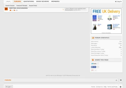
The large 'hole' in the middle of your forum home might display because I viewed as a guest but it breaks the flow. Perhaps this would be a time to not use a grid of nodes and use the traditional vertical node layout to fill this up?

Screenshot from 2014-08-03 17:29:06.webp
 
Thanks both for your feedback, although I do seem to miss a few points from your post @jauburn (we don't have a welcome announcement for example, only the notice down right).

@melbo that's a good point, we may just need to use the vertical nodes mode or perhaps kill something off the sidebar :)

Also, as a personal notice, I never bother creating forums based on just the factor of how popular they will become. I rather create forums based on my own interests and what I love doing. Not all forums need to become 500k member forums. ;)
 
My initial impression is that the site is too busy. I'm bombarded with a welcome announcement, a menu bar that slides from right to left when I scroll down, a welcome notice, a "sign up now" button, a "site uses cookies" notice, a "to finish or not to finish" announcement or thread preview, and then a lot of red icons, which evokes feelings of anxiety and dread. Overall, not a pleasant first experience. Makes me want to click away as quickly as possible.

That aside, there's almost nothing that I can think of that would be less conversation inducing than a site in which books are discussed. May sound odd from someone who runs a site devoted to poetry, but that's my take. Yes, there's goodreads, and that's successful, but I'm not sure how much energy there is left after the few successful book discussion sites already out there.
Good luck. It's a noble cause, perhaps. But I wouldn't want to be going down that road.


Ahhh, well over 2000 posts in four weeks says that there are people out there who don't feel any anxiety or dread... although why a thread about whether you finish or don't finish a book would inspire such feelings is beyond me and would make me suggest you might possibly need to seek some help with that.

Other than that, thanks for your review.
 
The large 'hole' in the middle of your forum home might display because I viewed as a guest but it breaks the flow. Perhaps this would be a time to not use a grid of nodes and use the traditional vertical node layout to fill this up?

View attachment 79606
Thanks, there is still work being done on the styles and we're tweaking based on feedback from visitors and members as we go :) We'll definitely look into this.
 
It's nice but I am amazed at how few members you have but they seem to be posting a lot. I have the opposite problem. Almost 200 members and barley any post.
 
Back
Top Bottom