Fixed Random Media: image-size / navigation-arrows

erich37

Well-known member
issue:
when you decrease and increase the size of your browser-window, then suddenly the navigation-arrows are bigger than the photos.


screenshot:
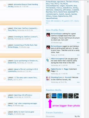
arrow_bigger_than_photo.webp


Suggestion:

1)
remove "Navigation Arrows"

2)
Make the images in a fixed size, not increasing and decreasing in size based on browser-window size.
Image-size of photos should not adjust with size of browser-window.

3)
Admin should be able to decide the amount of images to show.


:coffee:
 
Chrome seems to have a different behavior to other browsers here, and I believe Chrome's behavior is the correct one (based on the size of the block).
 
I am using FireFox 33.1.1


However, I would suggest to remove these arrows. They are looking quite ugly.

Also there is this "loading icon" showing all the time when you navigate left/right to see more images.
It looks like it needs a lot of time to display another small photo, because the "loading icon" always shows up before it shows an actual photo.
Seems to be a strange script you are using for the "navigation" in this area.
 
Seems to be a strange script you are using for the "navigation" in this area.

What I like about this 'strange script' ;), is that it is touch-enabled. You can actually swipe through the images on a tablet (y).

But you do have a bit of a point:

random media block resize issues.webp

That is on Chrome (Windows 7) on a re-sized window. You can not see the arrows anymore and also not (understandably) the titles of the images. But then again... a page refresh helps out. (That's actually also something I noticed... when you resized your window and then maximize it again, the images do not show itself anymore like it started out: as 2 bigger thumbnails. They still show as many little thumbnails. You need to do page refresh to get it back to 2 images). Maybe not such a big deal... and I guess it's related to this one: https://xenforo.com/community/threads/random-media-block-is-not-displayed-correctly-on-ios-6.88277/
 
The loading icon shows because the random media is a Lazy Load. You don't waste bandwidth by downloading multiple images when showing two at a time (also bonus for mobile speed + data usage) when using a lazy load.

Trust me, this was a proper move (I worked in mobile focused, image heavy development for years) and having the losing image helps reduce UX confusion of images not being there and appearing...

"lazy loading" should rather display the image background-color rather than a "loading icon".
http://xenzine.com
 
Matter of opinion there. I prefer the loading icon, more representative of what is actually happening.
 
This is fixed now.

The slider was still behaving in a responsive manner, despite being in what is effectively a non-responsive container (e.g. a fixed width sidebar). So if it is a sidebar we basically force it to be non responsive which avoids this problem.
 
Back
Top Bottom