Let me preface this by saying that I already know I'm the world's most anal human being, so no need to point that out... 
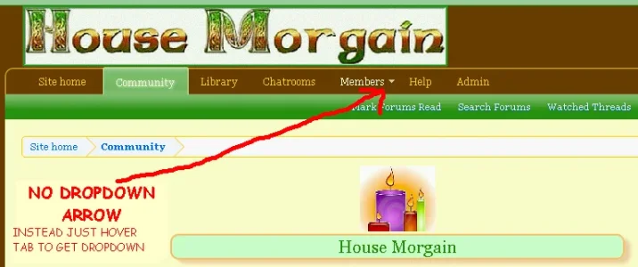
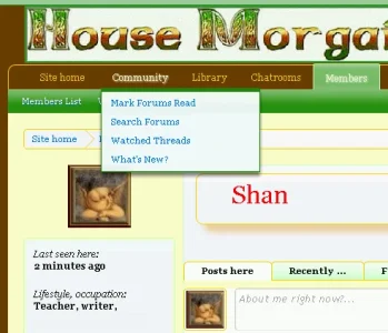
In the navigation bar, some of the tabs give a pop-up menu (for example Members). What is the purpose of the "Quick Links" label in there? What makes those links quick exactly? Or more importantly, do you really think someone would open that menu and not see the label letting them know there are links in it and be like, "Damn, I wish I could click on these menu items, but I guess they aren't links..."
To *me* it seems like something left over from 10 years ago when DHTML was a novel new thing. Back then they were "quick" because, wow... you could get a menu quickly without needing to go to a table of contents page. But today, I'd say users are past needing a link on a menu labeled as a link.
I would even argue that the "Members" label within the menu should be removed... I just clicked (or hovered) over the Members link, isn't it kind of redundant that this is a members menu? The title in the menu itself would be more appropriate if it was just an icon you were clicking.
In the end, does putting a menu title of "Members" and "Quick Links" make the user experience better for users, or is it there for no purpose other than to just have it there?
Removing both items just looks better/less cluttered in my opinion...

Upvote
12


