Pulsing Register Button

Pulsing Register Button

iamjudd

Well-known member
iamjudd submitted a new resource:

Pulsing Register Button - Create a pulsing effect coming from your register button.
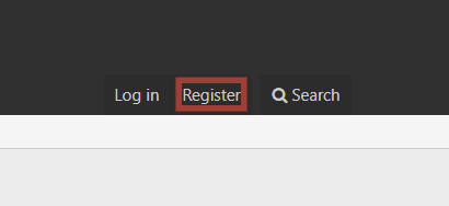
What you achieve:
ZOcef4f.gif


Add to extra.less template:
Code:
/* PULSE ANIMATION */
.pulse {
    position: relative;
  box-shadow: 0 0 0 0 rgba(232, 76, 61, 0.7);
  cursor: pointer;
  -webkit-animation: pulse 1.25s infinite cubic-bezier(0.66, 0, 0, 1);
  -moz-animation: pulse 1.25s infinite cubic-bezier(0.66, 0, 0, 1);
  -ms-animation: pulse 1.25s infinite cubic-bezier(0.66, 0, 0, 1);
  animation: pulse 1.25s infinite cubic-bezier(0.66, 0, 0...

Read more about this resource...
 
change the pulse 1.25s
That makes the animation slower, but doesn't increase the delay between iterations.

I tried this out after googling a bit. I think it's okay.
Code:
@-webkit-keyframes pulse {
    20%, 100% {
        box-shadow: 0 0 0 45px rgba(232, 76, 61, 0);
    }
}
@-moz-keyframes pulse {
    20%, 100% {
        box-shadow: 0 0 0 45px rgba(232, 76, 61, 0);
    }
}
@-ms-keyframes pulse {
    20%, 100% {
        box-shadow: 0 0 0 45px rgba(232, 76, 61, 0);
    }
}
@keyframes pulse {
    20%, 100% {
        box-shadow: 0 0 0 45px rgba(232, 76, 61, 0);
    }
}
 
Why are you editing the page container if you can do this all from the extra like this:
Code:
.p-navgroup-link--register {
    position: relative;
  box-shadow: 0 0 0 0 rgba(232, 76, 61, 0.7);
  cursor: pointer;
  -webkit-animation: pulse 1.25s infinite cubic-bezier(0.66, 0, 0, 1);
  -moz-animation: pulse 1.25s infinite cubic-bezier(0.66, 0, 0, 1);
  -ms-animation: pulse 1.25s infinite cubic-bezier(0.66, 0, 0, 1);
  animation: pulse 1.25s infinite cubic-bezier(0.66, 0, 0, 1);
}
.p-navgroup-link--register:hover {
  -webkit-animation: none;-moz-animation: none;-ms-animation: none;animation: none;
}

@-webkit-keyframes pulse {to {box-shadow: 0 0 0 45px rgba(232, 76, 61, 0);}}
@-moz-keyframes pulse {to {box-shadow: 0 0 0 45px rgba(232, 76, 61, 0);}}
@-ms-keyframes pulse {to {box-shadow: 0 0 0 45px rgba(232, 76, 61, 0);}}
@keyframes pulse {to {box-shadow: 0 0 0 45px rgba(232, 76, 61, 0);}}
 
I do not make manual changes...
this is why people create addons...

I would also suggest that it stop blinking
once someone registers and signed into the forum.

If you create an addon, then you can add other options
such as shaking certain buttons to get attention, etc...
I have a similar plugin that I use on my blog content,
and I can make just about anything dance on the page....
 
Could anyone update this to get it working on XF 2.1? I think it made a difference for my forums...

I'd say this is an easier approach (no template edit) just add into EXTRA.LESS:

Code:
/* PULSE ANIMATION */
.p-navgroup-link--register
{
    position: relative;
    box-shadow: 0 0 0 0 rgba(232, 76, 61, 0.7);
    cursor: pointer;
    -webkit-animation: pulse 1.25s infinite cubic-bezier(0.66, 0, 0, 1);
    -moz-animation: pulse 1.25s infinite cubic-bezier(0.66, 0, 0, 1);
    -ms-animation: pulse 1.25s infinite cubic-bezier(0.66, 0, 0, 1);
    animation: pulse 1.25s infinite cubic-bezier(0.66, 0, 0, 1);
    border-radius: 0 !important;
    &:hover
    {
        -webkit-animation: none;-moz-animation: none;-ms-animation: none;animation: none;
    }
}

@-webkit-keyframes pulse {to {box-shadow: 0 0 0 45px rgba(232, 76, 61, 0);}}
@-moz-keyframes pulse {to {box-shadow: 0 0 0 45px rgba(232, 76, 61, 0);}}
@-ms-keyframes pulse {to {box-shadow: 0 0 0 45px rgba(232, 76, 61, 0);}}
@keyframes pulse {to {box-shadow: 0 0 0 45px rgba(232, 76, 61, 0);}}

EDIT: Didn't see @MojoW 's post above, the same thing essentially except for a border-radius issue.
Thank you! I got it working...
 
Top Bottom