Problems when resizing QuickReply

Neil E.

Active member
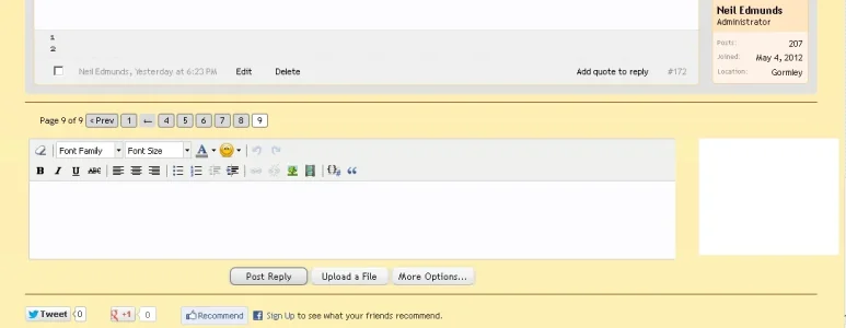
I want to place a google ad to right of QuickReply. Note that QuickReply sits on the left side of the forum (message_user_info block has been removed). Here is a pic showing the 180 x 150 ad as a white block:
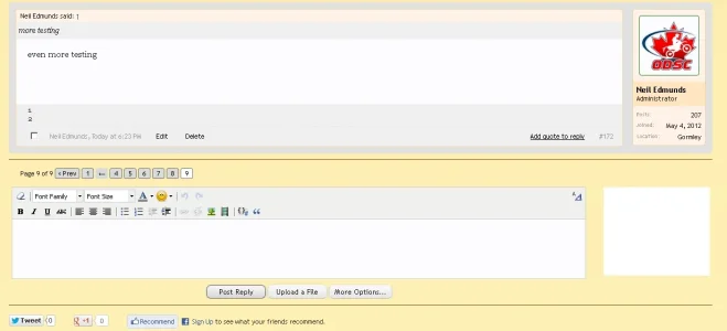
2013-02-18 19_30_59-THREAD TITLE WITH CAPITAL LETTERS _ Page 9 _ Ontario Dual Sport Club.webp

The parent div class is .quickReply, containing #Quickreply and .ad_beside

HTML added to template quick_reply
<span class="ad_beside">
<xen:include template="ad_beside_quick_reply">
</xen:include>
</span>

New template ad_beside_quick_reply contains the google ad code.
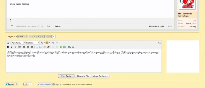
So far all of this works as intended, however once .ad_beside exists, #Quickreply shrinks to about half it's normal width, leaving a big gap to .ad_beside

I changed the width of #Quickreply to compensate, but due to the fixed width, it won't telescope when the page is resized. I have messed with every CSS property I can think of without any success.

.quickReply
{
border-top: none !important;
margin-bottom: 10px !important;
padding: 2px 0px 0px 5px !important;
height: 190px !important;
}
/* ~remove top border and define height~ */

#QuickReply
{
float: left !important;
margin: 0px 0px 0px 0px !important;
width: 82% !important;
overflow: hidden !important;
}
/* ~force width and move to the left side of forum~ */

#QuickReply .submitUnit
{
margin-top: 10px !important;
text-align: center !important;
}
/* ~move submit buttons away from resize problem area~ */

.ad_beside
{
float: right !important;
display: inline !important;
position: absolute !important;
margin: 0px 0px 0px 30px !important;
}
/* ~positions the ad beside QuickReply~ */

I welcome any thoughts on whether or not #QuickReply can be modified.

Note that Quick Reply is only visible when logged in to http://www.odsc.on.ca/.xenforo/index.php and you are on the last page of a topic.

If you are interested in seeing how it behaves, PM me for a log in.
 
I'm sure it can be modified but if your catering for the lower resolution users there may be some adverse affects to the layout depending on how big the ads are. If they don't exceed the width of the messageuserinfo I shouldn't think they'll be too much of an issue. if the width of the ads are big you may have but i'm guessing due to past experiences in modfiying it via css.
 
The problem is more related to how #QuickReply functions. In the default configuration it goes full width with a large margin on the left side to clear the message user block (avatar). As soon as I add something into the .quickreply container, #QuickReply changes size instead of just butting up against the added element. I think the #QuickReply behaviour comes from it's javascript construction since it doesn't respond well to CSS changes. I'll take some screen shots to illustrate this better.

One further note, I selected a 180x150 ad, but I would prefer a 200x200. In order for this to look correct I need to increase the vertical height of the text reply area of #QuickReply. I couldn't find where to adjust the height of only the text entry field.

I'm not concerned about resolution just the normal window resizing. The biggest problem was trying to keep my added element (ad) from being pushed down breaking the page layout.
 
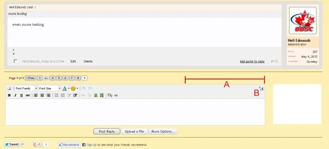
1) I am trying to get length "A" to change on resize so that the text editor switch "B" shows inside #QuickReply.
desired layout.webp


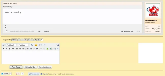
2) Default width .quickReply with relative positioning (ad: float right), note how narrow .quickReply becomes. default width quickreply with ad and relative positioning.webp


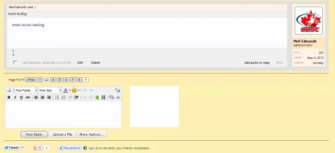
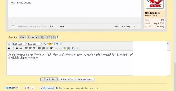
3) Default width .quickReply with absolute positioning, same narrowed .quickReply.
default width quickreply with ad and absolute positioning.webp


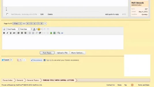
4) Resized .quickReply with relative positioning (.quickReply width 82%). Text editor switch is gone and ad is out of place.
resized 82% width quickreply with relative positioning.webp


5) Resized .quickReply with absolute positioning (.quickReply width 82%). Text editor switch is gone. Ad is now moving off to the right as the page is reduced.
resized 82% width quickreply with absolute positioning.webp
 
You have extensively modded the quick reply view. Also, when using absolute positioning, the relative sizing is quirky to say the least, it usually uses the width of the entire page, not the parent container. When looking at example 4 above, all you need to do is to make it smaller or change the margins on either side. When an element behaves like that when using float it basically means you don't have room for it on the right side.
 
I found that #QuickReply textarea would adjust the height so I can use a 200x200 ad and match both elements vertically.

By the time #QuickReply is narrow enough to allow the ad to stay in place, it's too narrow and makes the page layout look wrong. I think that some other change I've made is altering the behaviour of #QuickReply. I'll keep poking away at this and see what I can find.
 
The only width property in the default template quick_reply.css is
Code:
#QuickReply textarea
{
    width: 100%;
    *width: 98%;
    height: 117px;
    box-sizing: border-box;
}

None of the other classes have a width defined. I think the 100% here just means 100% of #QuickReply. Can anyone explain why #QuickReply moves past the .quickReply container on page resize (extends off to the right as seen in this screen capture)?

default XF resized.webp

Also, what does {xen:helper clearfix, '.quickReply'} do?

I'm trying learn how the width of #QuickReply is controlled by the stock software.

<Paging Jake>
 
I have a few conclusions now. Placing a float property on #QuickReply is what causes it to reduce dramatically in size (either float left or float right). It changes to the narrow version shown above in 2). For the layout I want, a float is not needed, so the width is OK.

Where I place ad_beside in the templates doesn't seem to matter. A large right margin on #QuickReply creates space for the ad; this is like the default large left margin that makes space for the default messageUserInfo.

I think the trouble occurs because #QuickReply is a form and does not behave like other elements. This screen shot shows my layout with a 200 x 200 ad.

6) Looks fine full size.
full size 200x200.webp


7) When the window is resized ad_beside moves over top of #QuickReply, blocking text. #QuickReply also extends to the right, moving past it's container (default behaviour it seems). I tried adding a z-index to get the ad to go under #QuickReply, but had no luck. Any other suggestions?

resized 200x20.webp
 
I had some time to look at this again. Default CSS:
Code:
#QuickReply textarea
{
width: 100%;
*width: 98%;
height: 117px;
box-sizing: border-box;
}

Making any change to these width settings caused #QuickReply to reduce in size again. That leaves only z-index to investigate further.
Adding position: relative to #QuickReply does not create any sizing problems and allows z-index to function.

A minus z-index on ad_beside caused the ad to go behind the page, effectively disappearing from view (even disappeared on Firebug).
Thus ad_beside needs the default z-index of 1 to be seen. So I had to bring #QuickReply forward. I applied a z-index of 10 to #QuickReply.
Now ad_beside slides under #QuickReply.

It's not very elegant but it will suffice.
 
Back
Top Bottom