XF 2.2 Prefix - Tooltips

Sado Yasashii

Active member
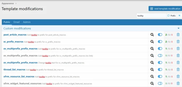
Can you, please tell me, how to display tooltips for prefixes?

I need a tooltip with a description of the prefix to pop up when users hover over the prefix. Is it possible?
1673426492968.png

"Description" - still not clear where it is displayed... If you can, please give me a hint with this.

"Prefix usage help" - the description is only displayed when creating a post/resource.

Is it possible to make a tooltip with the output of one of the fields shown?
 
Solution
You can use the styling option to add a title that will pop up when hovering over a link. I don't currently have Xen installed but a example code would look like

<a href="{tagUrl}" title="Description that will pop up when hovered">{tagTitle}</a>

Change the shortcodes accordingly since your screenshot don't show the Display styling options.

I'm also not sure if this works at all for XenForo but it should apply everywhere where you can use html styling.
If you use the Description option... it will show after selected.
Thank you for the clarification, at least I understand where the "Description" is displayed. It's not very convenient in XFRM. I'm primarily interested in the ability to pop up tooltips when viewing XFRM prefixes. Can you help me with this question?

For example, I want to display the prefix not in text but in an icon (font awesome), but without a tooltip this principle is not relevant to use.
 
I think that's where being precise in your prefix definition comes into play. Prefixes should really never be more than 2 words long, and those 2 words should get the point of what it pertains to across without need of defintion.
 
You can use the styling option to add a title that will pop up when hovering over a link. I don't currently have Xen installed but a example code would look like

<a href="{tagUrl}" title="Description that will pop up when hovered">{tagTitle}</a>

Change the shortcodes accordingly since your screenshot don't show the Display styling options.

I'm also not sure if this works at all for XenForo but it should apply everywhere where you can use html styling.
 
Solution
You can use the styling option to add a title that will pop up when hovering over a link. I don't currently have Xen installed but a example code would look like

<a href="{tagUrl}" title="Description that will pop up when hovered">{tagTitle}</a>

Change the shortcodes accordingly since your screenshot don't show the Display styling options.

I'm also not sure if this works at all for XenForo but it should apply everywhere where you can use html styling.
Thank you for the example, it may be useful to someone. I was able to solve my problem by writing an array and adapting my prefixes through modifiers. I was able to display a tooltip on the header of the prefix, which is what I needed. Display it in the description, as I wrote above is not relevant. Also, if you're using Multi-Prefix plugin, then using a description of the prefix makes no sense.
Here's what I got:
1673611209680.png
Screen Shot 01-13-23 at 03.09 PM.PNG
Screen Shot 01-13-23 at 03.17 PM.PNG
Screen Shot 01-13-23 at 03.11 PM.PNG
As you can see from the example, in the prefixes are displayed icons and when you hover its name is displayed. In the design of the resource, when you select a prefix, then after selecting and hovering you will see the name, not very convenient, but in another way not solved. Perhaps requires improvement, but I'm fine with it. Filtering by prefix also works.

This is actually what I needed to implement. It's a pity that the solution from XF for 1 prefix does not provide an opportunity to do otherwise, so without modifications there is no way.
 
Last edited:
Thank you for the example, it may be useful to someone. I was able to solve my problem by writing an array and adapting my prefixes through modifiers. I was able to display a tooltip on the header of the prefix, which is what I needed. Display it in the description, as I wrote above is not relevant. Also, if you're using Multi-Prefix plugin, then using a description of the prefix makes no sense.
Here's what I got:
As you can see from the example, in the prefixes are displayed icons and when you hover its name is displayed. In the design of the resource, when you select a prefix, then after selecting and hovering you will see the name, not very convenient, but in another way not solved. Perhaps requires improvement, but I'm fine with it. Filtering by prefix also works.

This is actually what I needed to implement. It's a pity that the solution from XF for 1 prefix does not provide an opportunity to do otherwise, so without modifications there is no way.
May I ask what addons you used to achieve this and what theme you are using?
 
May I ask what addons you used to achieve this and what theme you are using?
To display prefixes:
The simplest option for you to use is this:
extra.less:
Code:
/*** Prefix Pack A ***/
.label.label--CUSTOM-PREFIX-NAME {
    background: #CD7F32;
    color: #fafafa;

    .label:not(.menuPrefix)& {
        font-size: 0;
    }

    &:hover {
        background: #4A4E51;
        color: #fafafa;
    }
    &:before {
        .m-faBase();
        .m-faContent(@fa-var-cogs);
        padding-right: 5px;
        font-size: @xf-fontSizeNormal;
        padding-left: 5px;

        .label:not(.menuPrefix)& {
            font-size: @xf-fontSizeNormal;
        }
    }
}
/**********/
photo_2023-01-10_22-18-49.jpg
extra.less:
Code:
/*** Prefix Pack A ***/
.label.label--CUSTOM-PREFIX-NAME {
    background: #CD7F32;
    color: #fafafa;
    &:hover {
        background: #4A4E51;
        color: #fafafa;
    }
    &:before {
        .m-faBase();
        .m-faContent(@fa-var-cogs);
        padding-right: 5px;
    }
}
/**********/
photo_2023-01-10_22-19-08.jpg
extra.less:
Code:
/* #### Thread Prefixes #### */
.label
{
    &:before
    {
        padding-right: 4px;
        .m-faBase();
    }
    &.label--
    {
        &CUSTOM-PREFIX-NAME:before
        {
            .m-faContent(@fa-var-bullhorn);
        }
    }
}
core_labels.less add after line 77:
&.label--CUSTOM-PREFIX-NAME { .m-labelVariation(white, #ff8800); }
I got it here:
As for the tooltip, it is a personal modification. You can do it yourself, if you need it.

Theme:
 
Last edited:
На полпути, теперь все, что мне нужно, это всплывающий текст при наведении курсора, как вы этого добились, если это не слишком сложно?
No less than 6 modifications of templates applied to implement the tooltips in the right places... It was problematic enough to do. For such a case it is better to make a plugin, but I do not know how. Therefore, for such a task needs a performer. I can not share this. I told you where to start, I can only show you what templates you need to work through. Work it out from there on your own.
 

Attachments

  • 1673719855713.webp
    1673719855713.webp
    41.8 KB · Views: 14
Top Bottom