Implemented Poll as collapsed option

TheLaw

Well-known member
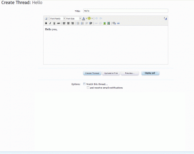
Most of the time people aren't creating polls. Having it open takes up too much valuable screen real estate for doing what we do most when creating a new thread -- typing in this box. I'd opt for a longer vertical text box and just a collapsed option for a poll that I could click to expand. Feels a little cramped here on the top, even in a big monitor.
 
Upvote 18
This suggestion has been implemented. Votes are no longer accepted.
It would probably work quite well in the same way Add Additional Response works - so you'd have an Add a Poll button and then the options expanded down. :)
 
I think it is super weird that for every Post you make, there is an option to make it a Poll.
and 0.001% of posts are Polls.

For Kier who doesn't like cluttered GUIs, POLL options while Posting is clutter 99.999% of the time.

And this is coming from someone who LIKES POLLS !
 
Instead of a tab which would otherwise display the creation of a poll in all it's glory why not an additional button after "preview" where upo clicking the full display of the poll creation options come out of hidden mode? This would effectively kill two birds with one stone with the user not missing that they have the option to create a poll but would reduce the clutter significantly. Once the "create poll" button is clicked the poll options appear?

Edit: Added Mockup
 

Attachments

  • display_poll.gif
    display_poll.gif
    41.3 KB · Views: 22
  • Untitled-1.gif
    Untitled-1.gif
    72.7 KB · Views: 21
Yeah, I'm actually looking at how I can disable polls for everyone. It just is too confusing for some users and a bit cluttered. I want to "Keep It Simple Sam".
 
I like the suggestion to use a tab under the editor like the smilie tab suggestion. You'd be able to lose the extra "create thread" & "preview" buttons that are currently under the poll form.

after thinking about it more, a user could get confused if there's more than one tab. for example, if they used the poll tab first & then jumped to the smilie tab, their poll info might get forgotten. out of site out of mind kind of thing. still, i like it & assume if they are advanced enough to post a poll, they are advanced enough to be able to handle clicking the tab again.

i like the add poll button suggestion as well.
polltab1.webp
polltab2.webp
 
I simply hid the the poll with <!-- --> for the time being. It makes more sense for me to exclude it from everyone than to include it for everyone.
 
I am bit surprised that only 7 people think these (rarely used compared to posting a normal post) poll options should not be presented like this in XenForo's posting system.

This whole area adds 11 (eleven...) user input-(text fields, selection boxes, buttons, etc, etc)-elements to a screen that could be so much more simpler ('the XF way') and less distracting. I guess it's too late for 1.0 Gold, but I do hope a future version can improve on this.
 
Some inspiration from 'some other' platform ;),

poll options vB.webp

This is how the current vBulletin handles poll options. It's conveniently hidden behind a tab and I am still eager to see something like that in Xenforo to hide it once and for all for all my board members.

This cluttered New Thread interface with all the poll options visible -that only 0.0000001% of your audience will ever use- does not suit the otherwise crystal clean interface of Xenforo. At least vBulletin got 1 thing right o_O ;)....

(FYI: the opening post has 4 likes, but that is a bit misleading, since this one has 15 likes, making it actually a total of 19 likes so far actually)
 
For me, the poll area never shows until I scroll down, so it's never a problem for me.

The two instances of "Create Thread" work to overcome the issue of a redundant space.
 
Also in the newest version of XF this is apparently not addressed. And in my opinion the neccesaty of providing the enduser of XF with an convientent tab to completely hide these obtrusive poll options becomes even bigger with the newest version. Have a look:

image.webp

At least 13 (!) completely unneccesary fields are presented to the enduser on this screen. 99% of our endusers want to post a thread instead of a poll. 1 % wants to add a poll. So why are these obtrusive fields presented there in 100% of the cases?
 
Top Bottom