You are using an out of date browser. It may not display this or other websites correctly.
You should upgrade or use an alternative browser.
You should upgrade or use an alternative browser.
Implemented Please move Bookmarks to sub-navigation menu
- Thread starter AndyB
- Start date
This suggestion has been implemented. Votes are no longer accepted.
I'm not so sure that the forum sub-navigation would be the most appropriate location, since bookmarks may include content from other tabs - XFRM, XFMG, etc.
If the bookmarks navigation item were to move from the current location, then I think the user/account menu would be a better alternative. The ideal spot in the menu would be above the divider (content-related links), not below (account settings related).

To be honest, I don't mind the current bookmark button location, when there is room for it. But for narrow width viewports (e.g. mobile), I do see merit for allowing site admins to toggle 'Bookmarks' and the 'What's new' shortcut link - as discussed by others in the HYS thread.
Just my 2c...
Initially we're supporting the following content types:
- Threads
- Posts
- Nodes (only page nodes exposed)
- Media items (requires XFMG 2.1)
- Albums (requires XFMG 2.1)
- Resources (requires XFRM 2.1)
- Resource updates (requires XFRM 2.1)
If the bookmarks navigation item were to move from the current location, then I think the user/account menu would be a better alternative. The ideal spot in the menu would be above the divider (content-related links), not below (account settings related).

To be honest, I don't mind the current bookmark button location, when there is room for it. But for narrow width viewports (e.g. mobile), I do see merit for allowing site admins to toggle 'Bookmarks' and the 'What's new' shortcut link - as discussed by others in the HYS thread.
Just my 2c...
We've made some changes here and rolled them out here.
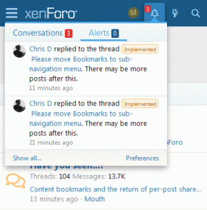
We no longer have a bookmark icon in the account navigation area, and we have brought back the lightning bolt icon in its place for narrow displays.
Bookmarks are now available from your visitor menu (your avatar) in the navigation area in a separate tab in the menu.
We no longer have a bookmark icon in the account navigation area, and we have brought back the lightning bolt icon in its place for narrow displays.
Bookmarks are now available from your visitor menu (your avatar) in the navigation area in a separate tab in the menu.
If Bookmarks icon removed then why not put back as default Inbox and Alerts phrases?
Last edited:
We've made some changes here and rolled them out here.
We no longer have a bookmark icon in the account navigation area, and we have brought back the lightning bolt icon in its place for narrow displays.
Bookmarks are now available from your visitor menu (your avatar) in the navigation area in a separate tab in the menu.
Thank you, Chris.
While I don't have any issues with the current approach, it might be more helpful/obvious to not make them empty phrases by default and customize here to set them to empty. Again, I personally have no issues either way as long as it is customizable, but it seems like many people are hung up on this.Because we prefer it without them. I mentioned in another thread though that the phrases still exist but they are empty by default.
it might be more helpful/obvious to not make them empty phrases by default and customize here to set them to empty.
Typically what you see here on xenforo.com will be the default settings.
That's not always the case. There are many default behaviors that are not useful or preferred here and there are some custom stuff that are being used here, but not shipped.Typically what you see here on xenforo.com will be the default settings.
That said, I am not trying to be vocal about it here, but I do see a little challenge for translators in this case. If I were to translate a phrase, I would see what the phrase says in English and translate accordingly in another language. However, in this case one has to draw conclusions from the phrase id itself or actually know the context of it.
The issue that I see here is that the phrase system is being used for an optional behavior and not necessarily for translation, which can become problematic over time and certainly needs out-of band information (hence many more confused customers). An alternative approach would be to provide a switch somewhere in style properties to enable or hide textual description of these navigational items.
IMHO, the new location for bookmarks is actually quite intuitive, the user profile is the most common area which a member uses on regular basis and bookmarks is very clearly visible there...
@Mr Lucky , you might be thinking of the older FontAwesome 4.x version?  https://fontawesome.com/v4.7.0/icon/bolt https://fontawesome.com/icons/bolt?style=regular
Look closer, that’s basically the same as all icons nowI think it is outlined instead of filled?
Look closer, that’s basically the same as all icons now
Not so good, is there a setting to have the previous icons, which looked much better?
Yep. See the Font Awesome 5 HYS thread.Not so good, is there a setting to have the previous icons, which looked much better?
Any clues where it might be in that thread? Thanks
Similar threads
- Replies
- 20
- Views
- 2K
- Replies
- 3
- Views
- 1K
- Replies
- 2
- Views
- 1K

