If you've ever seen some of my attempts to learn HTML/CSS and other shenanigans here on the XF forum, you might've noticed my 2000s web design nostalgia is strong. If not, have a tl;dr: I miss 2000s-era web design aesthetics and have a 17 year-long interest* in HTML/CSS, specifically for forums. *Interest -. As in... not experience.
Alternadiv.com will become my personal website to share my free XF styles and other web dev nonsense.
I'm creating this thread to hopefully receive some feedback on the homepage and general aesthetic I'm going for. Beyond the homepage, there's not much for an unregistered user to see--not even forums--and that's intentional. I want my site to stay pretty raw.
If you're going to have a look, the only pages of interest would be https://alternadiv.com and https://alternadiv.com/about/updates. (If you manage to navigate elsewhere, well, good luck... I probably didn't even navigate there yet.)
I miss 2000s-era web design aesthetics. I enjoy experimenting with HTML/CSS. It's been 17 years of wanting to get into frontend web dev and the urge isn't going away. So, I'm accepting my fate and trying to learn how to write my divs like the big boys.
Speaking of writing divs like the big boys, I would be remiss if I didn't mention a few folks who--possibly unbeknownst to them--have kept me motivated.
@Russ from Pixel Exit, @AndyB, @Hotfix, @Deathstarr, @Ozzy47, @arn, @Kirby, @BassMan, @beerForo, @JoyFreak, and I guess... @Brogan.
Glad you asked!
I have a handful of interesting styles to be released here on XF soon. And I have a lot more in their beginning phases. I probably have 100 style ideas written down, most of which have the retro, unusual, or very niche aesthetic I've been blabbing about.
I'm a retired US Marine withchronic back pain a chronic interest in actually getting decent at this. I feel like there's potential for this little web design niche that I'm focused on, even outside of XenForo styles. From my site, here are some of my philosophies for Alternadiv design:
Again, this is a hobby for me. And the styles will be uploaded here on the XF forum, for free. I'm not really trying to pull traffic to my site. I don't know if there will ever be an actual reason to allow registrations and/or use the forum part of XF.
Ironically, the code for my homepage is messy right now, but I'll tidy that up when I stop making 100 tiny changes every hour. I haven't done much mobile-firsting yet, but that'll happen too. I'm not worried about the favicon or SEO/analytics for now, BUT! With @Kirby's Font Awesome add-on enabled, my homepage gets a 100 mobile/desktop PageSpeed score! I love removing excess elements (@Anatoliy).
My next big thing will be turning the XFRM into a tool that can display a portfolio without it resembling much of its former self.
If you're still reading this, thanks! Please do tell if you have any suggestions or ideas for any part of the site or me learning how to write good divs.
Also, if you have a XenForo forum that could use a new design, I'd love to make you one for free. Give me a few weeks to show off my "real" style portfolio first.
Also also: to keep Alternadiv.com authentically retro, I want to put some "affiliate site" banners somewhere in the footer. If you have a small forum that isn't monetized, let me know if I can add your link.")
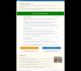
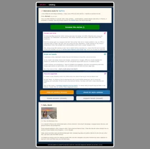
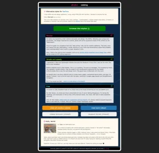
alt⟨div⟩ -- peculiar, retro, and other niche XenForo styles
Alternadiv.com will become my personal website to share my free XF styles and other web dev nonsense.
I'm creating this thread to hopefully receive some feedback on the homepage and general aesthetic I'm going for. Beyond the homepage, there's not much for an unregistered user to see--not even forums--and that's intentional. I want my site to stay pretty raw.
If you're going to have a look, the only pages of interest would be https://alternadiv.com and https://alternadiv.com/about/updates. (If you manage to navigate elsewhere, well, good luck... I probably didn't even navigate there yet.)
why⟨tho⟩ ?
I miss 2000s-era web design aesthetics. I enjoy experimenting with HTML/CSS. It's been 17 years of wanting to get into frontend web dev and the urge isn't going away. So, I'm accepting my fate and trying to learn how to write my divs like the big boys.
Speaking of writing divs like the big boys, I would be remiss if I didn't mention a few folks who--possibly unbeknownst to them--have kept me motivated.
@Russ from Pixel Exit, @AndyB, @Hotfix, @Deathstarr, @Ozzy47, @arn, @Kirby, @BassMan, @beerForo, @JoyFreak, and I guess... @Brogan.
wt⟨f⟩ ?
Glad you asked!
I have a handful of interesting styles to be released here on XF soon. And I have a lot more in their beginning phases. I probably have 100 style ideas written down, most of which have the retro, unusual, or very niche aesthetic I've been blabbing about.
I'm a retired US Marine with
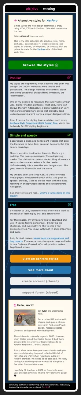
Websites were unique and personable. The "Webmaster" was passonite. Their design matched their content, albiet with chaotic HTML sometimes.
One of my design goals is to recapture that wild "web surfing" vibe, but for modern platforms. Hey, my HTML is controlled chaos, at least! That said, retro isn't always the way. Alternadivly, I prefer working on very niche or extraordinary styles, that probably (and understandably) aren't worth a proper designer's time.
I appreciate a clean and lightweight website that puts the literature in focus first. Less can be more.
To me, modern web design tends to feel bloated, cumbersome to navigate, difficult to visually separate the content you wanted from the clickbait. All that, with unexpected layout shifts and poor TTI speeds, to boot!
I prefer simplicity and minimalicity(!).
I'm newer to CSS, therefore most of my initial work is the result of learning by trial andservererror.
For that reason, my styles are free to download and use (if you're feeling dangerous). But I'm loving the challenge and eventually I'd like to push a few premium themes. You know, with built in style properties and such.
And, for that reason, I encourage suggestions and bug reports. I'm always ready to squash bugs and bake in new features, if asked. After all, practice makes PageSpeed scores!
Again, this is a hobby for me. And the styles will be uploaded here on the XF forum, for free. I'm not really trying to pull traffic to my site. I don't know if there will ever be an actual reason to allow registrations and/or use the forum part of XF.
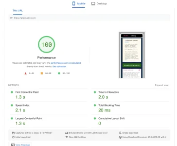
Ironically, the code for my homepage is messy right now, but I'll tidy that up when I stop making 100 tiny changes every hour. I haven't done much mobile-firsting yet, but that'll happen too. I'm not worried about the favicon or SEO/analytics for now, BUT! With @Kirby's Font Awesome add-on enabled, my homepage gets a 100 mobile/desktop PageSpeed score! I love removing excess elements (@Anatoliy).
My next big thing will be turning the XFRM into a tool that can display a portfolio without it resembling much of its former self.
If you're still reading this, thanks! Please do tell if you have any suggestions or ideas for any part of the site or me learning how to write good divs.
Also, if you have a XenForo forum that could use a new design, I'd love to make you one for free. Give me a few weeks to show off my "real" style portfolio first.
Also also: to keep Alternadiv.com authentically retro, I want to put some "affiliate site" banners somewhere in the footer. If you have a small forum that isn't monetized, let me know if I can add your link.
Attachments
-
 alternadiv v1.webp81.7 KB · Views: 78
 -
 304DC657-B479-470A-A504-418859454DCE.webp80.7 KB · Views: 50
 -
 Screen Shot 2022-02-04 at 6.17.18 PM.webp43.2 KB · Views: 37
 -
 Screenshot 2022-02-05 at 17-29-09 Peculiar Retro XenForo Styles.webp90.1 KB · Views: 35
 -
 Screenshot 2022-02-05 at 17-29-38 Peculiar Retro XenForo Styles.webp52.5 KB · Views: 33
Last edited:


")


