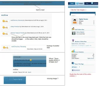
Just a few issues I've noticed at a glance. One of the images imo with relation to the breadcrumb link is far too big, and the one to the right of it is being cropped. To me, this issue easily rectifiable will improve the visual. That being said, not sure i like the breadcrumb and what you've done, it needs defined more and the nav_open icon looks odd floated over to the right.
The icons in the sidebar blocks also, for me, are just to big with relation to the link text that sits beside them, the icons really need to be smaller.
In the threadlistings I noticed you've used a button (image) to get the slider to drop. I think this is overkill when text would have been a better option. The other buttons in the thread list (More options & cancel) have some sort of border bevel that really doesn't look nice, looks odd infact. Also there's a huge gap inbetweet the bottom of the threadlist and threadlist tab, might want to fix that.
I understand that you want to make things a little different but the differences you've made imo aren't improvements that compliment the xenforo product.
The navbar text which as some kind of shadow makes the text hard to read, removing that imo or lowering the effect might be a good option.
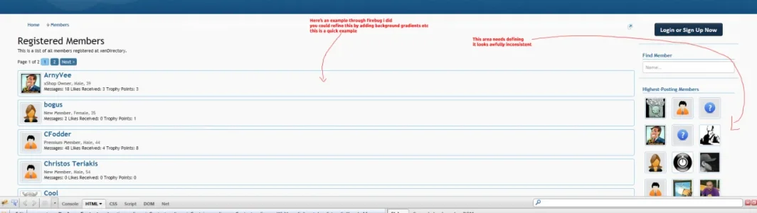
Might also want to add a little padding to the member list. the data residing within looks crammed.
http://xendirectory.net/members/
View attachment 17810


")