You are using an out of date browser. It may not display this or other websites correctly.
You should upgrade or use an alternative browser.
You should upgrade or use an alternative browser.
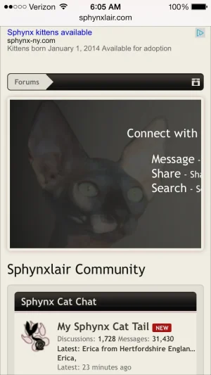
XF 1.2 Notice System - hide from responsive
- Thread starter tommydamic68
- Start date
EXTRA.css:
If you want to hide it on slightly larger displays too then change maxResponsiveNarrowWidth to maxResponsiveMediumWidth
Code:
@media (max-width:@maxResponsiveNarrowWidth)
{
    .Responsive #Notices.PanelScroller
    {
        display: none!important;
    }
}
If you want to hide it on slightly larger displays too then change maxResponsiveNarrowWidth to maxResponsiveMediumWidth
tommydamic68
Well-known member
Thanks @Chris Deeming - will give it a go tomorrow morning.EXTRA.css:
Code:@media (max-width:@maxResponsiveNarrowWidth) { .Responsive #Notices.PanelScroller { display: none!important; } }
If you want to hide it on slightly larger displays too then change maxResponsiveNarrowWidth to maxResponsiveMediumWidth
tommydamic68
Well-known member
That worked - Thanks @Chris DeemingEXTRA.css:
Code:@media (max-width:@maxResponsiveNarrowWidth) { .Responsive #Notices.PanelScroller { display: none!important; } }
If you want to hide it on slightly larger displays too then change maxResponsiveNarrowWidth to maxResponsiveMediumWidth
tommydamic68
Well-known member
tommydamic68
Well-known member
Why? Why is it not automatically responsive with just turning the option on with Xenforo? Also, I see nothing on specifically making the notice responsive in you linked page.You just need to make your notice content repsonsive.
http://xenforo.com/community/resources/responsive-design.2193/
Brent W
Well-known member
Why? Why is it not automatically responsive with just turning the option on with Xenforo? Also, I see nothing on specifically making the notice responsive in you linked page.
It isn't a magic wand. You can't just turn it on and then put html code or images in a notice that are not responsive and expect it to work.
tommydamic68
Well-known member
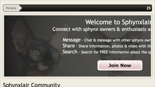
Yes @Chris Deeming - thats probably right. before going nutty on it, perhaps once responsive it is too small to be effective when viewing on a small device? Any who - here is the code.It's more than likely been created with some HTML or CSS that doesn't allow for responsive design.
If you post the content of your notice we'll figure it out.
Code:
<style type="text/css">
.noticeButtonContainer
{width: 225px;
padding: 10px;}
.csgoIntro
{background: url(rgba.php?r=0&g=0&b=0&a=153); background: rgba(0,0,0, 0.6); _filter: progid:DXImageTransform.Microsoft.gradient(startColorstr=#99000000,endColorstr=#99000000);
color: #ffffff !important;
font-size: 14px !important;
text-align: center!important;}
.csgoIntro a
{color: #ffffff !important;}
.csgoIntro h1
{color: #ffffff !important;
font-size: 20px;
font-weight: bold;}

.csgoMember
{font-size: 12px;}
.csgoMember
{color: #ffffff !important;}
</style>

<center>
<img src="http://www.sphynxlair.com/community/styles/sphynxlair/xenforo/forum25.png" style="display:block; width:825px; height:225px;"  title="" />
</center>

<div class="csgoIntro" style="position:absolute; top:0; left:0; height:300px; width:850px;">
    <div style="padding-left: 25px; padding-right: 25px; padding-top:10px;">
       <font size="5">Welcome to Sphynxlair!</font><br />
        <font size="4">Connect with sphynx owners & enthusiasts around the world!</font><br /><br />
            <div style="text-align: left; width: 420px; margin: auto;"><font size="4">Message</font> - Chat & message with other sphynx owners.<br /><font size="4">Share</font> - Share information, photos & video with the community.<br /><font size="4">Search</font> - Search for FREE information about the sphynx cat.</div>
       <center><div class="noticeButtonContainer">
            <label for="LoginControl" id="SignupButton"><a href="http://www.sphynxlair.com/login" class="inner"><b><font color="#141414">Join Now</font></b></a></label>
        </div></center>
    </div>
</div>tommydamic68
Well-known member
Yeah - I figured so. Honestly, I think a stripped version of the forum is better when on a small device like a cell phone - just too noisy with other "stuff."Yeah, as I thought...
If you read @Brogan's guide there's plenty of things in that code that are just not "responsive".
Fixed widths, e.g.
style="display:block; width:825px; height:225px;"
Do not make for good responsive design.
tommydamic68
Well-known member
Sounds good, but too much work...We use a similar notice but we put the actual text in the first 300 pixels and make sure the first 300px of the image background makes sense on its own and then just add some non-vital stuff to the rest of the notice background image.
russoroni
Active member
EXTRA.css:
Code:@media (max-width:@maxResponsiveNarrowWidth) { .Responsive #Notices.PanelScroller { display: none!important; } }
If you want to hide it on slightly larger displays too then change maxResponsiveNarrowWidth to maxResponsiveMediumWidth
Thanks Chris. You're the man.
Similar threads
- Replies
- 1
- Views
- 614
- Question
- Replies
- 0
- Views
- 422
- Replies
- 0
- Views
- 321
- Question
- Replies
- 5
- Views
- 3K


