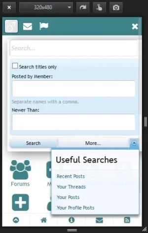
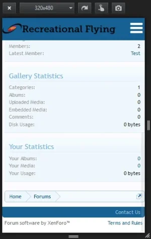
New site menu system

ibaker

Well-known member
I finally got a new menu system done for my site after getting it half way I enlisted a developer to finish it off. So far a poll on my live site shows a 93% of users liking it/not minding it which means it is a big hit as far as my users go.

A recent poll of users on my site also found that 50% of them use either a mobile phone or tablet to access my site so I designed a menu system that was:
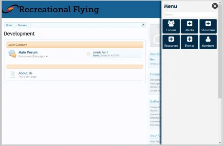
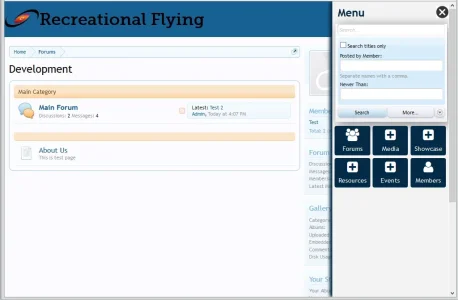
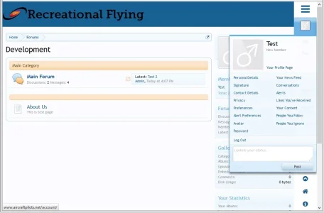
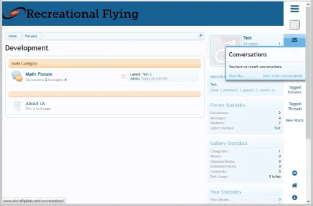
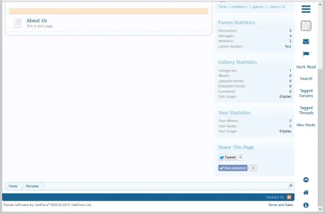
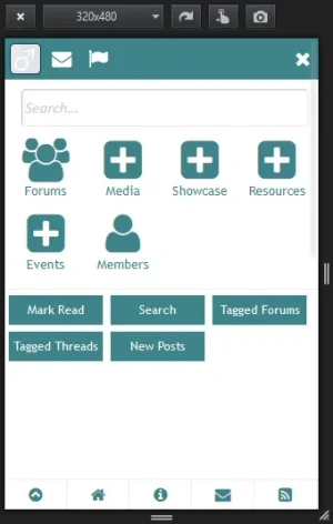
1. Always sticky - right column with slide out menu for large screen and slide out for mobile devices
2. Tablet users can navigate the site completely with their right thumb whilst still holding the tablet
3. Enormous amount of room for the list of main menu items to grow plus have space on the menu for advertising or special announcements
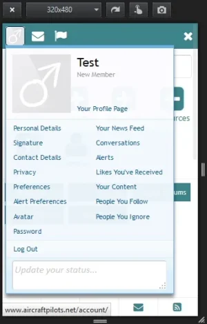
4. All the normal Xenforo features and functions still available
5. The right side column and menu is sticky wherever you scroll to on a large screen
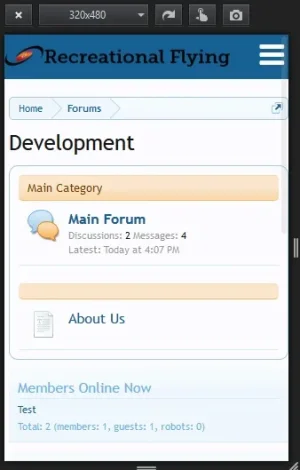
6. The site logo and menu access on a mobile device is sticky across the top so you can always access the menu as you scroll down the page
and more.

Here are some screen shots:
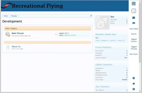
1.webp 2.webp 3.webp 4.webp 5.webp 6.webp 7.webp 8.webp 9.webp 10.webp 11.webp

Still a little bit of tidying up to do but my users really like it

If you want to see it, go to www.aircraftpilots.net and you can log in with User:Test and Password: test however this is just a test site so very soon the domain will be deleted.

Please, tell me what you think
 
Like it very much, but I believe it should be on the left hand side (new users go left for menus?) or at least make it an option in the user profile.
 
Congrats, looks nice.
I recently did similar, with a completely different style for mobile usage. Feedback was great, and they love it.
The single biggest requests though - to be able to get to 'New Posts' without it having to be a double interaction of opening the menu, and then selecting New Posts. I tell you this, because your's looks the same and may get the same feedback :)
 
I think that you are on to something good here. It works better than the default xenforo dropdowns which are not very mobile friendly. It also offers a lot of link space which is great for websites that have lots of addon functionality. It's also good to have the logo visible at all times.

But on the other hand it does introduce an extra step for links that are normally available on the main screen. So I guess that this is most useful for complex sites and less for forum only.

I have only tried it on mobile but will check it on desktop later.
 
Anyway, thanks again for the comments as they are very helpful. you comments have raised a question of whether users are ready yet for the hamburger menu system on a PC or is it a bit early for it
 
Like it very much, but I believe it should be on the left hand side (new users go left for menus?) or at least make it an option in the user profile.
Good idea about the user option of being able to select left or right menu.

I am looking at releasing this as an addon because it just uses changes to the standard XF navigation etc templates with a very small script file for the slide out. There is another option that I am playing with that creates the slide out purely by css which may be better than script. One of the benefits of it is that just like the standard XF menu, it automatically adds the extra menu and sub menu items you get when you install an addon.
 
Now that I have seen it on desktop I have to say that its great for mobile and probably also for tablet, but I think it decreases the user experience on desktop. I think it needs more tweaking for desktop.
 
Looking nice and useful, but not for desktop in my opinion. Like others already said, I like it on mobile too.
 
Now that I have seen it on desktop I have to say that its great for mobile and probably also for tablet, but I think it decreases the user experience on desktop. I think it needs more tweaking for desktop.
Thanks for that, can you say what tweaks you think would need to be done to make it a better user experience, thanks
 
My reaction is the same some others above... I think it looks great on mobile (Android phone) but not on my desktop (Win7). Maybe if I was using a tablet (or a laptop with a touch screen) as my primary device but on a standard laptop with a mouse device I prefer the normal menu header.

As an add-on, my interest would be having the mobile version of the menu as a supplement to my existing header navigation, not replacing it, so that as the user scroll downs the page and the normal header is no longer viewable then the mobile version would kick in & be displayed. I doubt I'd use the desktop version; maybe if there was a way to specify which device types it would show up on (eg: show only on tablets but not desktops).
 
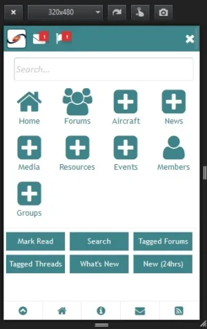
How do alerts work for mobile? Are those hidden?

A lot of the subnavigation links that xenforo has and that addons insert, are not used often. In contrast to often used navigation links, its actually a good thing that links like 'tagged threads' are not visible all the time. I would rather keep those at the top on desktop. If I need them then I can go to the top. by hitting the home button on my keyboard.

I think it would be best to follow Kevins advise for resolutions wider than 980px or so and assume that this is desktop.
 
Yes, but it seems alerts stay hidden until the user opens the menu. If the user does not then he may not notice the alerts and leave the site without responding to messages or acting on alerts.
IMHO that would be bad.
 
Yes, but it seems alerts stay hidden until the user opens the menu. If the user does not then he may not notice the alerts and leave the site without responding to messages or acting on alerts.
IMHO that would be bad.
I see what you mean, perhaps a flag next to the hamburger icon as an indicator may be the go, thanks for that
 
I suggest to learn from facebook. they have the message and alert icon in the header for good reason. This will make the user instantly aware of anything he needs to act upon. Put the hamburger next to that.
 
Congrats, looks nice.
I recently did similar, with a completely different style for mobile usage. Feedback was great, and they love it.
The single biggest requests though - to be able to get to 'New Posts' without it having to be a double interaction of opening the menu, and then selecting New Posts. I tell you this, because your's looks the same and may get the same feedback :)
This is also my experience

I added an extra new posts link in ad position 1 just for mobile users, as well as one in the footer and the conversations menu.

This made them very happy.

New posts seems to be a very popular way to browse the forum and quick wqays to get to it, or back to it are very well received IMO.
 
Last edited:
Maybe we need an icon for new posts similar to how facebook does it. Then put alerts, messages and hamburger next to it.
 
Back
Top Bottom