- Affected version
- 2.0.0 beta 1
(I've put this in bug reports because I do feel it is something which needs fixing rather than a suggestion - but feel free to disagree and move it)
The new "New media comments" search currently displays images as a thumbnail grid - in the same way that the "New media" search does.

Given for "New media comments" we're actually more interested in the comments than the images themselves, it would be more useful to have them displayed in list form (with small thumbnails), just as we would for general search results or Your Content or tags and so on:
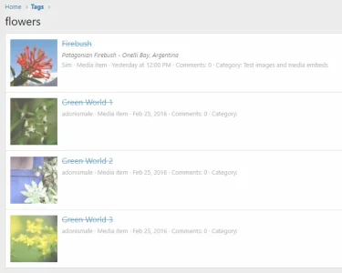
(minus the strikeout of course!!)
It would be even more useful to show the last person who commented like we do for thread lists - because it can be useful to see at a glance if it is someone we need to pay attention to now, or someone we'd rather ignore - and more importantly - how long ago the last comment was.
Also, if we turn off the "show only unread" filter, we'd potentially see photos where we were the last person to comment and it's useful to have an indicator that it was us who commented last.
Even if we can't get last commenter now, I'd be happy to just see this in linear form.
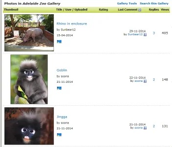
By way of comparison, back when I had vBulletin+PhotoPost (hacked to use vB threads for comments), I used to display the gallery photos in this format and I think it worked well:

The new "New media comments" search currently displays images as a thumbnail grid - in the same way that the "New media" search does.

Given for "New media comments" we're actually more interested in the comments than the images themselves, it would be more useful to have them displayed in list form (with small thumbnails), just as we would for general search results or Your Content or tags and so on:

(minus the strikeout of course!!)
It would be even more useful to show the last person who commented like we do for thread lists - because it can be useful to see at a glance if it is someone we need to pay attention to now, or someone we'd rather ignore - and more importantly - how long ago the last comment was.
Also, if we turn off the "show only unread" filter, we'd potentially see photos where we were the last person to comment and it's useful to have an indicator that it was us who commented last.
Even if we can't get last commenter now, I'd be happy to just see this in linear form.
By way of comparison, back when I had vBulletin+PhotoPost (hacked to use vB threads for comments), I used to display the gallery photos in this format and I think it worked well:
