Nav Tab Menu Size

Neil E.

Active member
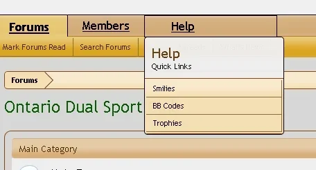
This one is just plain weird (Nav Tab still drives me crazy). Using this forum as an example, when I hover over the drop down arrow beside Members,
the menu pops up and the Members tab stays the same width.

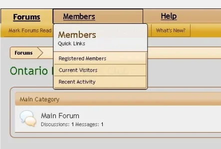
On my forum, the Members tab gets a lot wider when the menu pops up. I can't find the cause, any ideas?
This happens for both Members and Help (left side of Nav Bar).

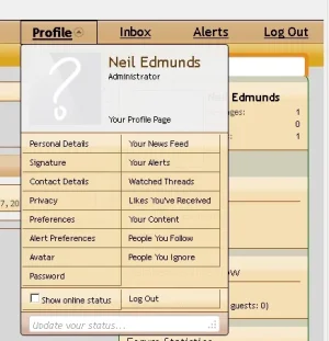
Tab width vs Menu works correctly on Profile/user, Inbox and Alerts (right side of Nav Bar).

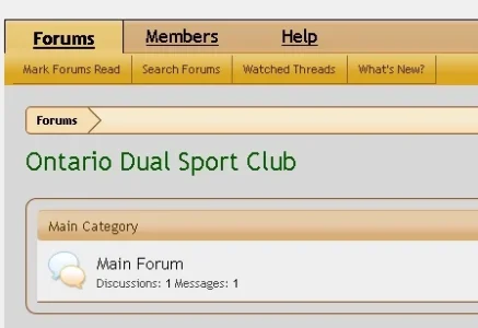
Pic 1 Normal no hover
Pic 2 Hover over Members drop down arrow, Help pushed over
Pic 3 Hover over Help drop down arrow, note wider tab like Members
Pic4 Hover over Profile drop down arrow, tab width unchanged
xenforo17.webp
xenforo18.webp
xenforo19.webp
xenforo20.webp
 
have you added any excess padding to the following?

A link to your forum directing people to the issue would be better in isolating the issue btw.

Code:
.Popup .PopupControl.PopupOpen, .Popup.PopupContainerControl.PopupOpen
 
Have you added any excess padding to the following?
Code:
.Popup .PopupControl.PopupOpen, .Popup.PopupContainerControl.PopupOpen


I don't see a direct match to your code. The closest I can find is in xenforo_popup.css

Code:
.Popup .PopupControl,
.Popup.PopupContainerControl
{
    display: inline-block;
    cursor: pointer;
}
 
    .Popup .PopupControl:hover,
    .Popup.PopupContainerControl:hover
    {
        @property "popupControlClosedHover";
        color: rgb(0, 0, 0);
        background-color: rgb(139, 69, 19);
        @property "/popupControlClosedHover";
    }
 
    .Popup .PopupControl:focus,
    .Popup .PopupControl:active,
    .Popup.PopupContainerControl:focus,
    .Popup.PopupContainerControl:active
    {
        outline: 0;
    }
 
    .Popup .PopupControl.PopupOpen,
    .Popup.PopupContainerControl.PopupOpen
    {
        @property "popupControl";
        color: @contentText;
        background: rgb(245, 220, 175) url('@imagePath/xenforo/gradients/tab-unselected-25px-light.png') repeat-x top;
        border: 1px solid rgb(0, 0, 0);
        @property "/popupControl";
    }
 
    .Popup .PopupControl.BottomControl.PopupOpen,
    .Popup.PopupContainerControl.BottomControl.PopupOpen
    {
        border-top-left-radius: @popupControl.border-bottom-left-radius;
        border-top-right-radius: @popupControl.border-bottom-right-radius;
        border-bottom-left-radius: @popupControl.border-top-left-radius;
        border-bottom-right-radius: @popupControl.border-top-left-radius;
    }
   
        .Popup .PopupControl.PopupOpen:hover,
        .Popup.PopupContainerControl.PopupOpen:hover
        {
            text-decoration: none;
        }


Since this relates to the Nav Bar, I thought the popup control from navigation.css would be the right place to look.

Code:
/* Links Inside Tabs */
 
.navTabs .navLink,
.navTabs .SplitCtrl
{
    @property "navLink";
    font-size: 13pt;
    font-family: Trebuchet MS;
    color: rgb(0, 0, 0);
    text-decoration: underline;
    background: rgb(185, 123, 43) url('@imagePath/xenforo/gradients/navigation-tab.png');
    border-top-color: rgb(0, 0, 0);
    display: block;
    float: left;
    vertical-align: text-bottom;
    text-align: center;
    outline: 0 none;
    width: 80px;
    @property "/navLink";
 
    <xen:if is="{$pageIsRtl}">*float: none; *display: inline; *zoom: 1;</xen:if>
 
    height: @headerTabHeight;
    line-height: @headerTabHeight;
}
 
    .navTabs .publicTabs .navLink
    {
        padding: 0 15px;
    }
 
    .navTabs .visitorTabs .navLink
    {
        padding: 0 10px;
    }
 
    .navTabs .navLink:hover
    {
        text-decoration: none;
    }
 
    /* ---------------------------------------- */
    /* unselected tab, popup closed */
 
    .navTabs .navTab.PopupClosed .navLink
    {
        color: @primaryLighter;
    }
 
        .navTabs .navTab.PopupClosed:hover
        {
            background-color: @primaryMedium;
        }
   
            .navTabs .navTab.PopupClosed .navLink:hover
            {
                color: @textCtrlBackground;
            }
   
    .navTabs .navTab.PopupClosed .arrowWidget
    {
        /* circle-arrow-down-light */
        background-position: -64px 0;
    }
 
    .navTabs .navTab.PopupClosed .SplitCtrl
    {
        margin-left: -14px;
        width: 14px;
    }
   
        .navTabs .navTab.PopupClosed:hover .SplitCtrl
        {
            /* nav_menu_gadget, height: 17px */
            background: transparent url('@imagePath/xenforo/xenforo-ui-sprite.png') no-repeat -128px {xen:calc '(@headerTabHeight - 17) / 2 + 1'}px;
        }
 
    /* ---------------------------------------- */
    /* selected tab */
 
    .navTabs .navTab.selected .navLink
    {
        @property "navTabSelected";
        font-weight: bold;
        color: @contentText;
        background: @primaryLightish url('@imagePath/xenforo/gradients/navigation-tab.png') repeat-x top;
        padding-top: 2px;
        margin-top: -1px;
        border: 1px solid @contentText;
        border-bottom: 1px none black;
        border-radius: 1px;
        border-top-left-radius: 2px;
        border-top-right-radius: 2px;
        @property "/navTabSelected";
    }
 
    .navTabs .navTab.selected .SplitCtrl
    {
        display: none;
    }
 
    .navTabs .navTab.selected .arrowWidget
    {
        /* circle-arrow-down */
        background-position: -32px 0;
    }
 
        .navTabs .navTab.selected.PopupOpen .arrowWidget
        {
            /* circle-arrow-up */
            background-position: -16px 0;
        }
 
    /* ---------------------------------------- */
    /* unselected tab, popup open */
 
    .navTabs .navTab.PopupOpen .navLink
    {
    }
 
 
    /* ---------------------------------------- */
    /* selected tab, popup open (account) */
 
    .navTabs .navTab.selected.PopupOpen .navLink
    {
        @property "popupControl";
        color: @contentText;
        background: rgb(245, 220, 175) url('@imagePath/xenforo/gradients/tab-unselected-25px-light.png') repeat-x top;
        border: 1px solid rgb(0, 0, 0);
        @property "/popupControl";
    }

I have to say that I'm confused about the ORDER in which the styling cascades. I understand that EXTRA.CSS in the final overlay, but how do the the other sheets work. If I'm not working at a higher level (closer to EXTRA) won't my changes effect a greater part of the forum?
 
Thank you both. That corrects the action. I had changed that property because I was trying to space the tabs a bit farther apart. Is there another way to do it? Padding? Margins?
 
Thank you both. That corrects the action. I had changed that property because I was trying to space the tabs a bit farther apart. Is there another way to do it? Padding? Margins?

Increase the following from 15px to whatever preferred increased size.

Code:
.navTabs .publicTabs .navLink {
    padding: 0 15px;
}

If your wanting to do the same for the links to the far right increase the padding size to your preference.

Code:
.navTabs .publicTabs .navLink, .navTabs .visitorTabs .navLink {
    padding: 0 15px;
}
 
Thanks again. I notice that you put up the code quickly and easily. Does a skilled person tend to go directly to the code and not bother with the more graphic oriented property groups in style properties?
 
Top Bottom