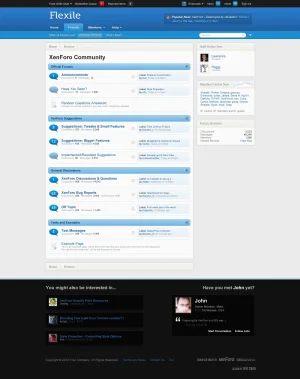
UPDATE: This is now a fully working XenForo theme, available for download here:
http://xenforo.com/community/threads/flexile.7164/
Below is the original mock-up and post, if you are interested.
Ok, so I saw a couple themes posted here, so I thought I would take a shot at developing my own. As XenForo is not yet released, this is obviously just a mockup, but I fully intend on developing it into a fully working theme with several interesting if not unique special features. Working title is "Flexile."
  Keep in mind this is the very first draft of the theme and there are probably lots of things in the mockup that can be changed or improved (I would love to hear your ideas!).

I have not developed a theme for anything before in my life, so any sort of feedback, specific, general, negative, positive, etc. is greatly appreciated. I'm not sure whether I'm going to release it for free or try to sell it. I'm planning for it to be a very flexible theme (hence the name), very customizable, and able to be used in many situations, so it should hopefully contain significant value. If I do choose to sell it (again, not decided yet), I don't want to underprice it.
What do you think of the quality and design of the theme? Assuming that the rest of the theme exhibits the same or better quality as you see in the mockup, what would you pay for such a theme, with and without the theme branding?
Thank's for all your feedback.
http://xenforo.com/community/threads/flexile.7164/
Below is the original mock-up and post, if you are interested.
Ok, so I saw a couple themes posted here, so I thought I would take a shot at developing my own. As XenForo is not yet released, this is obviously just a mockup, but I fully intend on developing it into a fully working theme with several interesting if not unique special features.

I have not developed a theme for anything before in my life, so any sort of feedback, specific, general, negative, positive, etc. is greatly appreciated. I'm not sure whether I'm going to release it for free or try to sell it. I'm planning for it to be a very flexible theme (hence the name), very customizable, and able to be used in many situations, so it should hopefully contain significant value. If I do choose to sell it (again, not decided yet), I don't want to underprice it.
What do you think of the quality and design of the theme? Assuming that the rest of the theme exhibits the same or better quality as you see in the mockup, what would you pay for such a theme, with and without the theme branding?
Thank's for all your feedback.