What you all think
You are using an out of date browser. It may not display this or other websites correctly.
You should upgrade or use an alternative browser.
You should upgrade or use an alternative browser.
music festival forum
- Thread starter SteelHouseFestivalForums
- Start date
The contrast in the colours between the lettering and background is bugging my eyes a little (but my eyes kind of suck even after spending a mint on them last winter, so maybe wait to see what others say). This is especially bad:

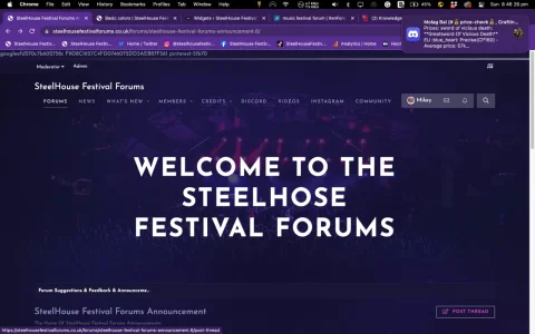
But this one, from the Travelling to the Festival forum is better.

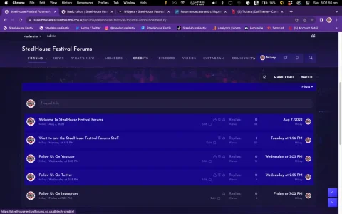
I do like the idea of a forum for an event like this. The picture at the top is nice, too. Gives a good idea at a glance that this is a music festival.
But this one, from the Travelling to the Festival forum is better.
I do like the idea of a forum for an event like this. The picture at the top is nice, too. Gives a good idea at a glance that this is a music festival.
thank you for the feedback will have a play with the colours
have had a play its more easy to read now


thank you fixed it
do the colours look better now
what colours beside blue do you think will work
thank youYeah, that's an improvement for sure.")
sorted that
thank you for the feed backKewl style. I dig itthank you for the feed
TPerry
Well-known member
One issue.... albeit minor is you don't have an favicon configured for you site int browser bar.
Also, I see this at the top of the browser window when I visit as a guest.

Other than that... IMHO you are flying WAY to many banners for the user profile
KISS applies inmost cases.

I MUCH prefer (as a user) something simpler

Also, I see this at the top of the browser window when I visit as a guest.
Other than that... IMHO you are flying WAY to many banners for the user profile
KISS applies inmost cases.
I MUCH prefer (as a user) something simpler
thank you for taking the time to have a look have removed a lot of stuff thats not neededOne issue.... albeit minor is you don't have an favicon configured for you site int browser bar.
Also, I see this at the top of the browser window when I visit as a guest.
View attachment 272090
Other than that... IMHO you are flying WAY to many banners for the user profile
KISS applies inmost cases.
View attachment 272091
I MUCH prefer (as a user) something simpler
View attachment 272092
i added a fav icon but its not working where do i need to add it
Similar threads
- Replies
- 7
- Views
- 1K
- Replies
- 1
- Views
- 2K
- Replies
- 0
- Views
- 2K
- Replies
- 0
- Views
- 784