Move "Post new thread"

Shanj

Well-known member
I keep blundering around not finding Post new thread.
It's great at the bottom of the page on the same line as the pagination.
But at top it's too far away and doesn't intuitively fit with the tabs for different places outside this thread.

I'd like it on the LEFT just before pagination - it feels logical to have making a new addition with the bit where you navigate existing stuff on this thread.

SCR attached..
 

Attachments

  • Xenforo layout.webp
    Xenforo layout.webp
    25.8 KB · Views: 45
Upvote 1
I keep blundering around not finding Post new thread.
It's great at the bottom of the page on the same line as the pagination.
But at top it's too far away and doesn't intuitively fit with the tabs for different places outside this thread.

I'd like it on the LEFT just before pagination - it feels logical to have making a new addition with the bit where you navigate existing stuff on this thread.

SCR attached..

Actually I agree. It was one of the first things I thought should be different in this UI, coming from vBulletin. See also: http://xenforo.com/community/thread...e-awkward-still.244/

The same can be said about [Post to Thread], it's there also in the upper right corner. But... I find myself now always using Quick Reply in this great UI, so I rarely click [Post to Thread]

But Shanj, then I am very curious to found out what you think about this one: http://xenforo.com/community/thread...ics.2082/#post-30259. There the position of an important button in the upper right corner is causing a problem when it comes to the UI of the Search functionality.
 
Agreed. I loved vB, pre-vb4. It just feels that some people are making suggestions because that's how it was in vB and that's what they want.
Similarities are ok, but XenForo needs to be different. Should be different.
 
How do you feel about Post-vB4 Pegster?
It's evil I tell ya!
witsend.gif
 
Please reconsider the positioning of important buttons next to breadcrumb

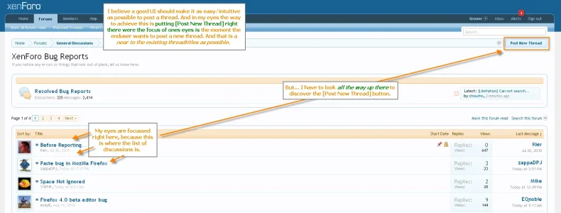
Aarghh... I just came across this same issue again (I kept searching for the [Post New Thread] a few seconds and couldn't find it!) and almost posted a new thread on it. Found this thread and decided to add this, in an attempt to explain it as clearly as possible:

post new thread.webp

I keep feeling strongly about the fact (for me at least) that the way the [Post New Thread] is positioned in XenForo makes XF harder to use then it 'should' be. I understand the vision behind positioning buttons next to the breadcrumb, but in practice this doesn't really work out that well, IMHO.

I believe the picture makes it very clear what Shanj and myself try to point out.

And like I said before, the fact that buttons are positioned way up there not only results in issues when posting new thread. It has also negative usability effect in other areas of XenForo. The Search is another important area where it 'fails' to provide a good UI for the enduser. Example: http://xenforo.com/community/thread...ics.2082/#post-30259
 
Please reconsider the positioning of important buttons next to breadcrumb

Aarghh... I just came across this same issue again (I kept searching for the [Post New Thread] a few seconds and couldn't find it!) and almost posted a new thread on it. Found this thread and decided to add this, in an attempt to explain it as clearly as possible:

View attachment 1275

I keep feeling strongly about the fact (for me at least) that the way the [Post New Thread] is positioned in XenForo makes XF harder to use then it 'should' be. I understand the vision behind positioning buttons next to the breadcrumb, but in practice this doesn't really work out that well, IMHO.

I believe the picture makes it very clear what Shanj and myself try to point out.

And like I said before, the fact that buttons are positioned way up there not only results in issues when posting new thread. It has also negative usability effect in other areas of XenForo. The Search is another important area where it 'fails' to provide a good UI for the enduser. Example: http://xenforo.com/community/thread...ics.2082/#post-30259
It should be above pagination, at least thats what I think.
 
It just feels that some people are making suggestions because that's how it was in vB and that's what they want.
Similarities are ok, but XenForo needs to be different. Should be different.

Hi Peggy,

Look at this post: http://xenforo.com/community/thread...ead.2538/#post-41403 where I provide 2 examples where the positioning of the buttons has a negative effect on the usability of the product.

It has not much (nothing actually) to do with 'how it was in vB'. It has everything to do with wanting and needing the best possible UI for this product, so I can use it on my platforms. I can tell you, that if I -as an experienced webuser- find it not quite working in practice to search for important buttons way over there in the upper right corner, then a lot of my users will feel the same. Sure, XF needs and should be different. But that doesn't mean that it should come at the cost of the usability of the product. XF is already so different and outstanding in it's entire UI that any comparison between it and other players on the market is pretty pointless. XF wins hands down. We (I speak for myself now) only provide suggestions to make the already great XF better (if M&K agree on them, ofcourse), not to make it a clone of vB in any way. On the contrary I would say, because the fact that it is so much different and therefor so much better is the reason in the first place we want to power our websites with it...

:)
 
This problem is due to the fact that there are subforums in that forum.

Yes, it does indeed. I also thought this the moment I created the screenshot. And since I will be using subforums a lot...it is yet another reason why the buttons really need to be more visible/accessible to our users/staff. And this is, IMHO, as close to the thread-titles as possible.

One has to look at the bigger picture...I don't know how 2 or 3 or 4 or x subforums will look (we only have an example of 1 subforum available), but imagine what would happen if XF displays them all below each-other in the above screenshot (which I expect)... then the [Post New Thread] will be even much further away from the actual thread list! I believe re-considering the position of these buttons will solve every single issue that comes up with the position that it has now in the current alpha 2 version of XF.
 
Hi Peggy,

Look at this post: http://xenforo.com/community/thread...ead.2538/#post-41403 where I provide 2 examples where the positioning of the buttons has a negative effect on the usability of the product.

It has not much (nothing actually) to do with 'how it was in vB'. It has everything to do with wanting and needing the best possible UI for this product, so I can use it on my platforms. I can tell you, that if I -as an experienced webuser- find it not quite working in practice to search for important buttons way over there in the upper right corner, then a lot of my users will feel the same. Sure, XF needs and should be different. But that doesn't mean that it should come at the cost of the usability of the product. XF is already so different and outstanding in it's entire UI that any comparison between it and other players on the market is pretty pointless. XF wins hands down. We (I speak for myself now) only provide suggestions to make the already great XF better (if M&K agree on them, ofcourse), not to make it a clone of vB in any way. On the contrary I would say, because the fact that it is so much different and therefor so much better is the reason in the first place we want to power our websites with it...

:)
I understand Grover, and please don't think that I was talking about you.

It is the myriad of suggestions that contain "... but vBulletin does it this way or that way, OR my users need it this way or that way because that's what they're used to", that irritate me sometimes.
 
I wouldn't like it moved to the left, and I think it is very neat design wise where it is, if it had to be moved I would want it on the right just above "watch thread" on topic view.. or the other options on forum view.
 
I understand Grover, and please don't think that I was talking about you.

It is the myriad of suggestions that contain "... but vBulletin does it this way or that way, OR my users need it this way or that way because that's what they're used to", that irritate me sometimes.

No problems, Peggy! :)
 
I wouldn't like it moved to the left, and I think it is very neat design wise where it is, if it had to be moved I would want it on the right just above "watch thread" on topic view.. or the other options on forum view.

It is 'neat' design wise yes, I can see that. But a neat design preferably must not get in the way of the usability of a product (just take a look at 'Apple' sometimes...). Putting it near 'watch thread' is already a better option indeed, because then it would not get placed further and further away from the threadtitles when you have lots of subforums. Thanks for thinking along, even if you don't agree with Shanji and mine points. Appreciated!

Still, I believe this single button is best positioned on the left, exactly there were the thread or post titles are located. Really, this is such an important button and you (generally speaking) must not 'tuck this away' somewhere were it is not in context with the things you want to do. Yes, I understand the reasons why it has been put in relation to the breadcrumb, but in practice it works much better when it is located in relation to where your eyes are. Exactly the same (or even worse) goes for the Search screen. Just take a look there and try it.
 
Top Bottom