Lack of interest Move go to Top link above quick reply box

This suggestion has been closed automatically because it did not receive enough votes over an extended period of time. If you wish to see this, please search for an open suggestion and, if you don't find any, post a new one.

Morgain

Well-known member
Small edit.
The go to Top link is very useful but it's lost down on the footer.
Once I've finished reading a series of posts to change pages using all the top navigation options I have to either scroll UP manually, or scroll DOWN to the Top link.

Please reposition the Top link on the right - ABOVE the quick reply form. That gives the choice of replying or going to the nav area for another page.
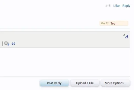
Top link.webp
 
Upvote 0
This suggestion has been closed. Votes are no longer accepted.
Why.. when the whole point of it is for when you're at the bottom of the site, so it's there to jump back to the top :rolleyes:

I have to agree. It's like the permalink, I think it looks better after the reply button rather than before the like link but it's a simple edit. Plus why clutter the bottom of the page with some 1999? when it's fine where it is. Personally, only lazy people want it a few inches up more (that sounds wrong reading it back *edit*) and I think clutter over a few inches isn't a great compromise. 2 pence and all that.
 
Why.. when the whole point of it is for when you're at the bottom of the site, so it's there to jump back to the top :rolleyes:

because the only way to get there is to look below the quick reply box and the breadcrumbs.
m y members typically don't even know it's there,
The footer bar is not a frequent use zone.

You can go to top via keyboard Home but an awful lot of users don't use keyboard commands at all.
 
because the only way to get there is to look below the quick reply box and the breadcrumbs.
m y members typically don't even know it's there,
The footer bar is not a frequent use zone.

You can go to top via keyboard Home but an awful lot of users don't use keyboard commands at all.

They use the scroll button on their mouse though? there can't be any avoiding that if i understood correctly..
 
because the only way to get there is to look below the quick reply box and the breadcrumbs.
m y members typically don't even know it's there,
The footer bar is not a frequent use zone.

You can go to top via keyboard Home but an awful lot of users don't use keyboard commands at all.
I use it a lot. Edit your site to suit.. but the standard is where it is... and since I'm pretty sure XF's byline isn't "designed to suit Morgain" I think it's fine where it is.
 
I use it a lot. Edit your site to suit.. but the standard is where it is... and since I'm pretty sure XF's byline isn't "designed to suit Morgain" I think it's fine where it is.

The standard XF is not set in stone so "where it is" does not rule out a redesign. If it were then this as a Suggestion thread would be completely pointless and illogical which XF never is.

As for XF being designed to suit me or any other single member specifically the idea is plain silly. This is a community.
However the fact that XF is not ruled by any one person's preference, is no argument against that person's suggestion being a valid one.

Again this thread exists for (small) suggestions.
 
I've been doing this for years. My users love it. I leave the default location alone and modify the templates to add it to each post. I've gotten so used to it, other sites just feel naked without it! :D


gotop.webp
 
Who needs a top button everywhere apart from the one in the footer... when you can just scroll up like you scrolled down?
 
Back
Top Bottom