Steve F
Well-known member
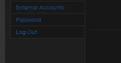
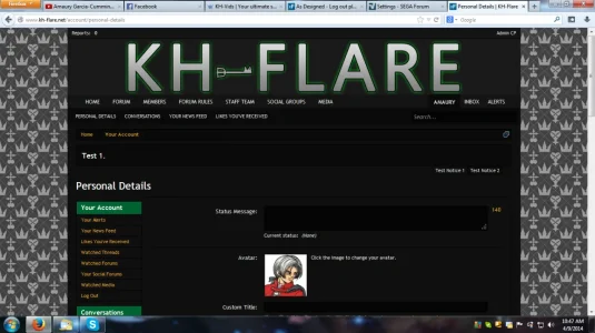
Notice the gap above the log out. It is placed in a section with no heading. Not sure if would be better placed above in the first section or just add to the CSS which is already in place. Not sure that is the best solution as it may do weird things if things are added in the future. It is just something that needs adjusting especially when the style is dark in color.

Default Style here at xf.com


Default Style here at xf.com

Rich (BB code):
.navigationSideBar .section:last-child
{
        margin-bottom: 0;
        margin-top: -10px;
}