haha agreed! And they did it left handed, with both eyes closedObviously someone who'd had one too many.
You are using an out of date browser. It may not display this or other websites correctly.
You should upgrade or use an alternative browser.
You should upgrade or use an alternative browser.
Just a Year to Go
- Thread starter Kier
- Start date
When "the dreadful logo"
You're missing the best part: The logo in color!
I remember the 2012 ZION debacle.

Iran was thinking of pulling out. [google]
Wolff Olins (http://www.wolffolins.com/)One of the worst logo's I have ever seen
Who designed that mess?!
They do some wonderful work but they missed the mark on this one sadly.Wolff Olins (http://www.wolffolins.com/)
I feel they miss the mark on many of their jobs, but I've never really liked their work (with a few exceptions). It really seems like something that was just slapped together at the last minute (They were given a year), and had really no thought put into it.They do some wonderful work but they missed the mark on this one sadly.
The logo would probably have gotten a better view back in the 80's, as it fits in nicely with Hammer pants, vivid colors, and misuse of geometric design.
haha truly! First thing I thought after saying "what the hell is this" was "my tight rolled stone washed, gap brand crotch huggers are miles better looking"The logo would probably have gotten a better view back in the 80's, as it fits in nicely with Hammer pants, vivid colors, and misuse of geometric design.
Wolff Olins (http://www.wolffolins.com/)
Worst Web Space.... EVER
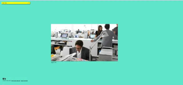
For a serious big time Brand Factory that is.. horrible colours, ugly yellow useless navigation box in the left corner just lurking annoyingly.... annoying as fluck ugly vimeo box plonked in the middle with zero thought - horrible lack of any imagination at all. Not surprising really if you look at the horrid all white work space they have to endure, it would be hard to be creative in a glossy white mouse maze.

Their work must be great in some spheres though.... surely?
All the venues are coming in under budget and ahead of schedule. Every event is a sell-out. The park looks amazing. I think it'll be an excellent games (as far as these things go. would rather spend the money on more worthwhile things).
I can't get the "dirty" interpretation of the logo out of my head
I can't get the "dirty" interpretation of the logo out of my head
Yeah its pretty bad...Worst Web Space.... EVER
For a serious big time Brand Factory that is.. horrible colours, ugly yellow useless navigation box in the left corner just lurking annoyingly.... annoying as fluck ugly vimeo box plonked in the middle with zero thought - horrible lack of any imagination at all. Not surprising really if you look at the horrid all white work space they have to endure, it would be hard to be creative in a glossy white mouse maze.
View attachment 17519
Their work must be great in some spheres though.... surely?
What I don't get is why didn't they go with the classic Olympic motif, and play off that? It wouldn't have been difficult to do, it would have presented a much more professional feel, and would have still have kept a traditional feel.
Right, but I'm sure they didn't mandate mouldy prawn crackers either, though the London 2012 logo appears to employ them as a primary design element.IOC rules are that the logo cannot use the rings as a major component of the design
Well I don't know how the London games will turn out.
What I *can* tell you...I live in Manchester, UK. In 2002 we hosted the Commonwealth Gmaes. Everyone said the same things...it'll be a disaster,etc. It was actually the most successful Commonwealth Games ever, and is widely seen as a model for how to stage such events.
So, don't write London 2012 off.
...We can keep writing the logo off though right?Well I don't know how the London games will turn out.
What I *can* tell you...I live in Manchester, UK. In 2002 we hosted the Commonwealth Gmaes. Everyone said the same things...it'll be a disaster,etc. It was actually the most successful Commonwealth Games ever, and is widely seen as a model for how to stage such events.
So, don't write London 2012 off.
Kier predicted it.Today marks the point at which we have just a year before theexcruciating embarrassmentopening ceremony of themost unmitigated sporting disaster in historygreatest show on Earth in London for the 2012 Olympic Games.
I'm sure it will be sensational.
^^^ LMFAOOOO
http://www.washingtonpost.com/blogs...de59954-df25-11e1-a19c-fcfa365396c8_blog.html
http://ohnotheydidnt.livejournal.com/70960194.html

Yooooo wtf is this lmfaoooo I'm dying.When "the dreadful logo" was mentioned I just had to check it out:

It took me a while to realize that those funky shapes are actually the numbers 2012.
This vid has me rollin http://www.thatvideosite.com/v/5852
OMG im in tears.This vid has me rollin http://www.thatvideosite.com/v/5852
Similar threads
- Replies
- 2
- Views
- 262
- Question
- Replies
- 3
- Views
- 413
- Replies
- 4
- Views
- 567