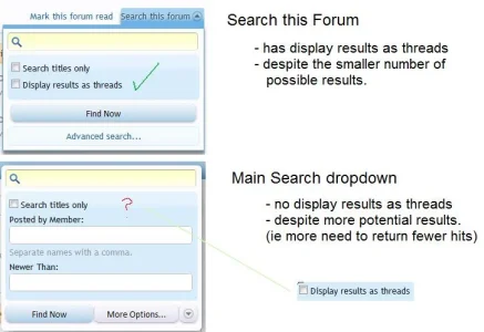
Implemented  Inconsistency in design of Search dropdowns

Grover

Well-known member
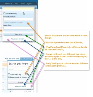
Search dropdowns are not consistent in their design:

- Blue background colours are different,

- [Find Now] and [Search]... different labels for the same button,

- Advanced Search has different font-sizes and missing (or should not be having maybe) the '...' at the end,

- 'Body' background colours are also different (white and light blue).

A picture says more then...
search.webp
 
Upvote 3
This suggestion has been implemented. Votes are no longer accepted.
Some of these differences might be on purpose/as designed, other maybe not. Either way I do not see a problem in this, but it's good to let them know of course.
 
Some of these differences might be on purpose/as designed, other maybe not. Either way I do not see a problem in this, but it's good to let them know of course.

There is no problem whatsoever, that's why I didn't report it as a bug :). Still, it is something that I recognized not to be consistent, so maybe it needs fine tuning.
 
Thats one thing i hate in software is things that are consistent.. ;)

EDIT: I think all search drop-downs should look like the main one.
 
HEY! I like the search box. LEAVE it ALONE.

Agh. Maybe make the option to reduce member search and "newer than" boxes [for people like the OP].
 
Did you actually read the suggestion?...
Yes I did. His image shows that he wants to make it less hmm...[I don't know the best word to use, but here goes nothing] "cluttered." The suggestion is to "reduce" at least one or two to a minimalist size.

I understand that the OP changed the search boxes for member search/newer than into checkboxes.

Oh, and its consistent, to me. Organized in the way that categorizes the boxes, if you ask me.

First: His, the OP ... is me ;).
Second: I am afraid you didn't understand the suggestion. Try reading it again.
 
I understand its you, I'm just trying to be nice, is all. :)

Oh, wait....You ...sneaky... runt. You were talking about the difference between the main site's search box, and "search this thread" boxes. AAAAAHHHH.....

*Defeated look, and walks away lookin' down*
 
Okay, so now that I've understood the suggestion. I think that I stay with the original statement - Why I say this, its because if Kier/Mike did change it to fit the consistency of the main search box - it would look too much of the same thing. We don't want a boring looking site, now do we? And on top of this, sometimes its confusing to distinguish between thread search, and main search. I had this confusion problem in my experience with VB.

Sometimes, in VB [doesn't matter which version between vb3/vb4] - I would click the search box for thread, when I meant to click the main one. Why? Too consistent.
 
I agree the main one looks better, but maybe the difference in color also helps to differentiate between the two? I certainly understand Carlos' point here.
 
Top Bottom