Lack of interest images blurred on larger screen-size

This suggestion has been closed automatically because it did not receive enough votes over an extended period of time. If you wish to see this, please search for an open suggestion and, if you don't find any, post a new one.

erich37

Well-known member
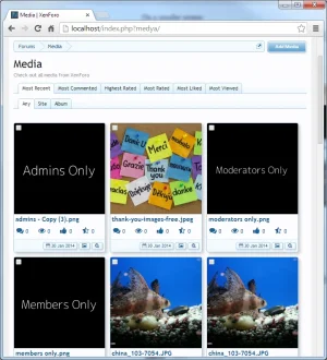
the photos are quite blurred when viewing the Media-Gallery on a bigger screen-size like e.g.: 23 inch or 24 inch screen monitor.

I guess this is because the images are originally in smaller size and then zoomed up (increased based on the screen-size).


Would it be possible to have a certain limit on how big the images are zoomed-up (width x height), but have more images displayed in the grid (more than 12) in order to fill the screen ?
 
Upvote 2
This suggestion has been closed. Votes are no longer accepted.
It is impossible to know screen size within PHP and adjust images returned. This is really something you'll usually just have to deal with in pretty much any gallery application.
 
The problem as described is most prevalent on large screens with a fluid width. I'll be the first to admit the current gallery design works better on a fixed width screen.

But, there is actually a very simple CSS solution.

Admin CP > Appearance > Style Properties > XFMG - Responsive Design

Under Settings:
Change the default items per row to a ridiculous number, e.g. 999

Under Responsive Column and Miscellaenous, add a fixed width, e.g.
width: 300px;

The end result is something like this. I created this screenshot a while ago:

upload_2014-11-16_18-17-13.webp

So the effect of the above simple changes is there is no longer a fixed number of items per row, and the items themselves are of a fixed width. This is more how it worked on very early versions of the Gallery. However, the above approach still allows the Responsive Design to kick in at the necessary points:

upload_2014-11-16_18-20-32.webp
 
thanks!

yeah, the images look fine on fixed-width-style.

Under Responsive Column and Miscellaenous, add a fixed width, e.g.
width: 300px;

I think this will work fine, setting it to 300px since all images are reduced to 300px by 300px.


But, there is actually a very simple CSS solution.

Admin CP > Appearance > Style Properties > XFMG - Responsive Design

Under Settings:
Change the default items per row to a ridiculous number, e.g. 999

just wondering:
if you set it to 999, how many images will there be displayed at 1 Page ?
 
It won't affect the number of items shown per page. It's actually just a bit of a hack to override some CSS.

Actually 999 can just be any number higher than the number of items you show per page, but it affects nothing other than making the end effect possible. (If that makes sense).
 
I was thinking along the lines of having the images as a fixed width (e.g.: width of 300px) and the grid being "responsive".
So that the number of images on the page adjusts itself towards the screen-size.

Like here:

http://xenzine.com


It does not need to be "Masonry" or endless scrolling.
 
Back
Top Bottom