XF 2.2 How to change image height in notice in html?

Black Tiger

Well-known member
I have some different html stuff which pops up at a certain time and date. I need to use notice because I want it above my forum and sidebare, which isn't possible with widgets.

Anyway, I definately don't want to use the extra.less or css for it. In the message part of notices it says "You may use HTML" so I would like to make use of that.

Normally in html, you can just use height="140" for an image.
Now I can set this to 500, it doesn't make any difference.

This is my code, what am I doing wrong? Or why does the html code not work here?
Code:
<div style="text-align:center;">   
<h2><font color="7A0000">Some text will be here</font></h2><br />
<img src="https://www.myforums.com/images/firstimage.gif" alt="firstimage" height="160" /> <img src="https://www.myforums.com/images/smalllogo-160.jpg" alt="Myforum" height="160" /> <img src="https://www.myforums.com/images/secondimage.gif" alt="Secondimage" height="160" /><br />
</div>
 
Solution
So this would mean fysically resizing all used images twice... that's odd.
Just make all your images the same size (largest you want to use) and then you can use multiple instances of the CSS code by changing the name slightly. I realise that this means adding more CSS to the extra.less file but it will work if you persevere with it. CSS is almost always preferable to HTML which is why it's used extensively.

So, to make the changes easy, just call out the scalable CSS that's applicable to your images. For example:

Code:
img.scalable1 {
    height: auto !important;
    width: auto !important;
    max-width: 100%;
    max-height: 60px !important;
}

img.scalable2 {
    height: auto !important;
    width: auto !important...
There is a height: auto; attribute set on images (for responsive purposes). Try setting a width that corresponds to the height you want instead (or resize the image itself to the desired dimensions, which is typically a better idea anyway).
 
There is a height: auto; attribute set on images (for responsive purposes).
No way to temporarily disable this? Because I have images for several purposes, especially for special days like Christmas and Easter for example. And some must not be made more wide, so that's why we cheat a little bit with the height instead of creating several images with several widths.
It is a better way, I agree but..... I'll see if I can create some extra and see if I manage to get it into the space I want.

On the other hand... is that auto height also in widgets? If not, why can't a widget be place above the forums so it gets displayed over the forums and the sidebare like a notice can?
 
You can specify an image in the notices settings:

1638718707740.webp

The image will appear above any text you add, which would be your standard HTML stuff using <p></p><br> etc. The image height will be the actual height of the image, so you will need to put multiple images that you want into one image, sizing them accordingly.

I know you prefer not to use CSS in the extra.less template, but this is needed for responsiveness, just add this:

Code:
.notice-image img {
    max-width: 100%;
    height: auto !important;
    max-height: fit-content;
}

It will adapt to whatever images you use so your varied content will remain viewable the way you want it to be.

Be sure to use the block setting in the notices.
 
Thank you very much, but since sometimes I change the images, i can't merge 3 images into one.
I've been looking at it and the main issue problem in the past was that I had some animated gifs which I couldn't get to resize without loosing animation.
However I've now found a very good resizer online which does the trick, so I decided to keep it as default as possible and use Jeremy's idea to just resize the images as the height are the same for all. And save the originals just to be sure.

However, I still might use our css code for something else, so thank you!
So I marked his as solution and upvoted yours.
 
Thank you very much
Always happy to help :)

You can also add this to your extra CSS which makes images scalable
Code:
img.scalable {
    height: auto !important;
    width: auto !important;
    max-width: 100%;
    vertical-align: middle;
}

The vertical align is optional, so delete it if it's not required. Use it in your HTML as:

Code:
<img src="https://www.myforums.com/images/firstimage.gif" alt="firstimage" height="160" class="scalable" />

The class="scalable" is what calls it. This basically honours the size of the image but makes it responsive.
 
Last edited:
You can also add this to your extra CSS which makes images scalable
Sorry to bother you again because otherwise I had to resize too many things and I loose flexibility

So I put it like this in the extra.less:
Code:
/// Banner afbeeldingen in hoogte aanpassen ///
img.scalable {
    height: auto !important;
    width: auto !important;
    max-width: 100%;
}

Then I put my image like this in the advertising html part as suggested (I would like to be able to use this in notices and advertisements):
Code:
<img src="https://www.myforums.com/images/someimage.jpg" alt="Some Image" height="90" class="scalable" />
but the image height is still 60, nothing changes.
What am I doing wrong?
 
The actual height of the actual image is 60 en the other images 62 in fact.
I use it in a div, but that's only a center div like this:
Code:
<div style="text-align:center;">

I just remembered. You can see the complete part of that html section including the div in my first post of this thread.
 
OK you're looking to make an image that is 60px in height in your code to be 90px; that's not going to work because you have created a conflict between the HTML and the CSS and the CSS is overriding the HTML because the height is being forced (the !important part) to auto, which is 60px the actual height of the image. If you want your image to be 90px then you will need to increase its physical size by upscaling it in a graphics program. There is a downside to doing this, in that the image may pixelate and look untidy. You can use bigger images than 90px and add an extra line to the CSS max-height: 90px !important; and the images will show no bigger than 90px regardless as to whether they are bigger. It won't upscale smaller images. You can lose the width and height commands in your HTML as they serve no purpose when using CSS.
 
Thank you. Then I have a problem which I never had before on any other forum software I worked with. I do like the scaling aspect but this is someting else.
I have banner which is always displayed. And at some periods.
This is displayed on various holidays combined with various pictures. Some are bigger, others are smaller. Most are bigger so they would be reduced in size. The HTML did that too with the height code.

That's exactly why I don't like to use CSS, because I don't understand these kind of things and it's not flexible enough to do what I want.
The css of max-height 90 px might be nice, but I don't want everything 90px, some things on another place I do want at 60.
So this would mean fysically resizing all used images twice... that's odd.

I never had to do that before with html. A lot of extra work for things which are only displayed a short periode of time.
I understand it doesn't scale then, but that doesn't matter a lot because they are only present for a short period of time.

Why is there no possible way, to add a banner somewhere the way I do it in my example, with just HTML code to either up- or downsize the fysical size, as it worked with all other forum software I worked with, even with IPB (where I just put it in a custom html box if I remember correctly).
It's not your fault, but I just don't understand why this isn't possible, even without your CSS code I put in.

Would it work with just HTML the way I want it if I would put it in a widget (which is kind like a custom html box like in IPB)?
And if yes, at this moment the banner is put as advertisement at the "Container content: below" position.

But I don't see that position with widgets and it must be on every page, not only the forum list.
 
So this would mean fysically resizing all used images twice... that's odd.
Just make all your images the same size (largest you want to use) and then you can use multiple instances of the CSS code by changing the name slightly. I realise that this means adding more CSS to the extra.less file but it will work if you persevere with it. CSS is almost always preferable to HTML which is why it's used extensively.

So, to make the changes easy, just call out the scalable CSS that's applicable to your images. For example:

Code:
img.scalable1 {
    height: auto !important;
    width: auto !important;
    max-width: 100%;
    max-height: 60px !important;
}

img.scalable2 {
    height: auto !important;
    width: auto !important;
    max-width: 100%;
    max-height: 80px !important;
}

These can be called in your HTML as scalable1, scalable2 etc

Just remember that whatever height you set the image must be at least that height. An example would be my site which uses an HTML front page where I assign the image size to be dependent on the <div> element and using an external CSS source rather than piling it all into the extra.less file. It's little more tricky but it works - https://rockmachine.org

1638978461878.png

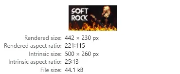
The actual image size is 500 x 260px but the rendered size to fit the <div> column is 442 x 230px

On mobile it changes again for the smaller screen:

1638978559957.png

Actual size is the same, but the rendered size decreases to fit the smaller <div> column

It's probably easier for me to get to grips with all of this as I was a website developer for 20 years before retiring.

The scalable way forward will be better for you whilst you get your head around the way the CSS system works - I'm always happy to help out.
 
Solution
Thank you again for explaining all this. I will have to read it a couple of times, I'm getting older too and only worked with minor easy css things which like center alignment. ;)

I changed solution to your post as this brings me more flexibility I guess then fysically resizing every image.

I've seen that big one at your site.
1.450px × 621px (scaled to 1.366px × 585px).

I don't fully understand everything, but I can test a bit. Just this one I wanted to ask:
Just remember that whatever height you set the image must be at least that height.
So if I set a height of 90 in my css code, the image must be at least 90px or higher but I have to loose the height and width codes, is that correct?
Would this mean, that for example my image has a height of 120, it will become 90 automatically if I use the scalable css code, like this:
<img src="https://www.myforums.com/images/someimage.jpg" alt="Some Image" class="scalable2" />
if I would use 90px instead of 80px in scalable2.

Would that be correct? Or do I need to include this in special div things? Or is my div to center things already enough?
You nailed it - that's the right approach. If you have it in CSS you don't need it in HTML, if it's not in CSS then you can use it in HTML but, it would not necessarily be responsive.

I used a lot of Project Sevens Dreamweaver addons and learned a lot about CSS structures from them. You can also visit:


There is a lot of basic info there for various elements you may wish to affect - dig into that and see if it helps. I also know what you mean about getting older (for anyone listening out there, it sucks, enjoy your youth and health while you can lol).
 
if it's not in CSS then you can use it in HTML but, it would not necessarily be responsive.
That part I don't understand, because I tried in html, but then I couldn't set the height to what I wanted. I'll try your solution. :)

The page you link to is familiar with me. I visited that one already several times when I had to find something I didn't know. Also for this, but I couldn't get the solution to work. Probably because I also used html, but even in the example within a html I did not succeed so I had to find a solution otherwise.

(for anyone listening out there, it sucks, enjoy your youth and health while you can lol).
Haha you got that right!! ;)
 
Top Bottom