You are using an out of date browser. It may not display this or other websites correctly.
You should upgrade or use an alternative browser.
You should upgrade or use an alternative browser.
Implemented Head Navigation Tab
- Thread starter bookmark
- Start date
This suggestion has been implemented. Votes are no longer accepted.
F
Floris
Guest
I think the left your account is perhaps obsolete in this concept, I really like the right dropdown.
Agree with you.I think the left your account is perhaps obsolete in this concept, I really like the right dropdown.
F
Floris
Guest
I see the left area as "the forum content navigation" and the right part to reflect as to content and account stuff, that reflects to just me.I don't use my username dropdown menu at all, much prefer those links in the header
F
Floris
Guest
I wouldn't mind if the account gets a row less, but a bit wider, so there's space for a few more links for now and the future, as well as having some info like threads/posts/trophies, .. i think it could be done without too much clutter.
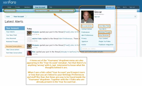
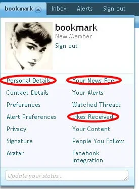
4 items out of the 'Yourname' dropdown menu are also appearing in the 'Your Account' menubar. Not that there's is anything 'wrong' with it, just interested to know what the thoughts behind it are.
When I see a link called 'Your Account' you'd expect more or less that you are linked to your Settings/Preferences and stuff like that. But these are now to be found inside the 'Yourname' dropdown. Together with the 4 links who are already present in the Your Account bar.

Actually, I have no suggestion this time, because there's not much to comment on
Brandon_R
Guest
Seems like a logical way to make the design more simple while still rataining functionality. I vote we remove the Your Account Drop down.
Just different ways to get there, I suppose
If there were a discussion to remove Your Account from the upper left navigation, I would be in favor
Nick
Well-known member
I agree, because the only link not in the username drop-down is "Personal conversations", but that's made up for with the "Inbox" link next to the username drop-down.Just different ways to get there, I suppose
If there were a discussion to remove Your Account from the upper left navigation, I would be in favor
I would at least consider it, it certainly seems redundant to me at the moment, and less things to confuse people.I too favour the removal of Your Account for its duplication.
I think this area could be improved. For instance, is there any reason to have all the user options available when viewing watched threads? I keep asking myself that.
Nick
Well-known member
It's part of "Your Account" (aka the User CP), so yes. Anything related to "you" (your news feed, watched threads, etc.) is within the your account area, which includes all of the side navigation links.I think this area could be improved. For instance, is there any reason to have all the user options available when viewing watched threads? I keep asking myself that.
Brandon_R
Guest
I have to agree on that one as there are always more than one way to accomplish something but the question we have to ask is is it the best way?IMO, good UI design provides for different ways to do the same thing, because we each think differently.
Well yes, I see the logic of course. But if you think about the basic UI 'flow' when using a forum, how often do you see Watched Threads vs all the other things that show up? In theory the Watched Threads could be in the Your Account, but also have just the Watched Threads show up when the dedicated Watched Threads button is clicked.It's part of "Your Account" (aka the User CP), so yes. Anything related to "you" (your news feed, watched threads, etc.) is within the your account area, which includes all of the side navigation links.
I really don't want to take this thread off topic too far though.
IMO, good UI design provides for different ways to do the same thing, because we each think differently.
You have said this a few times, and we disagree. I have done several case studies with users with a broad range of technical abilities, and the general results have been "the fewer ways to do things, the simpler it is for them".
.
I have done several case studies with users with a broad range of technical abilities, and the general results have been "the fewer ways to do things, the simpler it is for them".
This also makes it easier for the developers to maintain the software
Similar threads
- Replies
- 0
- Views
- 33
- Replies
- 0
- Views
- 63
- Question
- Replies
- 1
- Views
- 24
- Question
- Replies
- 1
- Views
- 50
- Question
- Replies
- 2
- Views
- 36

