Fixed  Hard to distinguish which "Tab" in profile settings is selected

Mez

Member
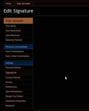
Because of the subtle blue hint not being particularly high contrast, it's hard to distinguish which "tab" in the UCP you're currently on - the most striking is the "header" yellowy colour...

This also brings to light that the "Your Account" and "Personal Conversations" and "Settings" are different colours. While, after thinking about it, "Personal Conversations" and "Settings" are styled like this to be subheadings of "Your Account" - this isn't obvious without an initial "subheading"
 
I've thought this a few times. It might make sense to have the high-contrast color (orange) be used to highlight the currently selected menu item, and use a different shade of blue or a blue background for the menu section headers.
 
Attached is a screenshot of the nav in inverted colours, which shows the lack of contrast more clearly (and is how I generally check on contrast things!)
 

Attachments

  • contrast.webp
    contrast.webp
    14.8 KB · Views: 35
By "tab" do you mean the left hand menu items?

The background colour is different, the font is larger and the menu item is written in 18pt black text at the top of the page.

I can't see the problem personally.
 
By "tab" do you mean the left hand menu items?

The background colour is different, the font is larger and the menu item is written in 18pt black text at the top of the page.

I can't see the problem personally.

Yes I do

Background colour is so close to the normal, it's indistinguishable. And the same for the font size.
 
Background colour is so close to the normal, it's indistinguishable. And the same for the font size.
That'll learn you for using a nasty Linux desktop with a horrible font renderer and broken colour management :p
 
I am a linux user and can see it fine, it is a little on the faint side but I can still see it just fine...
Perhaps I'm weighting my opinion too strongly on the ghastly mess I used to see on Mez' screen when he used to work at Jelsoft.
 
Perhaps I'm weighting my opinion too strongly on the ghastly mess I used to see on Mez' screen when he used to work at Jelsoft.

Fair enough... I know personally I haven't ever had problems with color/contrast on linux... though that may be more to do with high quality montiors that are correctly setup.
 
That'll learn you for using a nasty Linux desktop with a horrible font renderer and broken colour management :p
Well, the screenshot's there so you can comment on my kerning now, though, it has improved a lot now I'm using Gnome rather than KDE (somehow, KDE just didn't seem to do it right).

Also, not everyone has a nice fancy spectrometer to calibrate their screen with. I don't think that should be a pre-req for using XF
 
Top Bottom