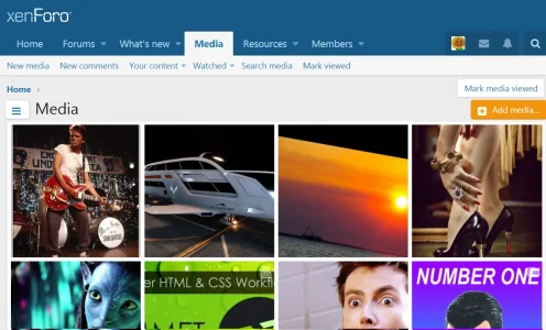
Hamburger Navigation menu - alternate location ?

Digital Doctor

Well-known member
1505149828798.webp

First off, Kudos to Xenforo Media Gallery 2.0.
The default Look is much better than 1.0.
The focus on the images vs the stats of the images is great.

But that lonely Navigation hamburger with the huuuuuge amount of greyspace around it looks awkward.

I believe the purpose of a menu is to give access to additional items but not take up alot of space. In this case, the menu takes up so much space, you could list the items of the menu in the space the menu takes up.
 
Upvote 0
Note that this also applies to Resources - there is a "Categories" submenu in the same position.

I don't think collapsing the hamburger into something that doesn't contain text is a good idea - especially since this isn't the main navigation menu - it's a specific submenu and so we need to indicate what the purpose is.

But if you include the text, it wouldn't really work to the left of the title IMO. I don't think it works to the right next to Add Media either.

I don't think it is as much of a problem on mobile devices - it works in the position it is in because it won't really fit anywhere else.

It also isn't an issue on high res tablets in landscape mode because it will actually just show the side navigation rather than the hamburger menu.

To me, it's only really an issue for tablets in portrait mode and while it does kind of stick out there a bit, I'm not sure there's really a good alternative.

I would generally want it aligned to the left of the page - directly under the title - because that's where I generally expect to find a hamburger menu, but that leaves just as much blank space.

I agree that the current positioning is not ideal - but I can't think of a better way to do it right now.

I have noticed some inconsistencies with the buttons though which is a little bit related to this - I'll post a bug report about that.
 
Further to this, I found the placing of the buttons a little inconsistent across devices.

On desktop and tablet we get this on wider screens (why can't those buttons be next to each other?):
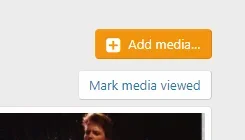
1505190364005.webp

... but this on narrower screens:

1505190483508.webp

... which is the point of this thread.

But on my mobile phone (Samsung Galaxy S6 running Chrome), I get this in portrait mode (what happened to the Mark media viewed button?):
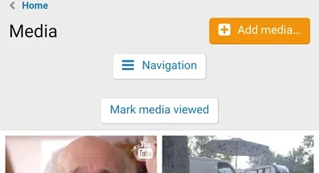
1505190571852.webp

... and this in landscape:

1505190675386.webp

... I just think all these buttons take up a lot of room and they aren't terribly consistent in location.

As discussed above - I don't really have a problem with the Navigation being in the middle, but it just looks strange the way it splits the two other buttons right now.

I recognise that they all serve different purposes ... the Add media button is supposed to be floated to the right of the title; the hamburger is in the middle because it's a menu; the Mark media viewed item is an action like we get above threads or thread lists (Watch, Mark read, etc)

So I get that Add media and Mark media viewed should be where they are for consistency. Which I guess is why the Navigation is where it is - it's below the title line, but above the action line - which is supposed to be immediately above the content.

I'm wondering whether it would be just better to left align the hamburger?

1505191030784.webp

Or how about above the title?

1505191361937.webp

... or even:

1505191401677.webp

... although I'm not sure I like that as much - leaves the title too exposed.

My vote would be the previous one - left aligned, directly above the title.

Alternatively, floated to the right of the breadcrumb, directly above the Add media button, which would save a little screen real estate:

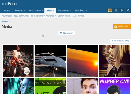
2017-09-12_14-38-43.webp
 
Last edited:
Top Bottom