Hi there,
I would like to share the custom design of my forum Gsmarthub.com!
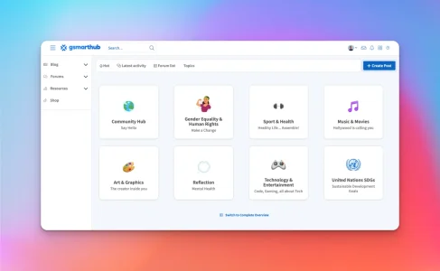
This is the simplified forum overview. Instead of an overwhelming list of nodes, the categories are divided into a grid. When a user clicks on a category, a modal will open up with the nodes inside that block. However, users can still switch to a complete overview.
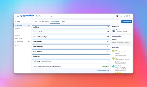
This is the complete overview. To still keep it easy on the eyes, you can collapse the category.
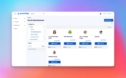
You can buy badges!
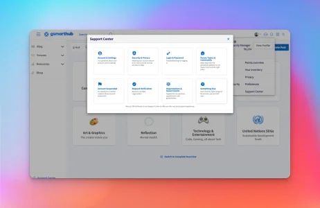
And of course, there is a Support Center!
Looking forward to your feedback!
I would like to share the custom design of my forum Gsmarthub.com!

This is the simplified forum overview. Instead of an overwhelming list of nodes, the categories are divided into a grid. When a user clicks on a category, a modal will open up with the nodes inside that block. However, users can still switch to a complete overview.

This is the complete overview. To still keep it easy on the eyes, you can collapse the category.

You can buy badges!

And of course, there is a Support Center!
Looking forward to your feedback!