Grandyo.com forums - layout opinions please.

mightlife

Member
Hi Xen people,
I have enjoyed setting up a 1.4 installation for the company at which I am (trying to be) a Community Manager.

We don't have any real discussion at the moment, and need to get things happening. I wondered whether the problem might be the way I have laid out the forum and would value your feedback about it - and any other aspect of the site (should you wish).

The topic of the site is not really the discussion (I don't want this post to turn into self-promotion), but if you're interested, our aim is to deal in the crowd sourcing of assets (3D, concept art, music and the like) for video games and their promotion.


Please take a look at www.grandyo.com/forum


Any feedback is much appreciated,
Garret
 
I would recommend eliminating all th eempty white space (see image).
Hello Goodfella, thanks for the comment.
Yea, it's something that the web developers are looking into, the footer to the Xenforo installation is also missing - no links to contact us, help or RSS etc.

Any thoughts on the way the Nodes are organised? I am worried that there is too much content or it's too confusing and might keep members from posting - we have 35 or so, but they're not posting.

Any comments continue to be appreciated :)
Many thanks,
G
 
@mightlife, please ensure the XenForo copyright is restored as soon as possible.

It is a breach of the terms of license to remove it without the branding free option.
 
@mightlife, it looks like your forum is embedded in an iFrame with a static height of 2000px, which would explain the excessive whitespace. Whilst that is a quick and easy way to maintain the header and footer from your main website, it also has the side effect of making it slightly harder to share forum links as the address bar remains static whilst browsing your forums.

Node sections look good, but maybe consider renaming "General Discussion" to "Grandyo Discussion" as in its current form that may imply it's an off-topic section.

Also your node description bubbles appear to be missing a border on the end tip:
speech-bubble-tip-missing.webp
 
Last edited:
@mightlife, it looks like your forum is embedded in an iFrame with a static height of 2000px, which would explain the excessive whitespace. Whilst that is a quick and easy way to maintain the header and footer from your main website, it also has the side effect of making it slightly harder to share forum links as the address bar remains static whilst browsing your forums.
View attachment 89781

Thanks for your comment @Optic, it is much appreciated.
Indeed, not being the web developer who is trying to integrate the Xenforo with our main site can lead to some 'difficulties' and delays addressing issues, such as those pointed out (especially by @Brogan). Sadly, I am not in the position to make such changes, but only have control over the layout of the Nodes, Resources and other Forum SuperAdmin-type abilities.

Optic said:
Node sections look good, but maybe consider renaming "General Discussion" to "Grandyo Discussion" as in its current form that may imply it's an off-topic section.
Thanks. I'll certainly consider renaming the Discussion category, good point.

Optic said:
Also your node description bubbles appear to be missing a border on the end tip:
I must admit, despite looking, I can't seem to find where to add the border to the tooltip arrow.

Any ideas for getting our current members to actually say anything (short of sending out a mass PM)?
Cheers,
G
 
Not responsive? Have a look at the site on mobile....

Personally I would fire those "web developers", get a good theme from here and start the styling afresh. Looks like they have no idea what they are doing.
 
Not responsive? Have a look at the site on mobile....

Personally I would fire those "web developers", get a good theme from here and start the styling afresh. Looks like they have no idea what they are doing.
Haha, thats what I was thinking. However, I remember something like this happening to me and a few users as well a long time ago. Had something to do with the Facebook plugin. We put it in a small iframe and it started working again. Don't know if thats your problem but yeah...
 
Not responsive? Have a look at the site on mobile....

Personally I would fire those "web developers", get a good theme from here and start the styling afresh. Looks like they have no idea what they are doing.
Thanks for the reply @tajhay. I'm interested in what it is that brings you to that conclusion.
Is is the iframe issue, a mobile problem or the theme/ styling?

I'd like to get a custom theme for the installation, but that's not my decision.

Haha, thats what I was thinking. However, I remember something like this happening to me and a few users as well a long time ago. Had something to do with the Facebook plugin. We put it in a small iframe and it started working again. Don't know if thats your problem but yeah...
Thank you for commenting @Summit. I have added Facebook (and G+ and Twitter) integration, do you think it would make a difference to the display of the site if it were removed?

Thanks again all for your comments!
 
I'm interested in what it is that brings you to that conclusion.
Is is the iframe issue, a mobile problem or the theme/ styling?
Have you actually looked at the site on a mobile? Its quite evident what the issues are.

What exactly is the purpose of the iframe? Its ridiculous. Get rid of it. I have yet to see another site using that, and it makes bookmarking certain sections of your site a nightmare. WHY would you do that. It makes zero sense. What exactly is the 'problem' with the 'facebook plugin'? Are you talking about the core? Yet to encounter the issue on another site that would make a forum owner go towards an iframe.

I'd like to get a custom theme for the installation, but that's not my decision.
Why couldnt you get a theme from here and customise it further to suit your needs? Its hella cheap. i.e. UI.X is around 30 USD. Your customisations are simply and mostly graphic and could easily have been done yourself by modifying such a theme. Your 'web developers' are taking you for a ride. They have no idea what they are doing.
 
I can't agree more with what @tajhay said. I don't see the point including XenForo in a iframe when almost all the rest of your website can be handle by XenForo itself (pages + few addons like Node as Tabs to manage your navbar). It's also possible to just move the forum to an other directory and keep the rest of your site the way it is now (and of course, adapt the theme to suits your needs)

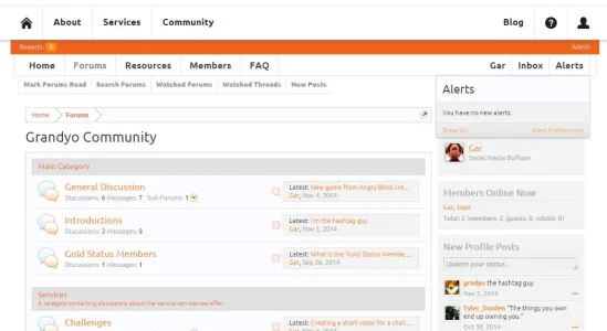
I don't know how much you paid and for how long those web devs' are working on your site but I made a try with UI.X and it took me 30 minutes to do that without editing a single template but only properties :

-> http://puu.sh/d3Fzd/8e637ceb5c.png
-> http://puu.sh/d3FzN/7d67545c5a.png

However, I have checked the rest and it looks fine ;)
 
Last edited:
Have you actually looked at the site on a mobile? Its quite evident what the issues are.

What exactly is the purpose of the iframe? Its ridiculous. Get rid of it. I have yet to see another site using that, and it makes bookmarking certain sections of your site a nightmare. WHY would you do that. It makes zero sense. What exactly is the 'problem' with the 'facebook plugin'? Are you talking about the core? Yet to encounter the issue on another site that would make a forum owner go towards an iframe.

Why couldnt you get a theme from here and customise it further to suit your needs? Its hella cheap. i.e. UI.X is around 30 USD. Your customisations are simply and mostly graphic and could easily have been done yourself by modifying such a theme. Your 'web developers' are taking you for a ride. They have no idea what they are doing.

Mobile? - Certainly I have looked at it I did a double check when you mentioned it previously and apart from the white space caused by the iframe, I can't see any problems, if there are other, please do point them out.
iframe? - It's not ideal, that's for sure, but as I said, I don't have control over the coding of the site as a whole nor of the XF installation.
FB 'plugin' (integration) - @Summit mentioned that he had experienced a problem similar to mine when using an FB plugin, although yes, I have only added the required FB dev ID (or whatever it's called, can't remember, who cares) to the core.
theme - I could get a free one that's true, getting a paid one is, as I said, not my decision in the company, even for $30. The simple customisations are my work - not the best I'll admit, but passable for the time being IMO. However, even if I were to get a theme, I don't see how that would resolve the iframe issue as it stands - or am I missing your point? (which is entirely possible ;) )

I can't agree more with what @tajhay said. I don't see the point including XenForo in a iframe when almost all the rest of your website can be handle by XenForo itself (pages + few addons like Node as Tabs to manage your navbar). It's also possible to just move the forum to an other directory and keep the rest of your site the way it is now (and of course, adapt the theme to suits your needs)

I don't know how much you paid and for how long those web devs' are working on your site but I made a try with UI.X and it took me 30 minutes to do that without editing a single template but only properties :

-> http://puu.sh/d3Fzd/8e637ceb5c.png
-> http://puu.sh/d3FzN/7d67545c5a.png

However, I have checked the rest and it looks fine ;)

Thanks for taking a look @HitArrowLegend, but as comprehensive and flexible a piece of software XF is, it could not do everything we need for the site; certain things could probably be brought under the umbrella of XF with the use of a good theme, a portal plugin etc, but not everything.
But as I mentioned, it's not within my remit to make such modifications.

I like what you have done with UI.X, perhaps it is what we're looking for, although we would need the footer (in your second image) at the bottom of the page ;)

Uix is great. Maybe its time to fire your webdevelopers. If you need theme customization talk to @thejackarmy
Thanks for the recommendation @Goodfella
 
Thanks for taking a look @HitArrowLegend, but as comprehensive and flexible a piece of software XF is, it could not do everything we need for the site; certain things could probably be brought under the umbrella of XF with the use of a good theme, a portal plugin etc, but not everything.
But as I mentioned, it's not within my remit to make such modifications.

That's why I said it was possible to move the forum in a separate folder and adapt the theme to suit your site, without using iframe :)

I like what you have done with UI.X, perhaps it is what we're looking for, although we would need the footer (in your second image) at the bottom of the page ;)

You can put the footer where ever you like. It's just CSS ;)
 
Mobile? - Certainly I have looked at it I did a double check when you mentioned it previously and apart from the white space caused by the iframe, I can't see any problems, if there are other, please do point them out.
iframe? - It's not ideal, that's for sure, but as I said, I don't have control over the coding of the site as a whole nor of the XF installation.
FB 'plugin' (integration) - @Summit mentioned that he had experienced a problem similar to mine when using an FB plugin, although yes, I have only added the required FB dev ID (or whatever it's called, can't remember, who cares) to the core.
theme - I could get a free one that's true, getting a paid one is, as I said, not my decision in the company, even for $30. The simple customisations are my work - not the best I'll admit, but passable for the time being IMO. However, even if I were to get a theme, I don't see how that would resolve the iframe issue as it stands - or am I missing your point? (which is entirely possible ;) )


Thanks for taking a look @HitArrowLegend, but as comprehensive and flexible a piece of software XF is, it could not do everything we need for the site; certain things could probably be brought under the umbrella of XF with the use of a good theme, a portal plugin etc, but not everything.
But as I mentioned, it's not within my remit to make such modifications.

I like what you have done with UI.X, perhaps it is what we're looking for, although we would need the footer (in your second image) at the bottom of the page ;)


Thanks for the recommendation @Goodfella
I said I had a problem with a plug-in at the time. It was fixed shortly after, but we put the plug in only into the iframe, then removed it once a solid fixe came. I now do agree with @tajhay about the whole getting a new theme. This just might not be working out in the end.
 
Very nice logo. My suggestion would be only keep one orange link color, the reddish one. right now you got 2 orange links. its not mixing in my eye.
Keep either one. Another one change to black or dark grey.
 
Mobile? - Certainly I have looked at it I did a double check when you mentioned it previously and apart from the white space caused by the iframe, I can't see any problems, if there are other, please do point them out.
It is not responsive. It is not user friendly at all as you cant even see any content without swiping down and then to the right. Its really really bad. Can only imagine how Google will treat you guys in regards to SEO since it has started putting more emphasis on usability and mobile responsiveness. I just dont understand...WHY?
iframe? - It's not ideal, that's for sure, but as I said, I don't have control over the coding of the site as a whole nor of the XF installation.
Then who made the decision to make it an iframe? Its pointless. Whoever made the decision has no idea on what they are doing.
FB 'plugin' (integration) - @Summit mentioned that he had experienced a problem similar to mine when using an FB plugin, although yes, I have only added the required FB dev ID (or whatever it's called, can't remember, who cares) to the core.
Never heard of it before, and as always the staff at this site should be able to assist you with their software, without ever having to go the path of an iframe just because you want fb integration which is built into the core.
theme - I could get a free one that's true, getting a paid one is, as I said, not my decision in the company, even for $30. The simple customisations are my work - not the best I'll admit, but passable for the time being IMO. However, even if I were to get a theme, I don't see how that would resolve the iframe issue as it stands - or am I missing your point? (which is entirely possible ;) )
I dont think you are getting the message. A forum is useless without content. If a forum is very low on usability, there will be very little content on there. Design means very little. You will see numerous successful big boards who have done very little customisation if at all, but have aimed to give their user the best experience. Your site isnt even responsive! This is 2014 not 2001!

Put your site into default style and see what works. Does responsive work then? If not, why not? I strongly suspect your 'web devs' are chopping and making changes to the xenforo codes rather than actually creating a theme. If so you guys will have a myriad of problems when it comes to updating xenforo in the future, and lord knows what will happen if you try to upgrade to xenforo 2.

Everything custom you guys have done, could have been done within the xf space.

Save yourselves the hassles. Wipe out everything thats been done. Fire your web devs. Buy a $30 theme from here. Customise it and go from there. Oh and have someone incharge who understands things. Not sure how many people involved currently do, iframe and turning off responsive mode should never have been a consideration. Create your site for usability not making it look pretty.
 
Last edited:
Thanks for your input @tajhay , but repeating that I should fire the web devs is not really constructive as there is nothing I can do about that, forgive me if I hadn't made that clearer beforehand. I appreciate your comments, but perhaps you're taking this a little too seriously.

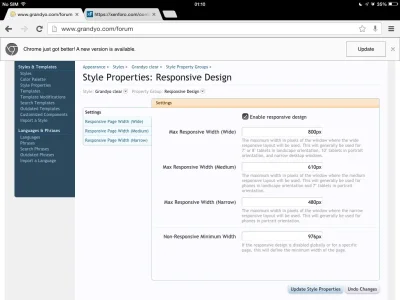
If by 'responsive' you mean the 'responsive mode', then, yep, it has been enabled (I have never touched that check box - see attached screenie from my iPad).
The XF displays fine on both Safari & Chrome on my iPad, although a zoom out is required on Chrome on the Moto G (Android). The forum displays just as this one does given the fact that the only customisations made to the colours/ fonts etc and four addons - Online Status Ribbon, XF Resource Manager, Soundcloud and FAQ Manager.

There has been no customisation /'chopping' of the XF code by anyone.

I agree with you about usability, I can feel the Jakob Nielsen flowing through you! ;)
I'm having to make the best with what is available at the moment.

@napy8gen thank you, the logo was crowdsourced - we like it too. I'll certainly take the link colour point into consideration - in fact, I'm not sure what I there actually meets the style guide for the site, so yea, a change is at hand :)
 

Attachments

  • image.webp
    image.webp
    52.1 KB · Views: 14
Top Bottom