Flat Awesome - PixelExit.com [Deleted]

Great theme, works really well.

On the current visitors page the online statistics block 2 of the lines have icons and 2 don't, I assume that's intentional. Is it easy to add icons for the other lines

http://msownersclub.com/online/

Easiest way on that one would be something like this:

Code:
.online_list #boardStats dl:nth-of-type(2) dt:before {
  content: "\f118";
}

.online_list #boardStats dl:nth-of-type(3) dt:before {
  content: "\f013";
}

Robots and guests have the same class name in regards to a selector.
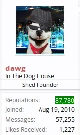
 
Russ, The only little thing i see is that the user name is partly covered by custom titles. Is this an easy adjustment? Thanks.

user.webp
 
Ya it's fixed in the next version but you can add some bottom padding to it:

Style Properties -> Message Elements -> Author Username(like 4px)
 
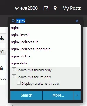
for search box getting black text on black background

if you change the ctrl text colour to white, then the other search inputs are white text on white background

search_blacktext_blackbackground_00.webp
 
@Proutie87 by default it uses a text based logo which you can edit via: style properties -> flat awesome

You can also disable the text based logo to use an image.
 
There is a little problem with quote "click to expand":

View attachment 77967

Try this in extra.css for now:

Code:
.bbCodeQuote .quoteContainer .quoteExpand.quoteCut
{
   background: -moz-linear-gradient(top,  rgba(244,244,244,0.75) 0%, rgba(244,244,244,1) 100%); /* FF3.6+ */
   background: -webkit-gradient(linear, left top, left bottom, color-stop(0%,rgba(244,244,244,0.75)), color-stop(100%,rgba(244,244,244,1))); /* Chrome,Safari4+ */
   background: -webkit-linear-gradient(top,  rgba(244,244,244,0.75) 0%,rgba(244,244,244,1) 100%); /* Chrome10+,Safari5.1+ */
   background: -o-linear-gradient(top,  rgba(244,244,244,0.75) 0%,rgba(244,244,244,1) 100%); /* Opera 11.10+ */
   background: -ms-linear-gradient(top,  rgba(244,244,244,0.75) 0%,rgba(244,244,244,1) 100%); /* IE10+ */
   background: linear-gradient(to bottom,  rgba(244,244,244,0.75) 0%,rgba(244,244,244,1) 100%); /* W3C */
   filter: progid:DXImageTransform.Microsoft.gradient( startColorstr='#bff4f4f4', endColorstr='#f4f4f4',GradientType=0 ); /* IE6-9 */
   color:  @facolor2;
   font-size: @fafontsizes;
   line-height: 0;
   padding-top: 69px;
   font-weight: bold;
}

I'll see about a better fix but that uses a transparent css gradient.
 
I would almost say the template needs to be changed itself.

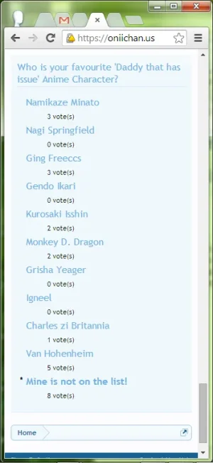
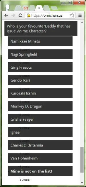
It looks like those options are using an h3 tag which is the default sidebar block heading.

So any styling you do to the sidebar BLOCK HEADING would trickle down to those options. Probably should switch the template h3 to an h2.
An easy fix, just remove background-color for h3, and tweak the margin. :D
 
An easy fix, just remove background-color for h3, and tweak the margin. :D

Can do that, but it won't change in the default release. Again I'd honestly suggest to the owner(maybe xfrocks not sure who's it is) to change it out of the h3 tags.
 
Can do that, but it won't change in the default release. Again I'd honestly suggest to the owner(maybe xfrocks not sure who's it is) to change it out of the h3 tags.
Yeah, you right. It's xfrocks addon. I've change wf_widget_poll_block_result from h3 to h2 like you said:

Code:
<h2 class="optionText" {xen:if $response.hasVoted, 'title="{xen:phrase your_vote}"'}>
                {$response.response}
            </h2>

Better solution.
 
Top Bottom