You are using an out of date browser. It may not display this or other websites correctly.
You should upgrade or use an alternative browser.
You should upgrade or use an alternative browser.
Flat Awesome + - PixelExit.com [Deleted]
- Thread starter Russ
- Start date
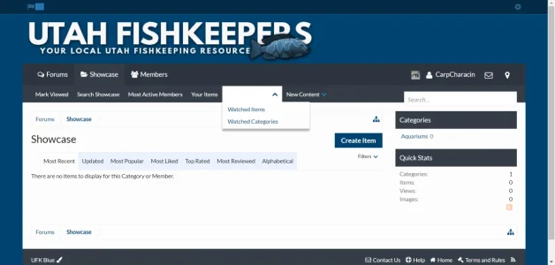
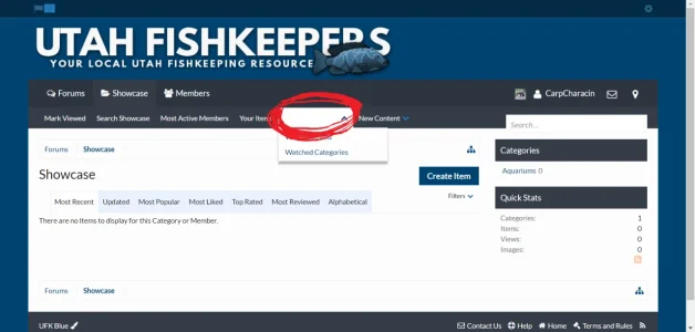
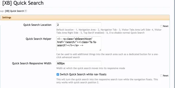
Also, in the quick search options, the switch quick search while nav floats option, along with position number 2, doesn't seem to generate any icon in the nav bar for search:

two more questions:
how do i center the text logo on mobile dependent up on the phone screen width?
is there an option to change the font awesome icons to the left of the nodes yet or does that have to be done with code still? if yes to either, how to do i go about this? i'd like to finally get rid of the bubbles.
Last edited:
Found another one - we use the CTA Featured threads home page, with widgets. If I set the Option for the off canvas sidebar, it completely breaks the page and you can't even see the navigation at all.
Also, in the quick search options, the switch quick search while nav floats option, along with position number 2, doesn't seem to generate any icon in the nav bar for search:
View attachment 143672
View attachment 143673
two more questions:
how do i center the text logo on mobile dependent up on the phone screen width?
is there an option to change the font awesome icons to the left of the nodes yet or does that have to be done with code still? if yes to either, how to do i go about this? i'd like to finally get rid of the bubbles.
For the logo, just use a media query at your desired width:
Code:
@media (max-width:@maxResponsiveWideWidth) { .Responsive #logo { float: none; margin: 0 auto; } }You can set your font awesome icons for the nodes here: Style Properties -> Node Icons
Just use the same setup:
http://fontawesome.io/cheatsheet/
As for the quick search, make sure the sub-nav is floating too: Style Properties -> [XB] Header and Navigation
I think that featured tag probably has a style property for it in the add-on. I can provide a fix though with a login. As for the off-canvas problem is it only doing it on a single page?
Yep. It completely kills the cta featured threads home page because i have widgets on it at the top center. if you want to login and take a look, shoot me a message.I think that featured tag probably has a style property for it in the add-on. I can provide a fix though with a login. As for the off-canvas problem is it only doing it on a single page?
i seem to have killed off dates on the posts somehow. where would i find the setting for that?
Edit: if I turn off the message header, the date mysteriously shows back up. If I leave it on it disappears from the header and does not show up in the post by the message controls.
message header on

message header off

Last edited:
Yep. It completely kills the cta featured threads home page because i have widgets on it at the top center. if you want to login and take a look, shoot me a message.
i seem to have killed off dates on the posts somehow. where would i find the setting for that?
Edit: if I turn off the message header, the date mysteriously shows back up. If I leave it on it disappears from the header and does not show up in the post by the message controls.
message header on
View attachment 143675
message header off
View attachment 143676
We actually disabled the date in the footer if the header is enabled to avoid the duplicate info. Are you hiding the date in the header using CSS?
nope. it just up and disappeared after the update and I haven't been able to figure out what the hell happened to it.We actually disabled the date in the footer if the header is enabled to avoid the duplicate info. Are you hiding the date in the header using CSS?
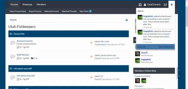
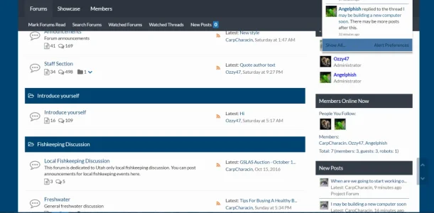
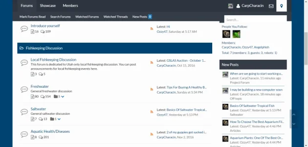
That is expected behavior and not really sure why anyone would want it to be open when scrolling.I have the sticky navigation enabled. When I scroll down, the alerts menu dose not stay.
View attachment 143737 View attachment 143738 View attachment 143739
How is it expected?
Because these menus are not expected to scroll the page with the user. We don't do anything extra with them, again I'm not sure why anyone would want the menu open when scrolling.
Close the menu, scroll down and re-open the menu, does the menu open in the correct location?
Close the menu, scroll down and re-open the menu, does the menu open in the correct location?
Yes.
I noticed a problem with the sticky navigation and the sticky sidebar. The sticky navigation covers the top of the sticky sidebar when scrolling down. It just does this when scrolling down, not scrolling up.
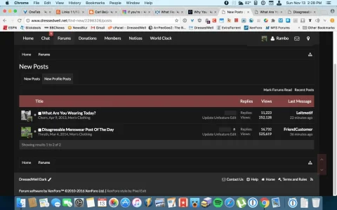
Is anyone using the dark theme with a different color than the default red? Just fishing for ideas on what might look good there. I was thinking some kind of grey but the contrast is REALLY hard to nail down.
I didn't try to make the screenshot huge. The white covers the text in the drop down menus on showcase.
Similar threads
- Replies
- 136
- Views
- 11K
