Flat Awesome + - PixelExit.com [Deleted]

Not sure I understand, are you wanting the sub-nav to float as well? There's an additional option below the float navigation option: Enable Floating Sub-Nav Bar
Maybe this will help. Here's a shot with floting nav bar on and make entire navigation button a dropdown on, but disable sub navigation off.

Here it is before the scroll down, showing the sub-navigation for the forum link:
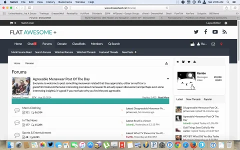
4.webp

And here it is scrolled down so the nav is floating. I have the cursor on the forum link but there's no way to access the sub navigation links:
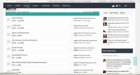
5.webp

Now here it is with the same first two options on, as well as the disable sub-navigation on. You'll notice how the forum sub links kick in here:
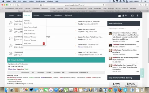
6.webp

Shouldn't it be able to do that without completely disabling sub-navigation, so that at the top of the page the forum will show sub navigation but when I scroll down it will condense into a dropdown menu like the other tabs do. Otherwise, there's no way to access the new posts buttons and whatnot.
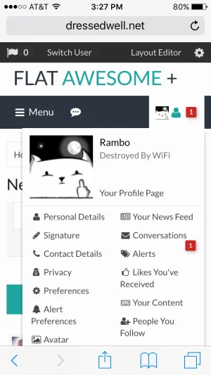
 
For the font awesome icons... no logical way of using CSS for it because the links have no classes. You can replace the entire navigation_visitor_tabs with the attached txt file code.
This was perfect, thank you. I modified the logout button to get a link there as well if it helps:
Code:
<li><a href="{xen:link logout, '', '_xfToken={$visitor.csrf_token_page}'}" class="LogOut"><i class="fa fa-sign-out fa-fw"></i>{xen:phrase log_out}</a></li>
         </ul>
 
This was perfect, thank you. I modified the logout button to get a link there as well if it helps:
Code:
<li><a href="{xen:link logout, '', '_xfToken={$visitor.csrf_token_page}'}" class="LogOut"><i class="fa fa-sign-out fa-fw"></i>{xen:phrase log_out}</a></li>
         </ul>

If you have any other plugins that add links there you'll need to modify the template it comes with to put in the fa-icon there as well just as a heads up.

Regarding the floating nav... it's really as designed unfortunately. The subnav functions in two ways essentially, one is tablinks where it is the bar itself when the tab is selected. The other is as a menu, basically if you want to float just the main nav and not the sub-nav but still have a dropdown available then every single selected navigation link would need double the sub-navs loading, one bar and one menu which isn't possible without major edits.

That being said... I've added some helper templates into the navtabs and visitor tabs to where you could add a recent posts link on the end of the navigation and do a nice little effect to show when it's in floating status if you wanted too. The templates are in the next update.
I get the concept but its weirdly implemented in the system. If I allow the subnav but then float the nav bar I can't access the subnav features unless I scroll all the way up to the top of the page. This makes it more difficult on mobile as well. Personally I'd just like to be able to access the New Posts button without having to click around too much, so I guess I'll have to kill the subnav function. Sometimes you just have to compromise.

Can you explain how to change the node and sub-node icons on the forum list? I'm a little confused with the options in there.
 
Last edited:
I get the concept but its weirdly implemented in the system. If I allow the subnav but then float the nav bar I can't access the subnav features unless I scroll all the way up to the top of the page. This makes it more difficult on mobile as well. Personally I'd just like to be able to access the New Posts button without having to click around too much, so I guess I'll have to kill the subnav function. Sometimes you just have to compromise.

Can you explain how to change the node and sub-node icons on the forum list? I'm a little confused with the options in there.

Essentially it really comes down to having a lot of options I'd say. We could of just forced users to float the navigation and sub-nav but instead gave options because we find different setups can benefit from each.

I'm a huge fan of New Posts link which is why I added it by default for the off-canvas menu :D. Another thing I do a lot is remove it from the sub-nav and put it in the main nav:
https://gamerexit.com/ (wip)


As for the node icons, pretty straight forward, all options are in: Style Properties -> Node Icons

If you're using Font Awesome icons make sure the top check box is checked obviously :D, you can edit the class names there: http://fortawesome.github.io/Font-Awesome/cheatsheet/

If you decide to use a normal sprite, just disable the font awesome node icons and use the Node Icon: Forum/Unread Forum/Page/Link on the left side.

You can use CSS to achieve some simple icons on the sub-nodes

https://xenforo.com/community/threads/flat-awesome-pixelexit-com.78151/page-33#post-1009109
 
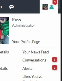
Interesting... did you make any changes to the alert bubbles by chance? The positioning of them isn't like that on a stock install:

Screenshot_10.webp
 
@Rambro What Donation add on are you using in the photo you posted here: #post-1010639

For the font awesome icons... no logical way of using CSS for it because the links have no classes. You can replace the entire navigation_visitor_tabs with the attached txt file code.
I was able to get all the icons put in (found codes in another thread that I think you helped) but I had to add the FA icons to the Post Ratings by going into that specific template. Probably just my OCD, but where the text starts (Ratings Received/Ratings Given) is closer to the icons than any of the other ones. Do you happen to know how I can fix this?
wpMqBLY.jpg
 
@Rambro What Donation add on are you using in the photo you posted here: #post-1010639


I was able to get all the icons put in (found codes in another thread that I think you helped) but I had to add the FA icons to the Post Ratings by going into that specific template. Probably just my OCD, but where the text starts (Ratings Received/Ratings Given) is closer to the icons than any of the other ones. Do you happen to know how I can fix this?
wpMqBLY.jpg
Robbo's Donation Manager.
 
Have you guys using the theme noticed that its really hard to make out links and tags because the font contrast isn't high/sharp/deep enough?
 
Have you guys using the theme noticed that its really hard to make out links and tags because the font contrast isn't high enough?

Changed in 1.5.3 already: Style Properties -> Message Elements -> User-Generated Link,

Or search ugcLink in the admin cp.
 
Changed in 1.5.3 already: Style Properties -> Message Elements -> User-Generated Link,

Or search ugcLink in the admin cp.
Lol. I should have known you'd be on top of that. I just noticed it the other day after I posted a link and couldn't find the damn post with it because I couldn't see it.
 
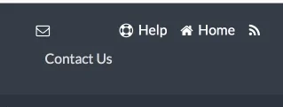
Installed the update. The bug where the contact us link sits blow the line of the other links is still there. The same way with the custom themes as well.

9.webp
 
That's probably the rellect mobile addon I'm assuming? I'll install it today and look at a fix for the addon
 
That's probably the rellect mobile addon I'm assuming? I'll install it today and look at a fix for the addon
Looks like it. I just deactivated it and the link got back in line.

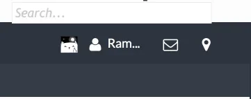
I also tried out the new quick search locations and they're still acting a bit funny. The 2-navigation tab one still sits slightly below the nav bar line, and the two visitor tab options look a bit weird.

2 - 3.webp

4 - 1.webp

5 - 2.webp

They look screwed up on mobile as well - the icon is up in the logo.
 
Looks like it. I just deactivated it and the link got back in line.

I also tried out the new quick search locations and they're still acting a bit funny. The 2-navigation tab one still sits slightly below the nav bar line, and the two visitor tab options look a bit weird.

2 - View attachment 123509

4 - View attachment 123510

5 - View attachment 123511

They look screwed up on mobile as well - the icon is up in the logo.

I'm going to say you more than likely have an outdated property/template. Just ran through all of the search options again and they appear to be working perfectly in all positions, responsive as well.

One think you may need to do:

Style Properties: [XB] Quick Search

Go through and revert: Quick Search CSS and QuickSearch Placeholder
I'll delete them and reinstall. Will report back.
 
Top Bottom