• This forum has been archived. New threads and replies may not be made. All add-ons/resources that are active should be migrated to the Resource Manager. See this thread for more information.

First Look: Editor icons

Shelley

Well-known member
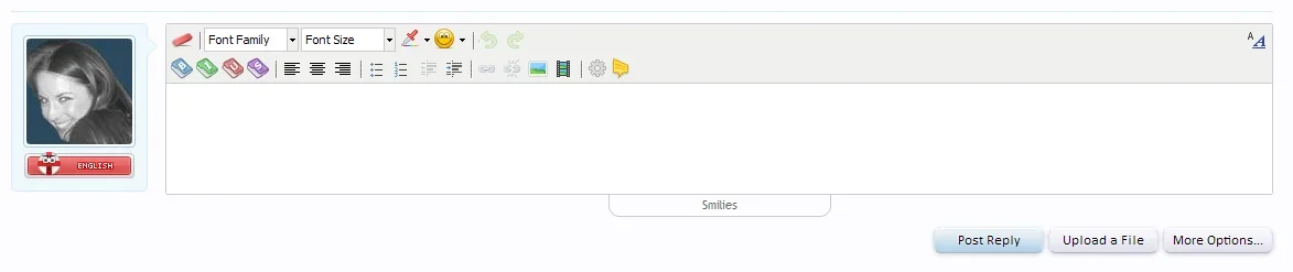
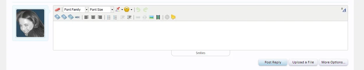
These are rushed so bare that in mind and I see these icons as a temporary solution until I can spend more time on them.

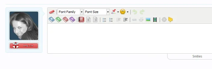
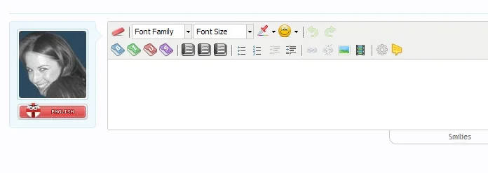
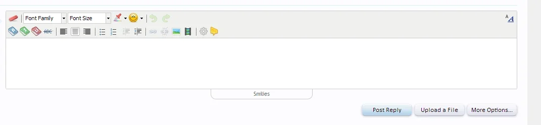
Firstly I really hate the look of the whole editor icons so started some new ones with the alignment icons only need designing from the screenshot. Another thing I did was renamed the style sheet from .gif to png because when curved graphics are deployed the gif format really doesn't induce those jaggy areas. Problem with that (not a problem really) is I had to change the icons.gif extension in the editor_ui.css template. There are 4-5 instances of the .gif extension you'll have to change pending you want to use these when I release them.

I kept the existing link/unlink icons in as I felt these looked good and fitted in with the theme so those and the alignment icons thus far are the only things i didn't design but I will be replacing the alignment icons with my own design.

Anyway, they aren't that great, they're rushed but once I can spend more time with it I'll produce a visually better set. Screenshot below.

mkklm1.png
 

Attachments

  • editor_icons_xenforo.webp
    editor_icons_xenforo.webp
    9.9 KB · Views: 34
They look great.
I think the code one doesn't really represent code though :/.

Whenever I see these coding sites the owners of those sites always or at least majority of the time associate and use the cog icon. I'll re-visit that though and see what I can come up with. in the meantime, I re-coloured the bold, italic and underline icons so they are different colours rather than them being all the same colour. (Update Screenshot Below)
 

Attachments

  • editor_xenforo2.webp
    editor_xenforo2.webp
    8.2 KB · Views: 42
I chatted with kier last night about this and since the style sheet is .gif I mentioned about the possibility of changing it to .png so at least the majority of the .gif instances I mentioned in this thread won't need changing. However, there will be one template change still need doing which can't be avoided which I'll explain upon submitting these icons.
 
I chatted with kier last night about this and since the style sheet is .gif I mentioned about the possibility of changing it to .png so at least the majority of the .gif instances I mentioned in this thread won't need changing. However, there will be one template change still need doing which can't be avoided which I'll explain upon submitting these icons.
Waiting anxiously ...
 
I'm still working on them. I've since replaced the "strikethrough" text look for a folder icon so that consistency with the text decor remains.

Once I've completed the alignment icons I'll submit them into the graphic database. :)
 

Attachments

  • editor_icons_shelley.webp
    editor_icons_shelley.webp
    10.7 KB · Views: 23
Another update: I thought I'd get some feedback at this point. What do you feel looks better, I'm referring to the alignment icons. Which design should I go with the book icon (as seen in the left aligned) or the page icon (as seen in the center & right aligned). Preview below so you can judge and see what icon design you want implemented.
 

Attachments

  • editor_icons_shelley1.webp
    editor_icons_shelley1.webp
    8.6 KB · Views: 26
  • editor_icons_shelley2.webp
    editor_icons_shelley2.webp
    8.6 KB · Views: 26
Another update: I thought I'd get some feedback at this point. What do you feel looks better, I'm referring to the alignment icons. Which design should I go with the book icon (as seen in the left aligned) or the page icon (as seen in the center & right aligned). Preview below so you can judge and see what icon design you want implemented.
Nice book is nice. :)
 
Another update: I thought I'd get some feedback at this point. What do you feel looks better, I'm referring to the alignment icons. Which design should I go with the book icon (as seen in the left aligned) or the page icon (as seen in the center & right aligned). Preview below so you can judge and see what icon design you want implemented.
The first is easier to decipher ....
 
My one criticism would be of the B/I/U/strike buttons, which have lost their meaning a bit in your version. In the default version (which was probably taken from Word originally I suspect), each of the B/I/U/strike buttons have their text formatted in the way that their function would affect, so the buttons' meanings transcend language - you can see that U is going to underline your text even if you are a non-English speaker and don't know that it stands for 'underline'. Anything you can do about that?
 
I'm re-starting this project again. TBH I almost gave up with it due to the icons getting some undesirable effects in IE browser like the redo/undo but I managed a workaround for that. I'm going to re-think the design for the alignment icons and the bold/italic/underline and strikethrough so those will be undergoing a re-design.

I'm keeping the video icon in (my own design it looks more vibrant and cleaner than the original) though the image tag icon has undergone a little tweaking. The redo/undo have went through a design change. Anyway, I thought I'd update on this project and to say screw you tinymce. :p

A little update. You'll notice the new undo/redo icons and the img tag icon have changed. (Screenshot Below)
 

Attachments

  • editor_tinymce_hate.webp
    editor_tinymce_hate.webp
    13.7 KB · Views: 38
Top Bottom