Feedback

Lee

Well-known member
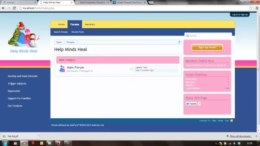
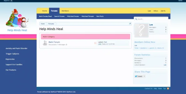
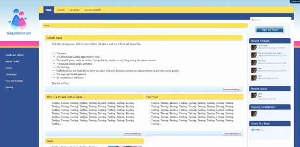
upload_2013-8-20_12-29-54.webp

Working on porting this theme from an old IPB site of mine with the view to re-launch shortly.

(Ignore the christmas logo, I have many variants and it is just the one I am playing with right now.)

I'm not really happy with how it "feels" I think the sidebar looks incomplete (not including the sign up button) and i'm struggling to style the breadcrumb to look satisfactory.

Anybody got any input? :)
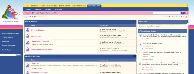
 
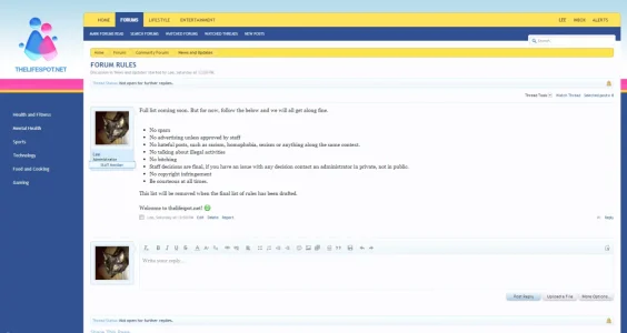
Have you got a screenshot of what the old site looked like.

Personally not digging the pink/yellow/blue vibe at the moment. Was it used on the old site?
 
  • Like
Reactions: Lee
That's got a much more subtle use of pink. If you could make the category bars/side bars blue rather than pink it would tone it down.
 
  • Like
Reactions: Lee
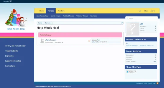
Better with the default colours? :)

Definitely less pink! ;)

If you could do the side bars similar to this and maintain the continuity with the category bars, and the content underneath relatively clean and simple that might look good.

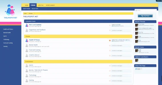
upload_2013-8-20_13-45-35.webp
 
  • Like
Reactions: Lee
How does that look?
Much improved IMHO. If you colour the forum banners the same, that would be worthwhile.

Also either add the rounded corners to the sidebars, or lose them from the category bars for continuity?
 
  • Like
Reactions: Lee
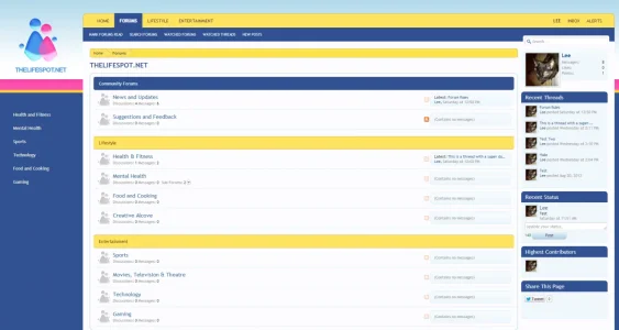
I'd suggest colouring your breadcrumb the same as the primary navigation. (y)
I'll give it a go in a moment :) See how that looks.

Much improved IMHO. If you colour the forum banners the same, that would be worthwhile.

Also either add the rounded corners to the sidebars, or lose them from the category bars for continuity?
I'll round the corners on the sidebar I think - probably would look best.

Thanks for the input guys. I've also closed up the column on the left a little as it was too wide as it is there.
 
I'd suggest colouring your breadcrumb the same as the primary navigation. (y)
Much improved IMHO. If you colour the forum banners the same, that would be worthwhile.

Also either add the rounded corners to the sidebars, or lose them from the category bars for continuity?

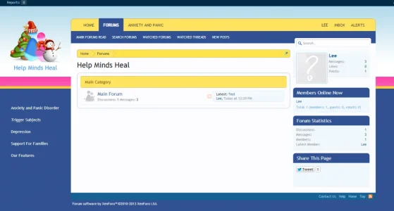
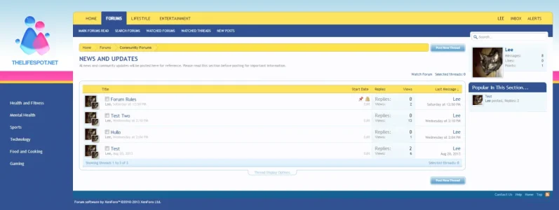
upload_2013-8-20_15-27-54.webp

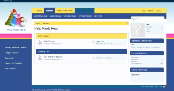
I went for a yellow category strip, I think it looks good now. I think i'm going to alternate the colour of the categories anyway, so i'll rope some blue and pink in there elsewhere. I think its coming together nicely now. Still not 100% happy with the sidebar though, it looks....unfinished to me.
 
Looks better - although, personally, I'd keep the categories either blue or yellow (both work well) rather than alternating (actually, at a push, I'd prefer blue as you have yellow in your two navigation elements). (y)
 
Back
Top Bottom