Feedback on Ironrangers.net

Barnes

Member
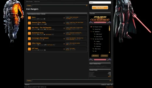
Would appreciate any feedback on Ironrangers.net We are a gaming clan site, have been around since 2004- but recently redesigned to Xenforo.

Running a modified version of Qwk86gn's Blackend theme.

I havent updated to 1.02 yet - but maybe this weekend

There are more forums, but they are for members only, guests can not see

Apreciate any critiques

Ironrangers.net
 
Nice.. The sidebar seems too long for the forums imo

Also then very top "drop down" login box bottom border looks abit out of place (been white)
 
I'm not a big fan of forums with dark backgrounds because I find them hard to read, but despite this I think you've done a very good job here. The background images are striking and the orange and white colour scheme works well. I also like the way you get straight to content without needless banner adverts obstructing the flow.

The actual thread view is one of the best I've seen with a dark theme, the way you have surrounded each post with a border is utter and complete eye candy :)

The only downer to my fussy eye is the gap on the main page under the forum lists (because the side bar is a lot longer).

Nice job though.
 
First off, I will say (and most everyone already knows), I do not like dark styles. They tend to hurt my eyes, and I can't be on a forum for long when one is in use.

That said, I like it! This dark style is one that I could handle a bit better, because of the bright text, excellent use of gradients in various areas, and the bright background images, plus that star wars image in the side bar, etc. These all draw my eyes away from the blackness, making it a visually appealing site for me.

Now, what I do not like - those bright orange squares used for forum status icons. They do not match the subject of the forum, and stand out like a sore thumb (to me).
Do a google search for star wars icons. Do SOMETHING, but get rid of those gawd-awful orange squares. (Shelley, if you designed them, I'm sorry, but I truly dislike them, lol).

Otherwise, great job!

I never designed the forum status icons. :LOL:

Since I'm in here. I feel the sides lacking a border gives the style the feeling it's not contained. Rather than trying to explain it and looking stupid a screenshot and code I used via firebug.I changed the background colour and added the border-right and left.

Code:
#content .pageContent {


    background-color: #191919;
    border-left: 1px solid #424242;
    border-right: 1px solid #424242;
    padding: 10px 20px;
}
 

Attachments

  • border_control.webp
    border_control.webp
    77.5 KB · Views: 14
Nice.. The sidebar seems too long for the forums imo
Thanks- yes it does look odd, but when the members area is visible, it looks much more evened out, as there are several forums that the permissions are for members only. The ventrilo widget gives the sidebar too much length without the members section being visible.

Do SOMETHING, but get rid of those gawd-awful orange squares.
Agree - I just havent found the right icon yet. Since we play different games (Battlefield and Star Wars) I need to keep everyone happy, Still searching.....

Since I'm in here. I feel the sides lacking a border gives the style the feeling it's not contained. Rather than trying to explain it and looking stupid a screenshot and code I used via firebug.I changed the background colour and added the border-right and left.

Code:
#content .pageContent {
 
    background-color: #191919;
    border-left: 1px solid #424242;
    border-right: 1px solid #424242;
    padding: 10px 20px;
}

Me Likey! - I never noticed that , but I do like the change. Thanks Shelley!

Just to be clear to everyone- as mentioned in the original post- I DID NOT create the actual style. I modified Qwk86gn's Blackend theme. (Header, background, some font color tweaks) I wish I could take credit for the original design , gradients, etc, but I can not

Thanks again to everyone for the feedback!
 
....Do SOMETHING, but get rid of those gawd-awful orange squares. (Shelley, if you designed them, I'm sorry, but I truly dislike them, lol).

Lol..Guess maybe I should try harder when doing icons. :unsure:

It was just a quick thing with those icons as most users tend to change them anyhow.
 
I never designed the forum status icons. :LOL:

Since I'm in here. I feel the sides lacking a border gives the style the feeling it's not contained. Rather than trying to explain it and looking stupid a screenshot and code I used via firebug.I changed the background colour and added the border-right and left.

Code:
#content .pageContent {
 
 
    background-color: #191919;
    border-left: 1px solid #424242;
    border-right: 1px solid #424242;
    padding: 10px 20px;
}

Very nice addition!

Please forgive me, but 'where' do we place this code, exactly? I'm familiar with doing this but I've just acquired xenForo and I want to be exact.
 
Very nice addition!

Please forgive me, but 'where' do we place this code, exactly? I'm familiar with doing this but I've just acquired xenForo and I want to be exact.
You can place it in Extra.css, or you can modify the style property (General -> Content).
 
Top Bottom