Lack of interest Ditch "More Options"-button

This suggestion has been closed automatically because it did not receive enough votes over an extended period of time. If you wish to see this, please search for an open suggestion and, if you don't find any, post a new one.

erich37

Well-known member
Suggestion: Ditch "More Options"


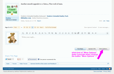
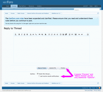
There is this "More Options"-button, which seems not to provide a lot of any additional options:
current_more_options_button.gif

current_more_options_editor.gif


Suggestion:
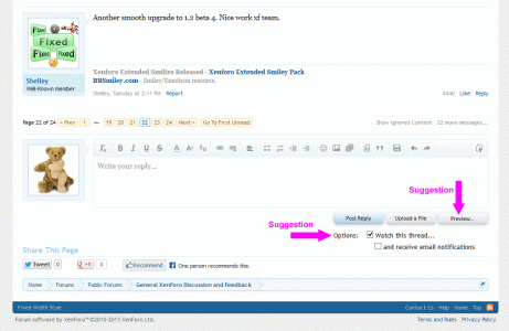
- Change the button named "More Options" into a "Preview"-button.
- Add the "Watch Thread" stuff either towards the current location at the top-right of the page (where it is already) or move it somewhere else (e.g.: below the buttons). Or remove the "Watch-Thread"-options completely, as those are already available at the top-right of the page.


I think eliminating the "More Options"-button would make it easier for users to understand the system as it would eliminate the double-dipping (showing twice) of the "Editor interface".

Also, this Suggestion is "consistent" with the interface when you "Create a New Thread", as there it also shows the "Preview"-button.


suggestion_ditch_more_options.gif


:)
 
Last edited:
Upvote 2
This suggestion has been closed. Votes are no longer accepted.
I would also agree with this, I don't see any major difference in the full editor view and quick reply apart from preview.

But maybe some people (while making big posts) like to use the longer version of the text editor?
 
Strongly disagree. When composing a large post, the quick reply box often isn't adequate and it's useful to have the larger input box (and preview function).
 
Strongly disagree. When composing a large post, the quick reply box often isn't adequate and it's useful to have the larger input box (and preview function).

there is no "larger" input box. It is exactly the same size.
Also, the "preview function" is already there (see "Preview"-button).


:)
 
which "non-cluttered look" ?


which "longer version of the text editor" ?

:coffee:
The text editor is vertically taller on the More Options page than the quick reply one.

Don't forget that there are additional options that appear on the More Options page for those with additional permissions - Set Thread Status (Open and/or Sticky).
 
The three buttons look much better than having 2 more lines of text and a check box when viewing from here. All I can see that doing is adding more space.

- Add the "Watch Thread" stuff either towards the current location at the top-right of the page (where it is already) or move it somewhere else (e.g.: below the buttons). Or remove the "Watch-Thread"-options completely, as those are already available at the top-right of the page.
 
Plus, when posting multiple times to that same thread, do we really need to see the options all the time?

To move the "Watch Thread"-options underneath the buttons is just an idea.
Of course, the "Watch Thread"-options could be removed completely, as there is a "Watch Thread"-Link already at the top-right of the page.
I agree, no "double dipping" required.


This suggestion is merely related to remove the "More Options"-button and add a "Preview"-button instead.

:)

But preview can give the suggestion it is merely an overlay showing what you have typed. Just "previewing", and no longer able to edit it.
 
Fairly sure this has been suggested before and for the reasons already given, the button does more than just preview.

In addition to the watch thread options, moderators also have thread status checkboxes.

"Thread Status Checkboxes" like "Open" and "Sticky" are also already available at the top-right of the page via the "Thread Tools Dropdown".

:coffee:
 
What does that have to do with it?

If I want to respond to a thread and lock or stick it at the same time, I can do so by clicking More Options.

I can't using the thread tools dropdown.
 
This is also why I prefer a simpler editor for quick reply and a more advanced editor when clicking the more options button. But the main reason is that noobs when they see buttons they have to use them. Making posts look like pages of a coloring book.

Suggestion: reduce the number of editor buttons for quick reply to the basics. Keep the rest under more options. Or at least allow for that flexibility in the ACP.

So true LMAO!
 
Suggestion: Ditch "More Options"


There is this "More Options"-button, which seems not to provide a lot of any additional options:
View attachment 50710

View attachment 50711


Suggestion:
- Change the button named "More Options" into a "Preview"-button.
- Add the "Watch Thread" stuff either towards the current location at the top-right of the page (where it is already) or move it somewhere else (e.g.: below the buttons). Or remove the "Watch-Thread"-options completely, as those are already available at the top-right of the page.


I think eliminating the "More Options"-button would make it easier for users to understand the system as it would eliminate the double-dipping (showing twice) of the "Editor interface".

Also, this Suggestion is "consistent" with the interface when you "Create a New Thread", as there it also shows the "Preview"-button.

View attachment 50712


:)

I like this idea. Gets people involved and engaged quicker by enticing them to watch a thread. Plus eliminates another page to streamline things.
 
Top Bottom